Canal 9 Televida is a cherished household media brand and one of Argentina's oldest TV channels, deeply entangled with Argentine society and its hometown region, Mendoza. It brings people together, from childhood through old age, and connects families across generations through news and content.
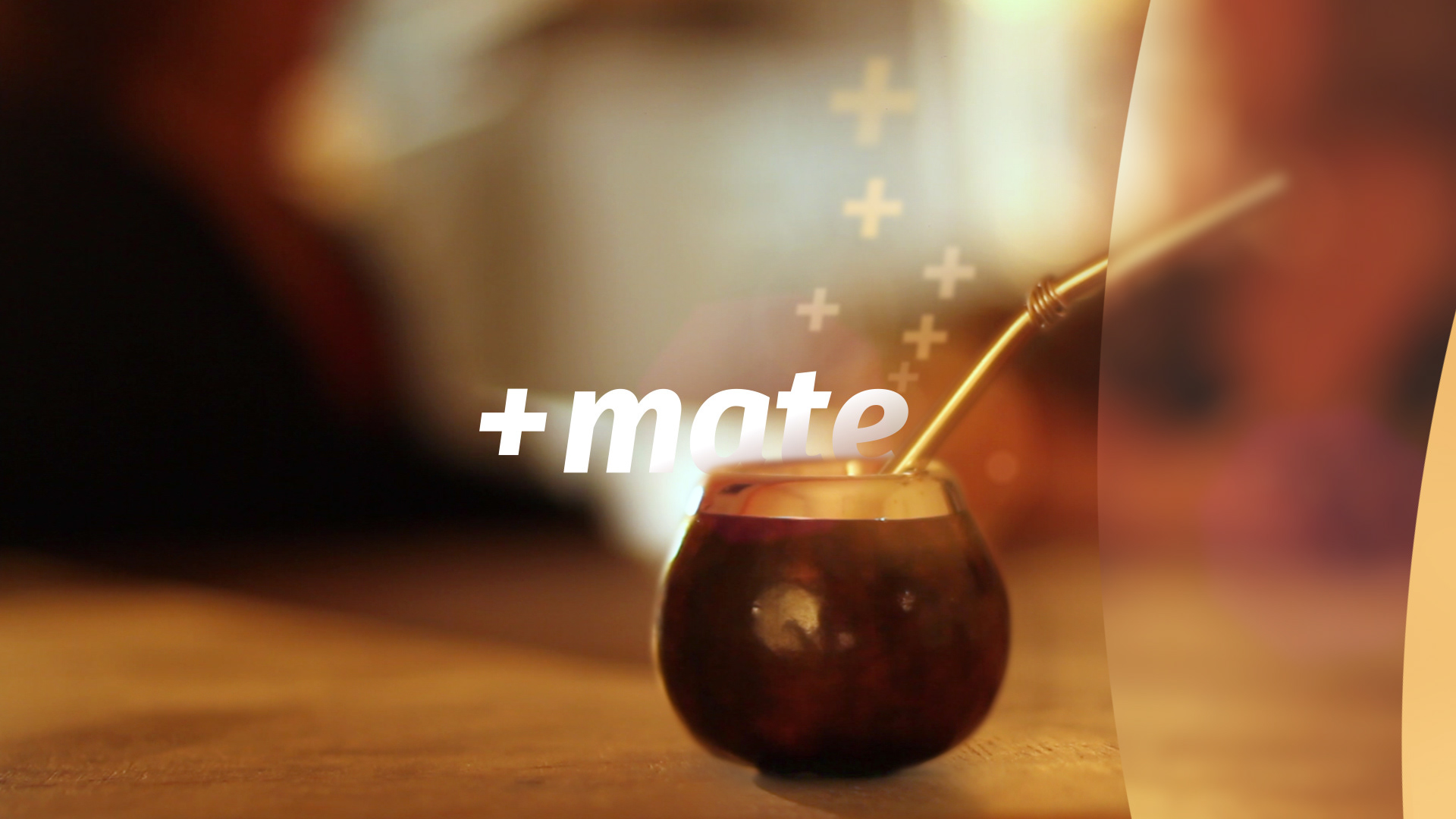
"Televida" is the sum of emotions sparked by the channel’s content and our everyday life. Passion, drama, comedy, family, love. Plus, the siesta, the mate, the conversations, our daily traditions and habits. When Telly + life come together, they are equal to Canal 9 Televida. We build a unique bond with the people of Mendoza and their everyday stories, putting the audience, the user and their community at the core of this identity. Los ARGENTINOS and Canal 9 Televida are one and the same.
THE CHALLENGE
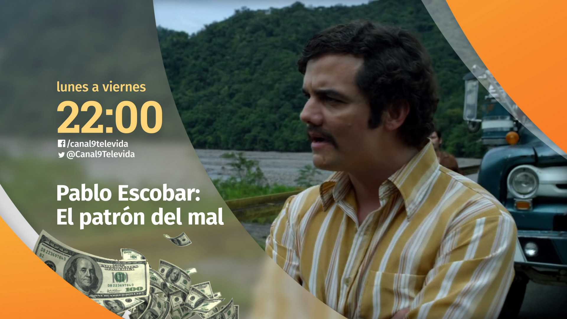
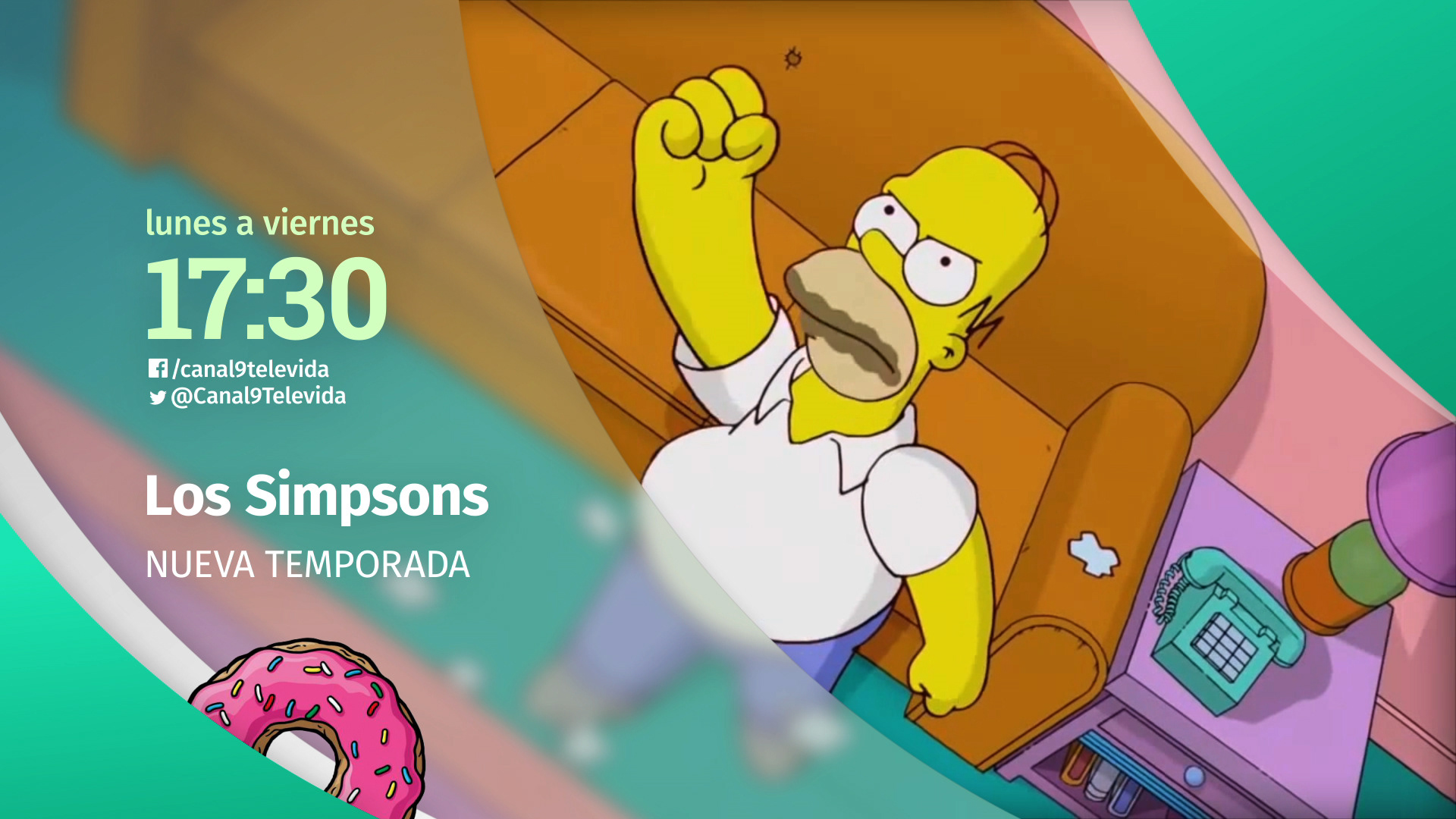
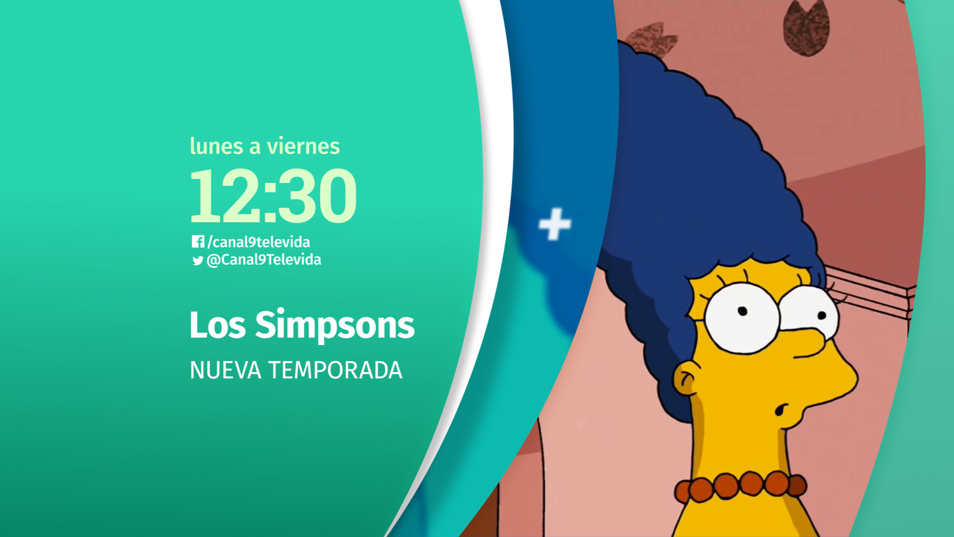
Our solution had to bend and stretch to fit the channel's colourful mix of content and truly connect with the people. From soap operas and breaking news to blockbuster movies, original productions, reality TV, lifestyle tips, and lively talk shows, Canal 9 Televida has something for everyone in the family. The real challenge was weaving these diverse voices into a unified brand while working with a tight budget.
THE PROCESS
Working hand in hand, trough Co-creation, we shaped a new identity for Canal 9 that truly captures their spirit and is rooted in their core values: family, tradition, social responsibility, and community, which have formed the heart of their mission since their founding. The result was a brand essence centred on cherishing everyday life and activities, as their audience and users do.
THE BRAND STRATEGY
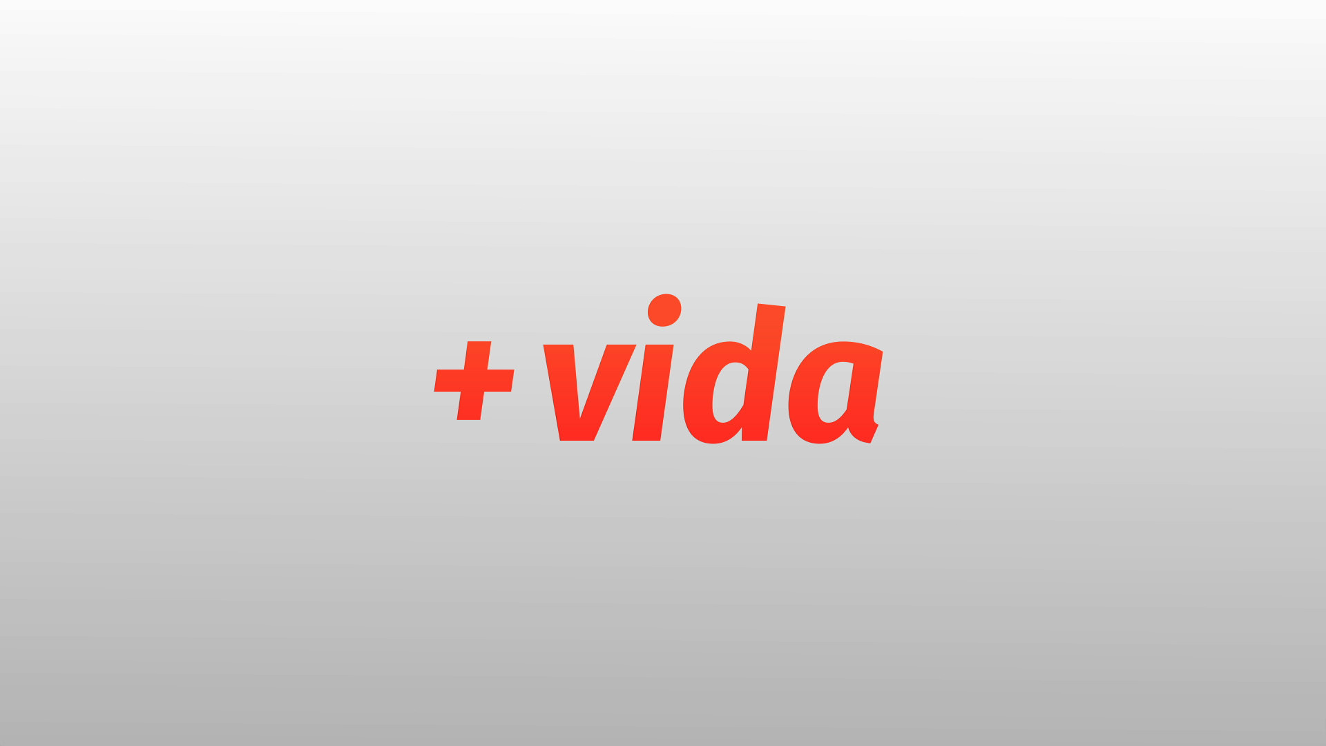
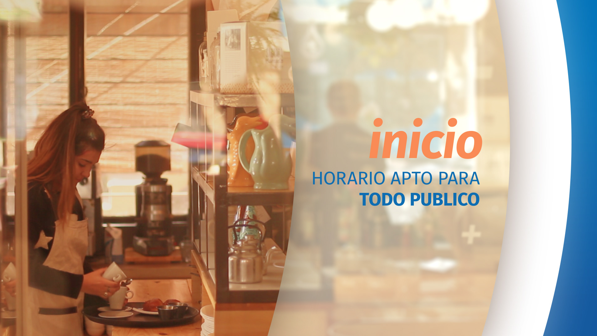
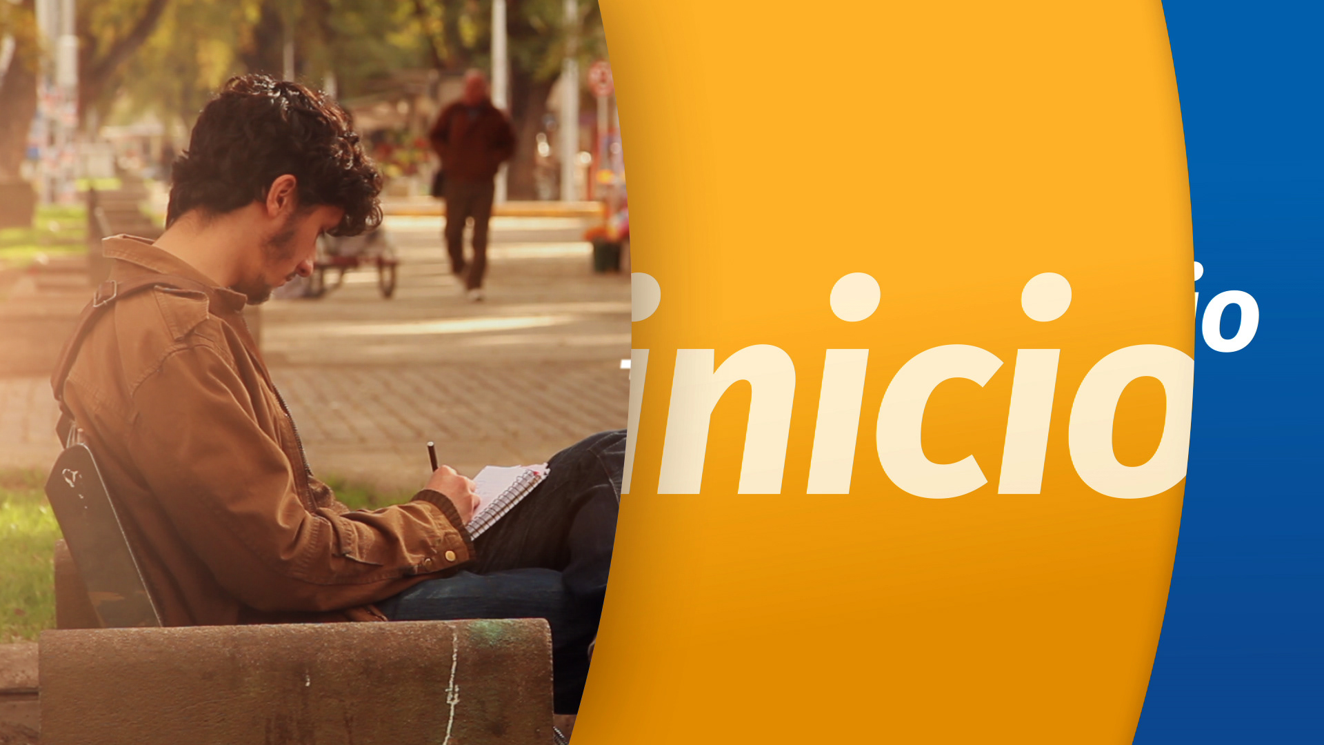
We regained the word Televida (meaning Tellylife), part of Canal 9's original name, conceived 50th years ago. A key concept. Simple, rewarding, deeply connected with the audience, and unique to the brand.
Tele+Vida is on Canal 9, and it's more alive than ever.

TONE OF VOICE
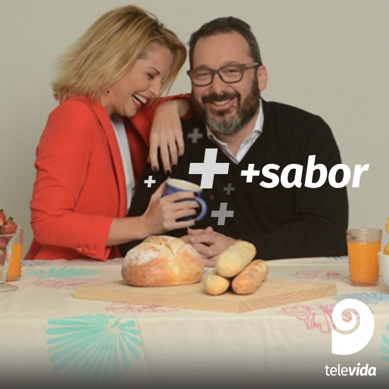
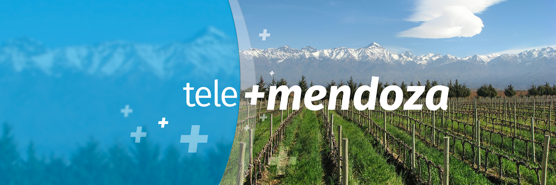
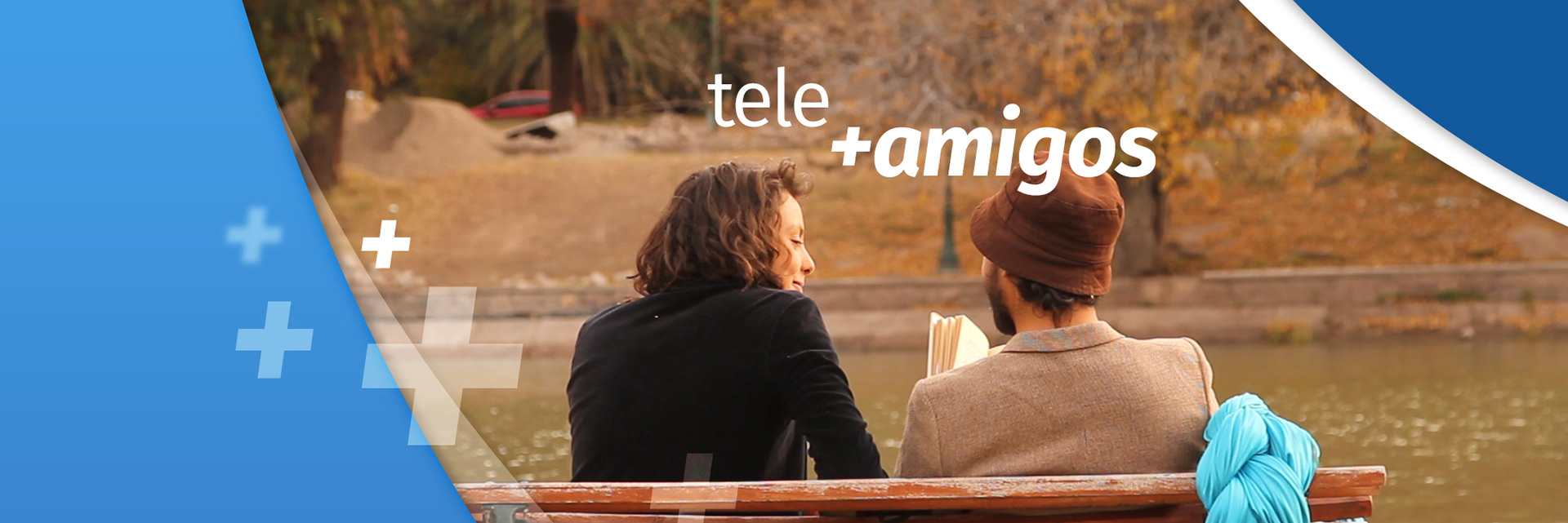
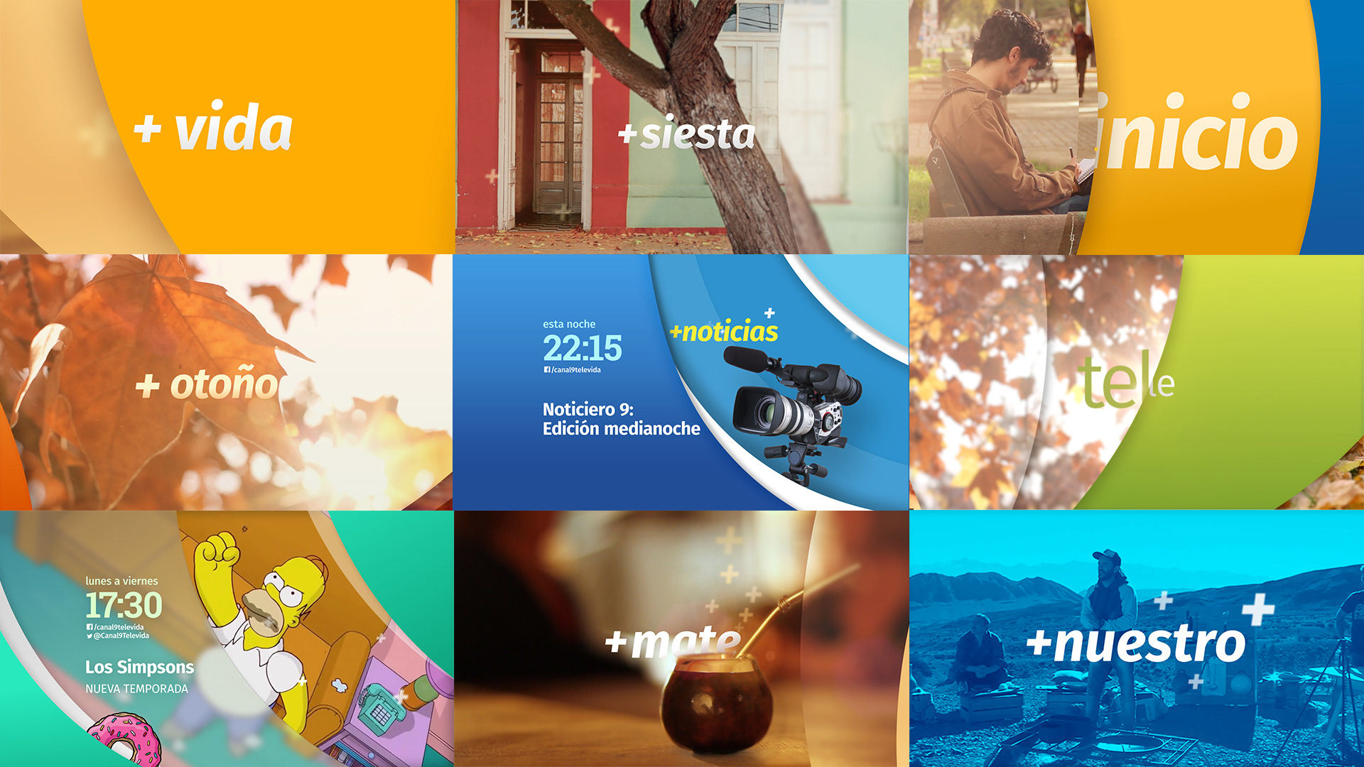
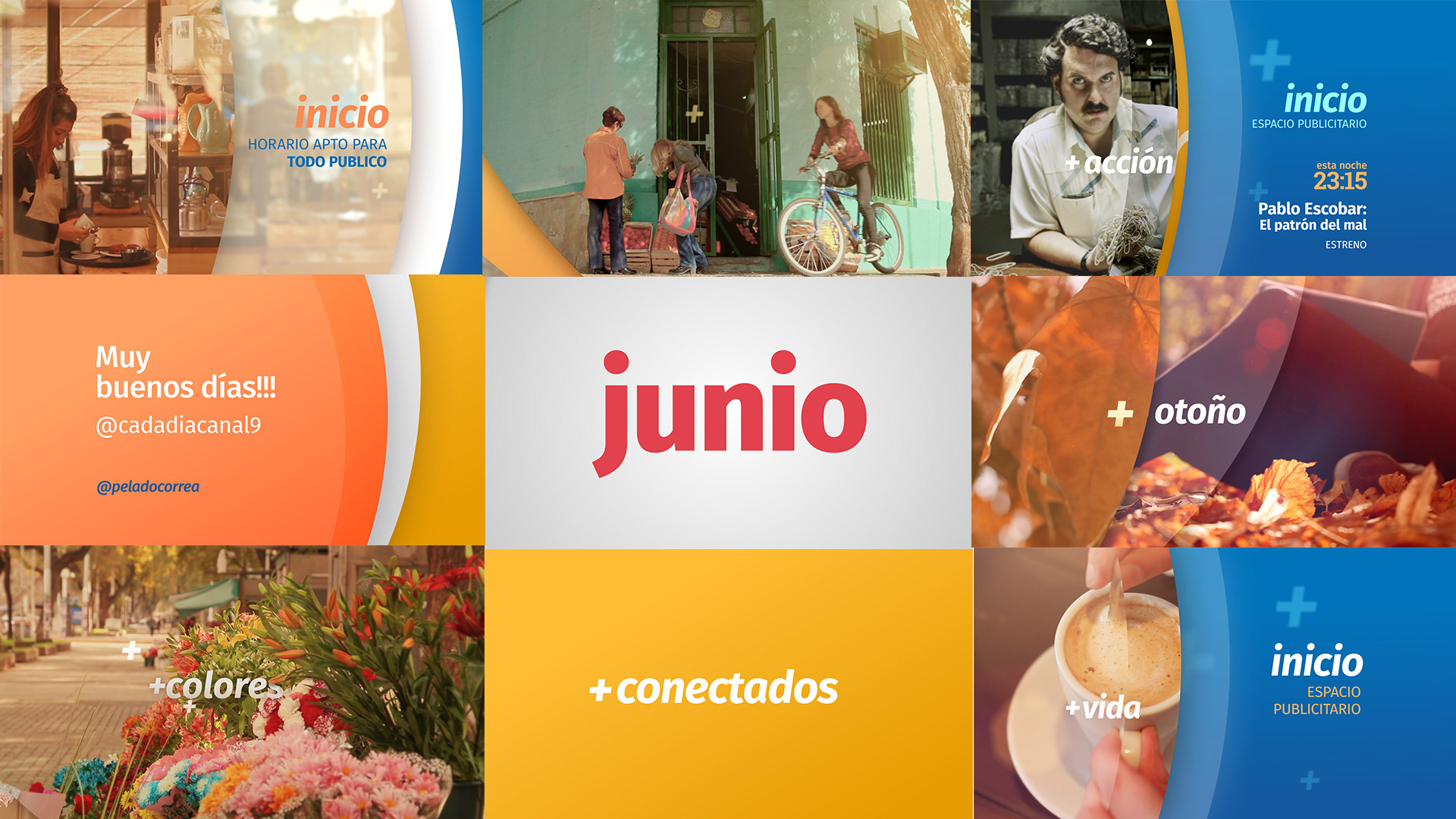
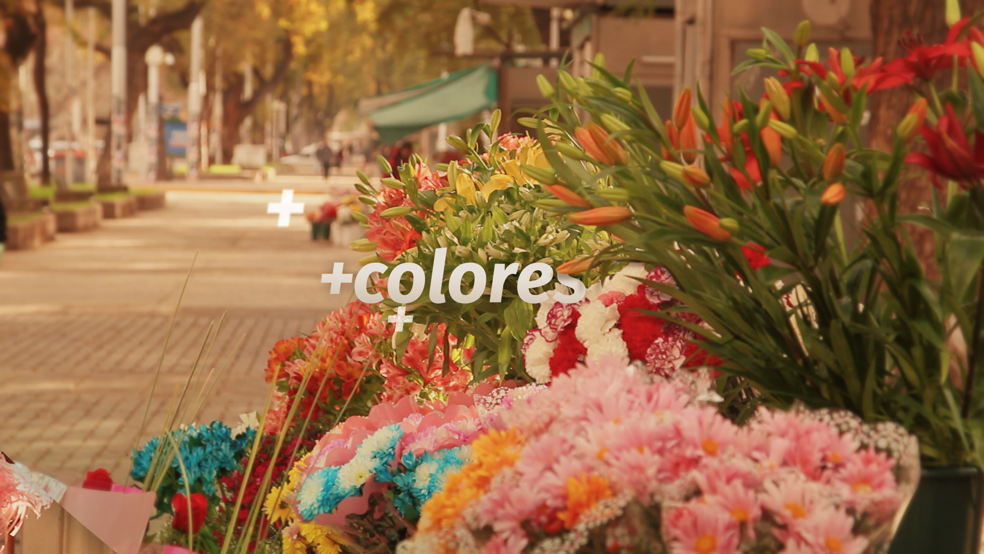
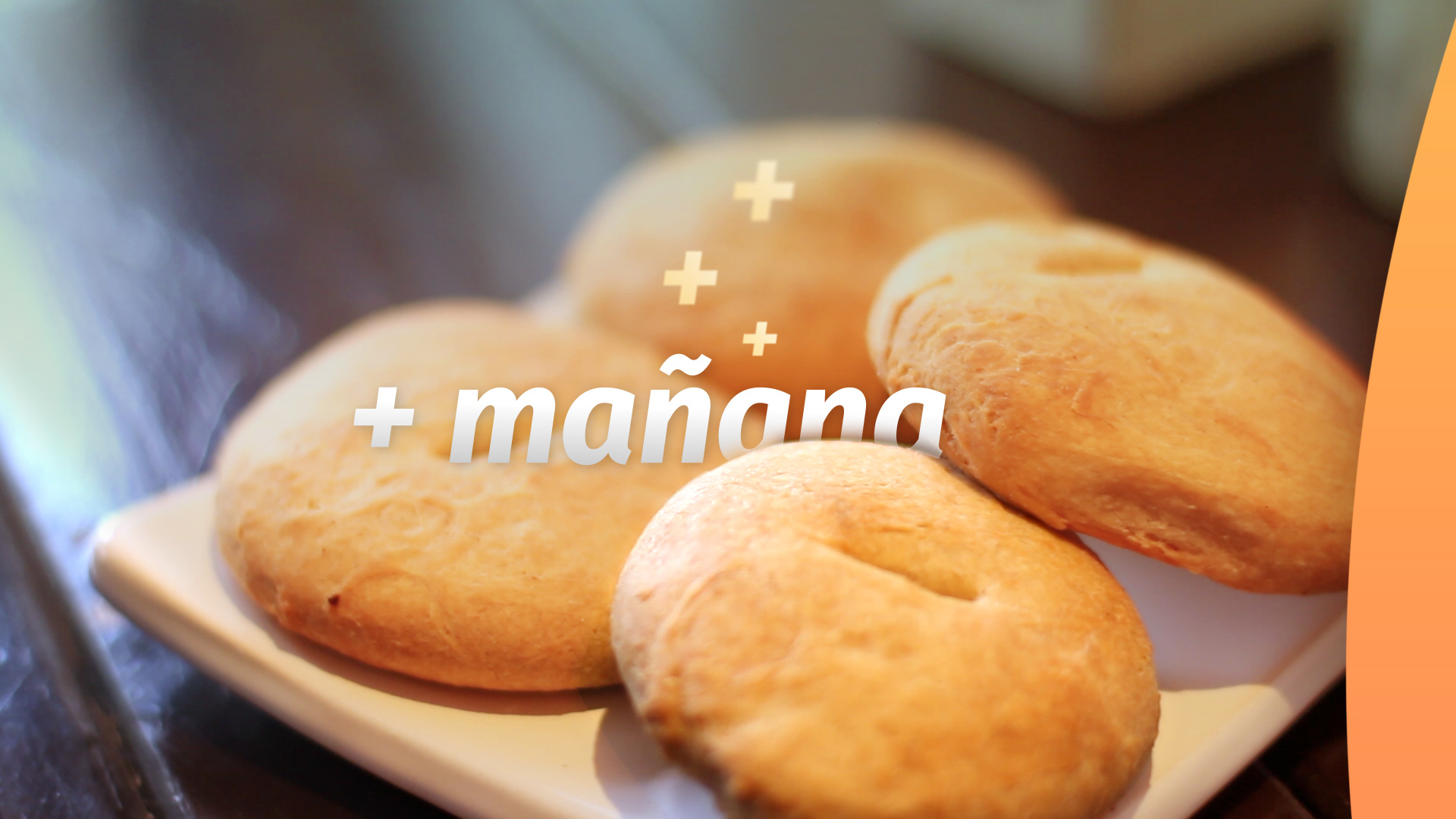
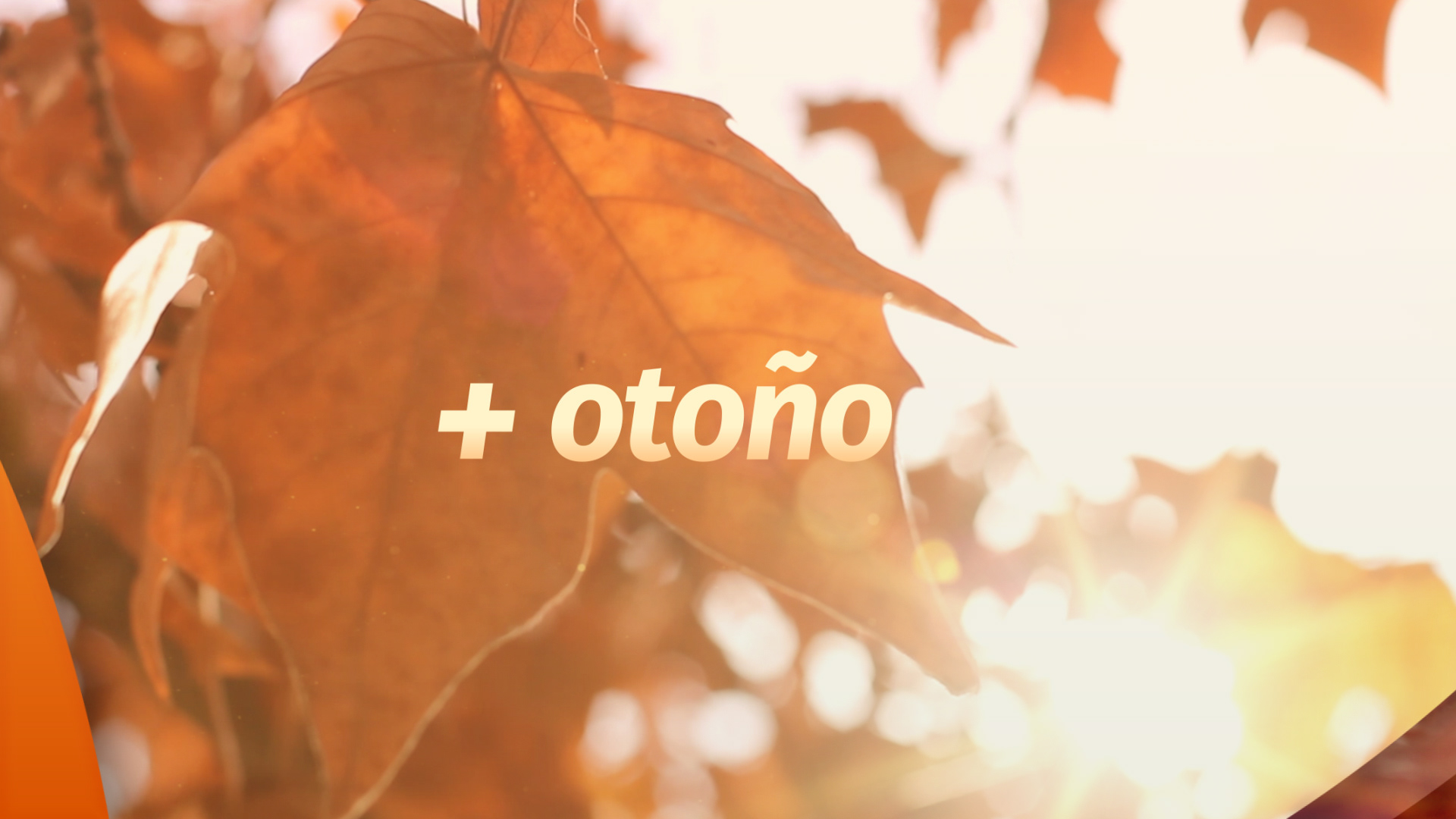
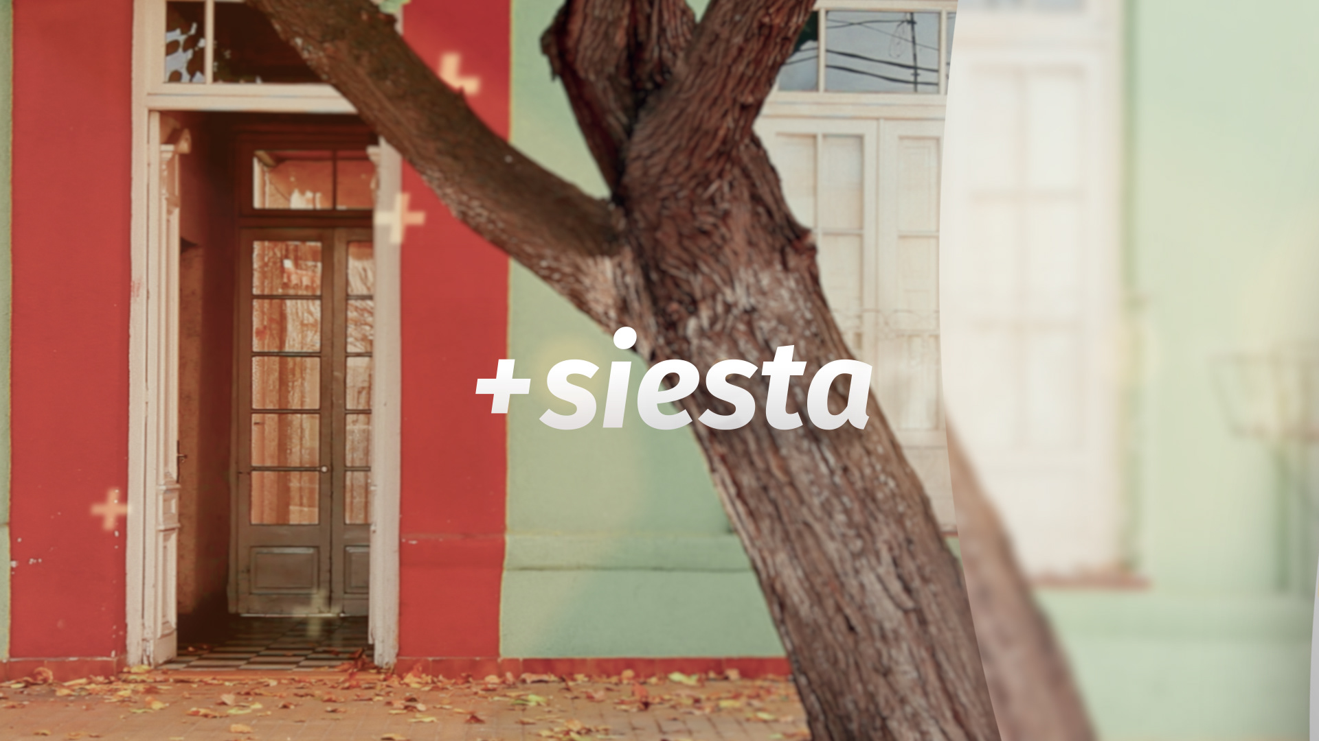
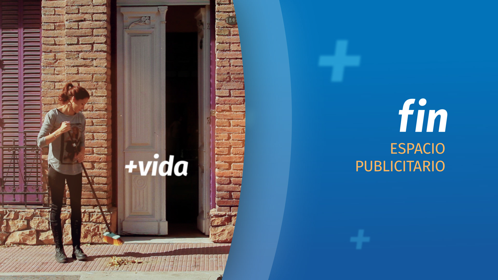
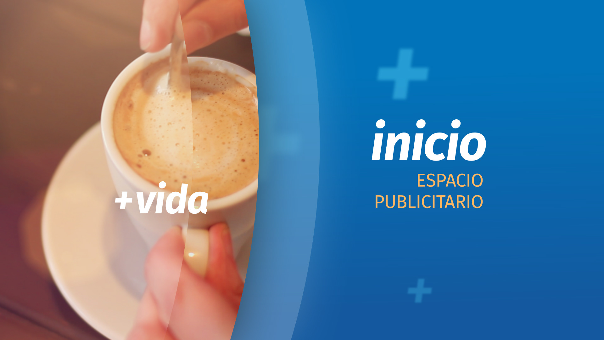
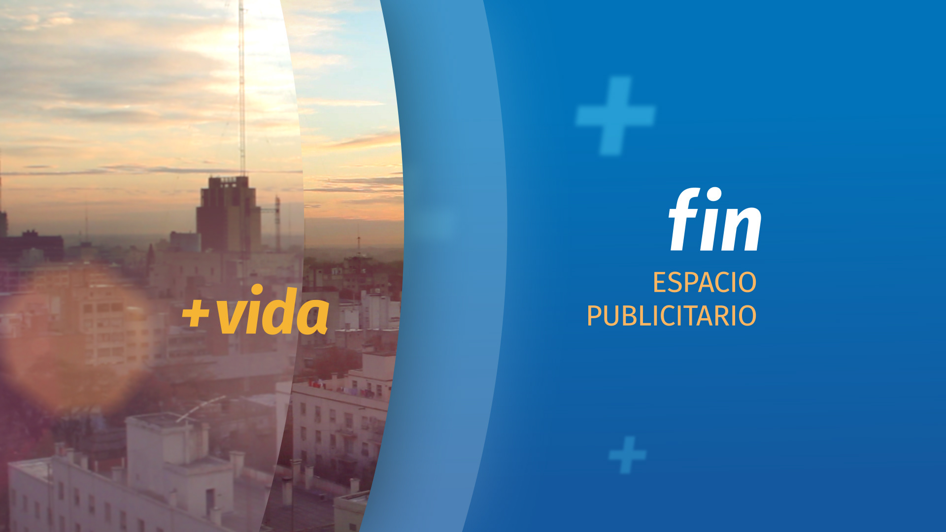
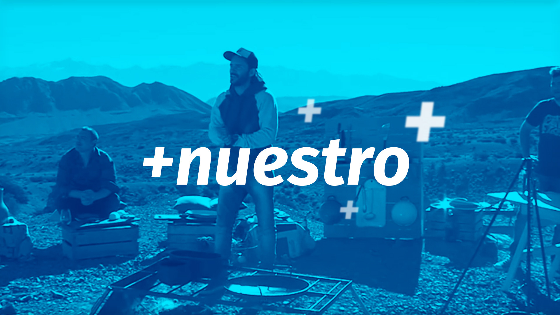
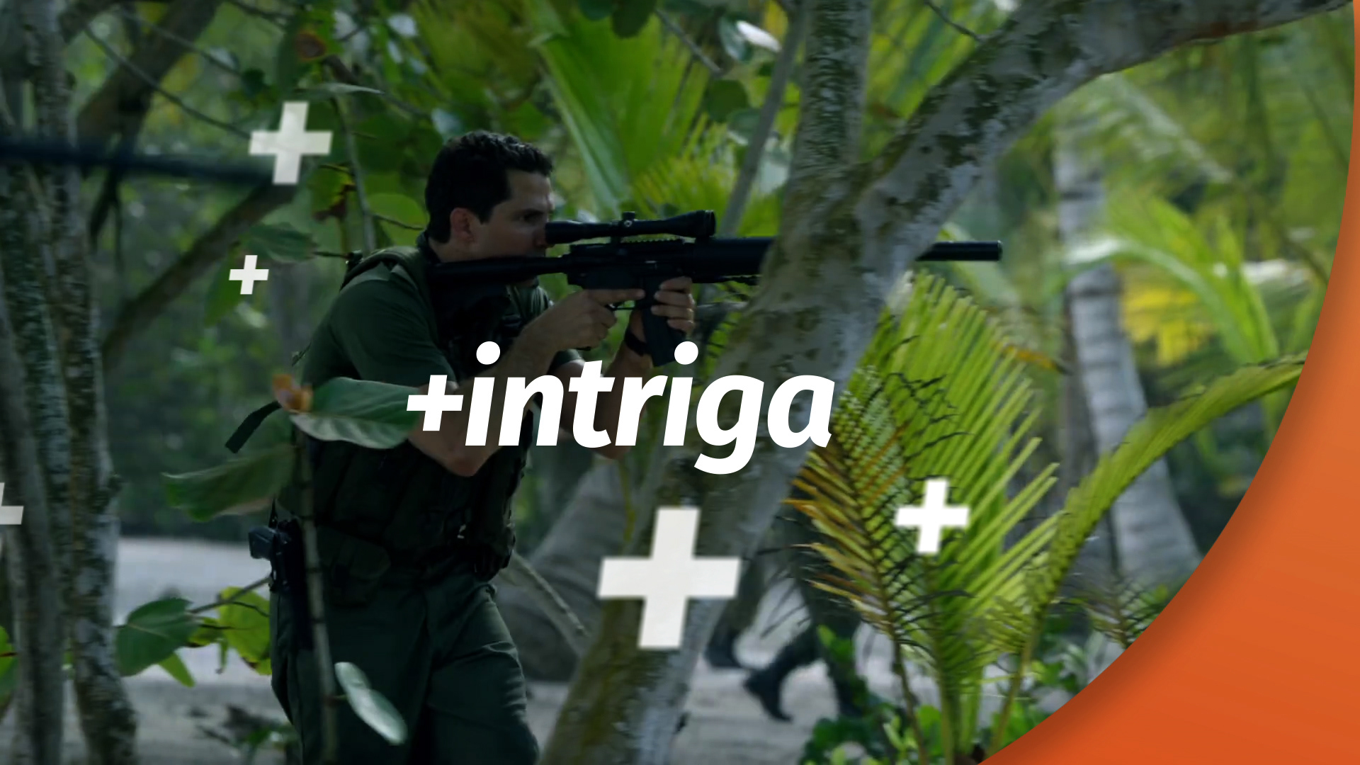
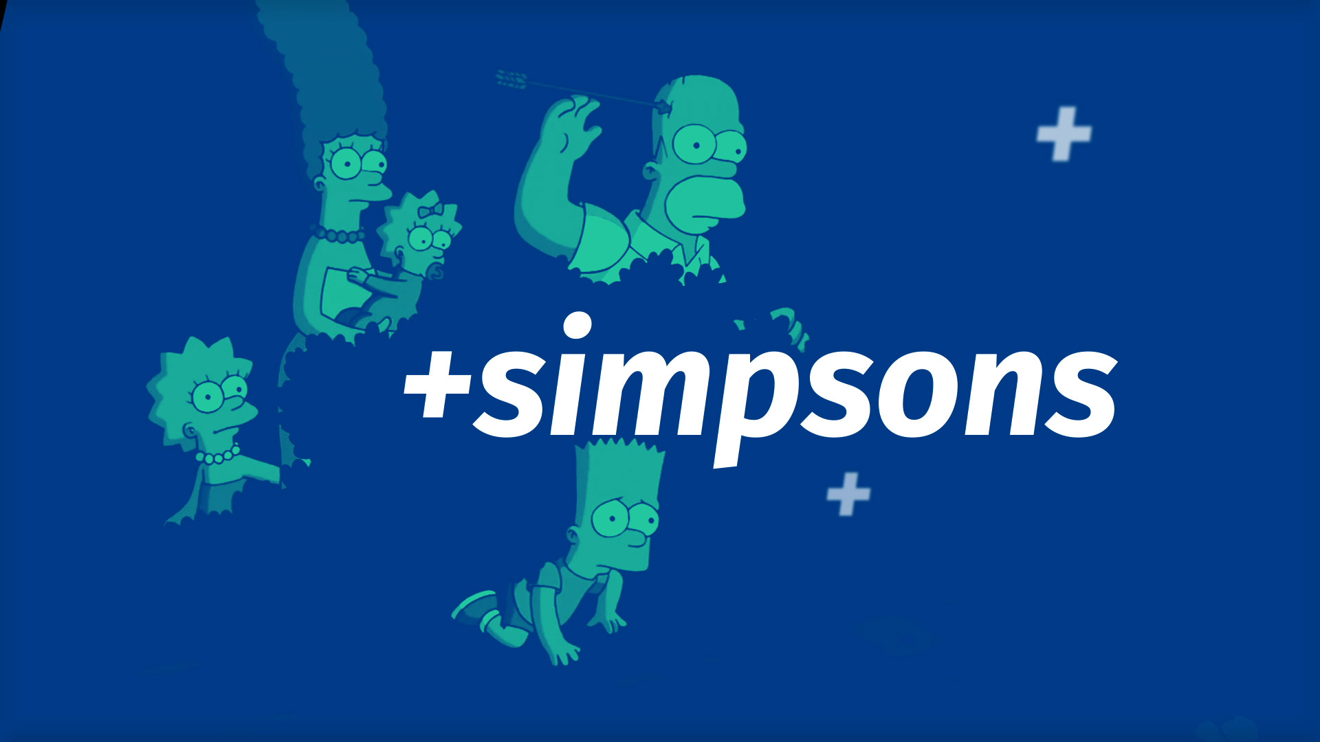
“Vida” (life) is everything. Our traditions, history, experiences, emotions, friends, families, our everyday life. Televida is all that and much more. The + symbol is the key element that brings life and telly together. The sum of its parts is greater than the whole, and this is Canal 9 identity.
A clear message: a more human — closer to the audience — brand.
Our main characters: the people from Mendoza, the mendocinos. Surrounded with daily sounds placed in beautiful landscapes of the city. Simple and authentic, like the people of Mendoza.
DESIGN CONCEPT
We took the curves of Canal 9's historic logo to create “layers”. Like onion skin, we used layers to overlay emotions, life, and telly. The sum of the parts equals Canal 9 Televida.
COLOUR PALETTE
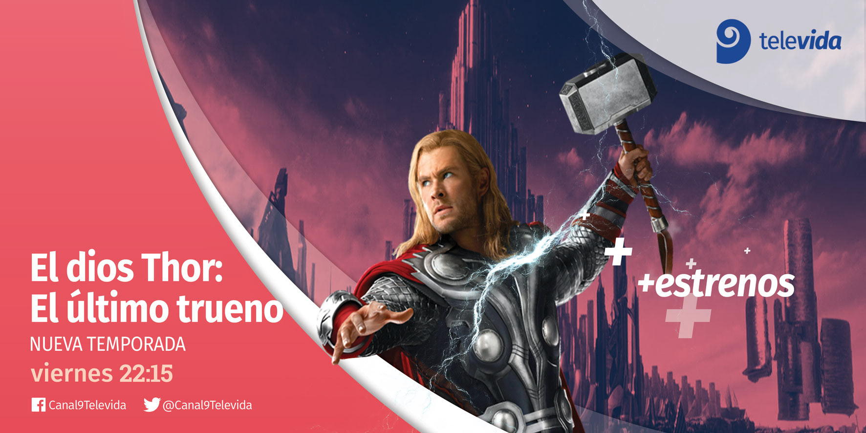
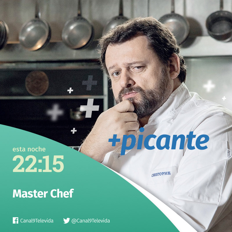
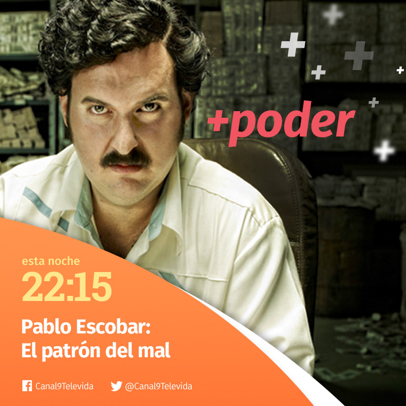
We crafted four distinct colour palettes to bring clarity and character to every brand touchpoint, from soap operas and reality shows to movies and original and own productions. At the heart of each palette shines Canal 9's iconic blue, a nod to its rich heritage that preserves the brand equity built over the decades.

IDENTS
OSP / BRAND TOOLKIT

EVERYDAY LIFE BREAKS
THE TONE OF VOICE
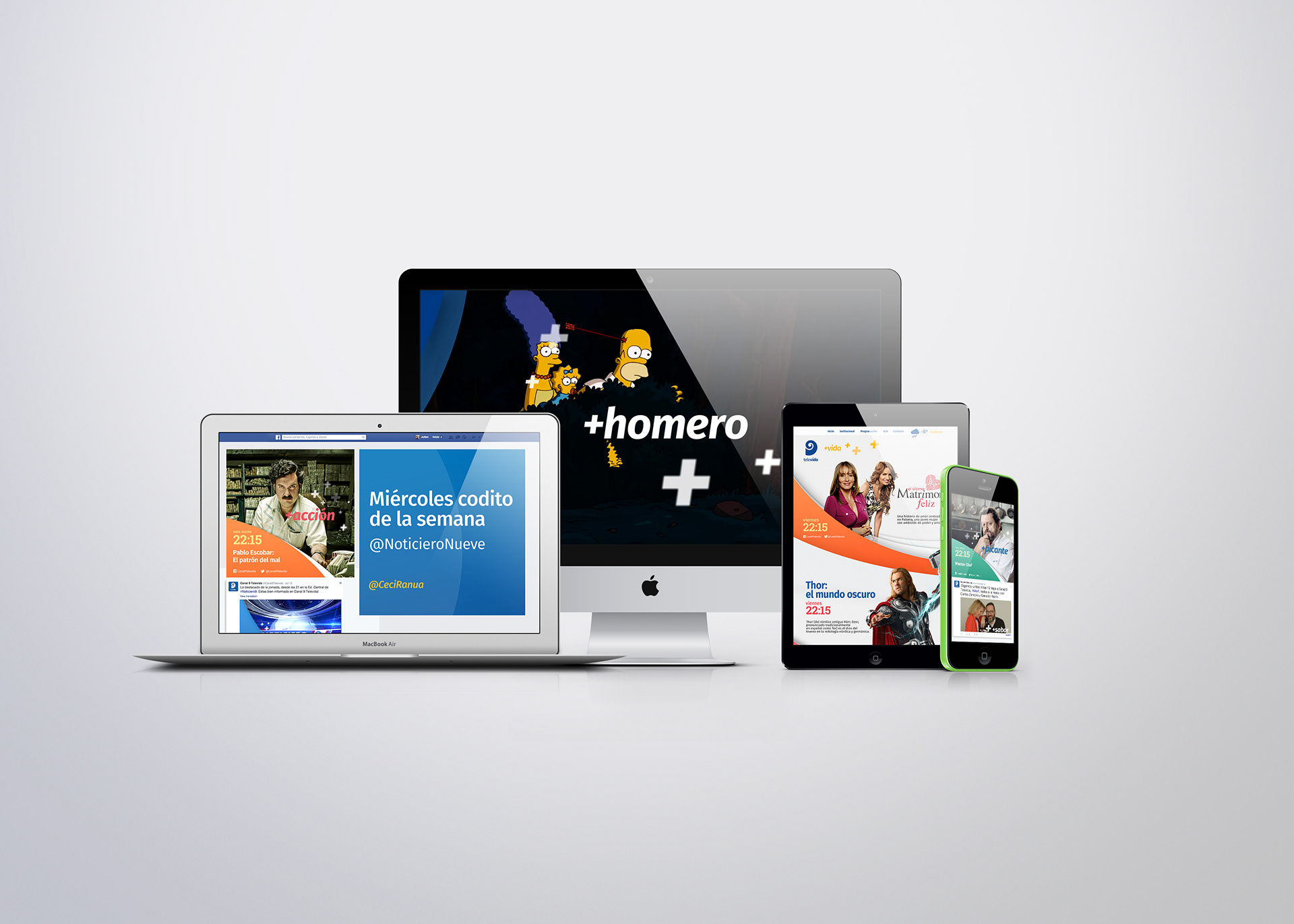
THE BRAND ACROSS PLATFORMS