

THE BRAND STRATEGY
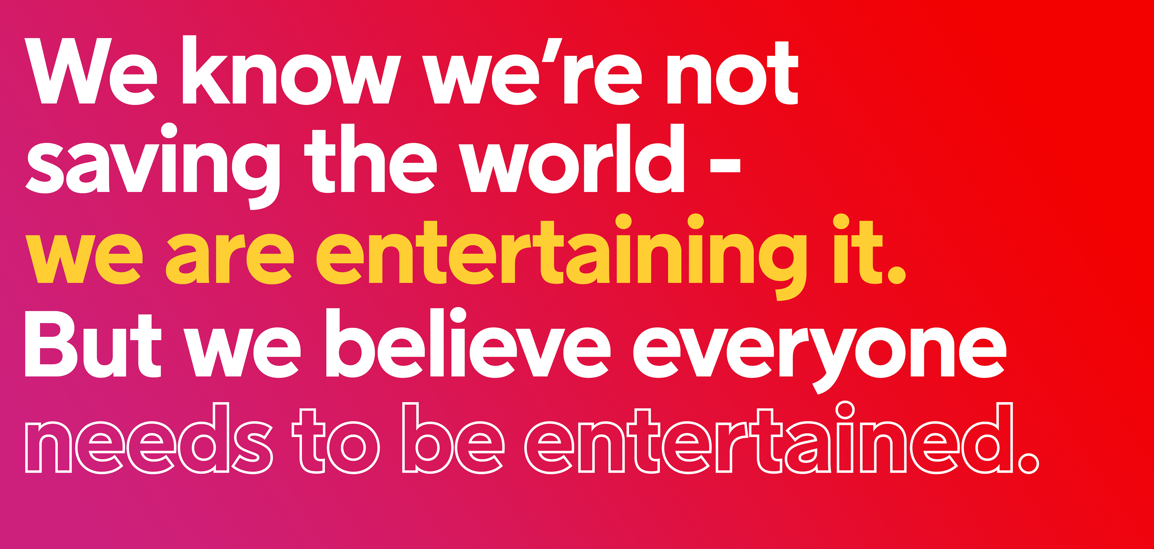
Positioning strategy: The irreverent maverick.
We use wit and humour to challenge complacency and perhaps an amused gasp of disbelief about changing the world while watching a TV show. Irreverent mavericks. An opportunity—for a challenger narrative of provocation, deliberately setting out to entertain and engage—even court a little controversy—when talking about ourselves, our content or the other’s brands.
Our Tone of Voice: The streaming challenger.
“We do things our own way. We don’t try to fit in with the competition or play by their rules. We know that streaming means relaxation, and quality time spent alone or with friends and family. And we think that’s important enough—no need to pretend it is more than that.”
How we talk: Down-to-earth. Easy-going and confident. Straightforward and to the point. Fun, witty and a bit cheeky. Honest and genuine. Warm and welcoming.
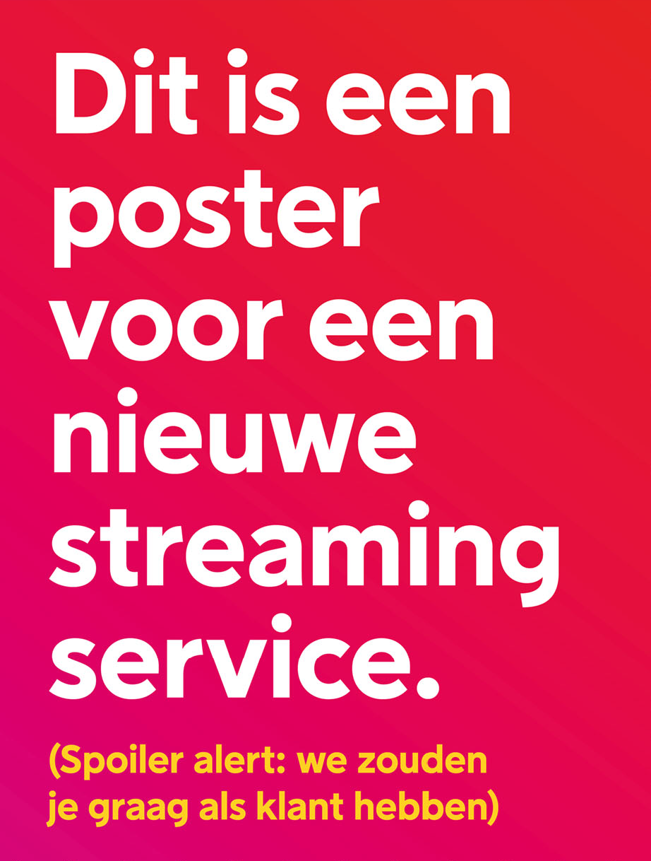
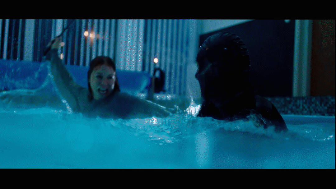
This is a poster for a new streaming service. (Spoiler alert: we’d love you to join.)
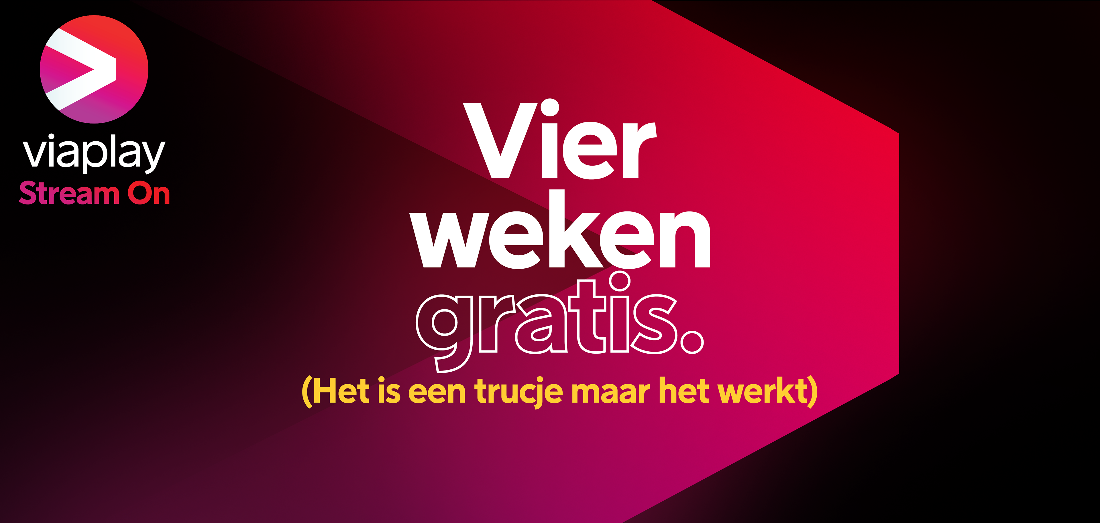
Four weeks for free. It's a trick but it works.
The design strategy
Grow the brand with distinctive brand design assets. Mental shortcuts to the brand in our memory. A proxy for the brand itself. The solution was to develop a clear set of distinctive branding assets using sensory cues (colours, audio, layout design…) to remember and recall. Flexible within the execution. Adaptable to the medium. Neurological diverse.
The motion theory is the glue across all the brand design elements. Bringing them to life, captivating the eye, creating cohesion and allowing them to co-exist and create new narratives in all moving assets.
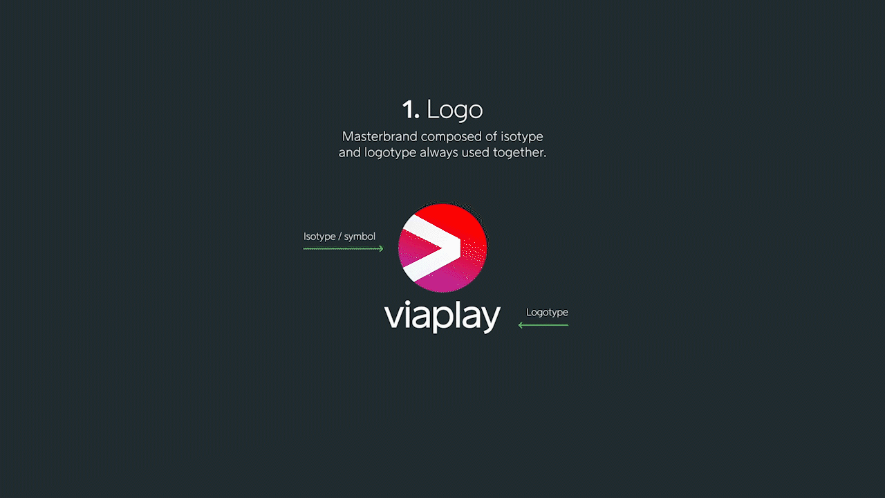
VISUAL IDENTITY
The brand identity is built as a global-local brand. The distinctive design assets are localised depending on the market. This allows us to bring brand ambassadors into the conversation and add stories to build truly relevant connections with users. We get to know our audience and reach them in the closest way to their interests.
USE OF COLOUR
The Viaplay gradient is a story of success. First introduced in 2019 as the main colour for the brand, it's been key to developing the visual identity of Viaplay.
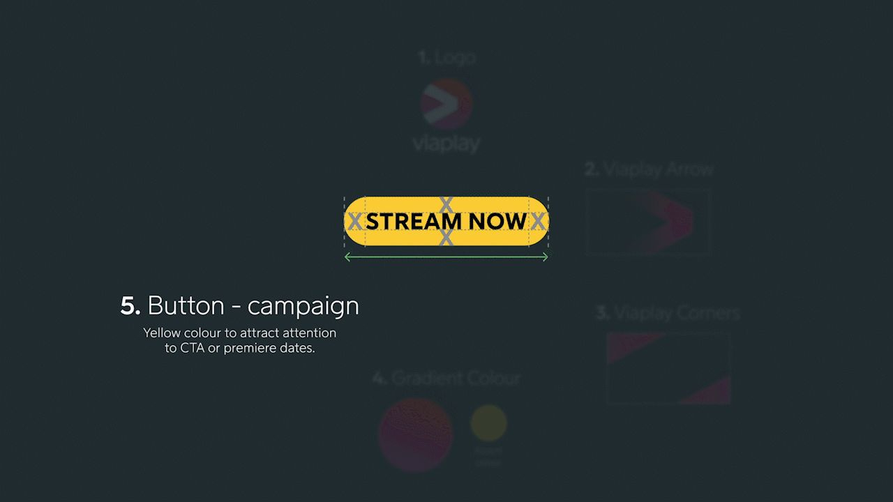
It's mostly used with a shape: the logo, the arrow, the corners, or the typography. Its value is measured by higher awareness and differentiation among competitors, contributing to Viaplay's uniqueness and fame. Complemented with yellow as a highlight for accent, the pair appeals to family and sports fans, representing energy and warmth.
USE OF TYPOGRAPHY
Typography is central to the brand, as it carries the tone of voice and leads to engagement. Viaplay Sans. Viaplay Sans is a geometric typeface; its neat design goes harmonizing with our symbol. The original family was narrow, so designing a new Viaplay Sans Black Outline font was necessary to achieve our goals and further expand the family with italics. This allows for a better range of weights and variations that serve to communicate the concept across the brand.


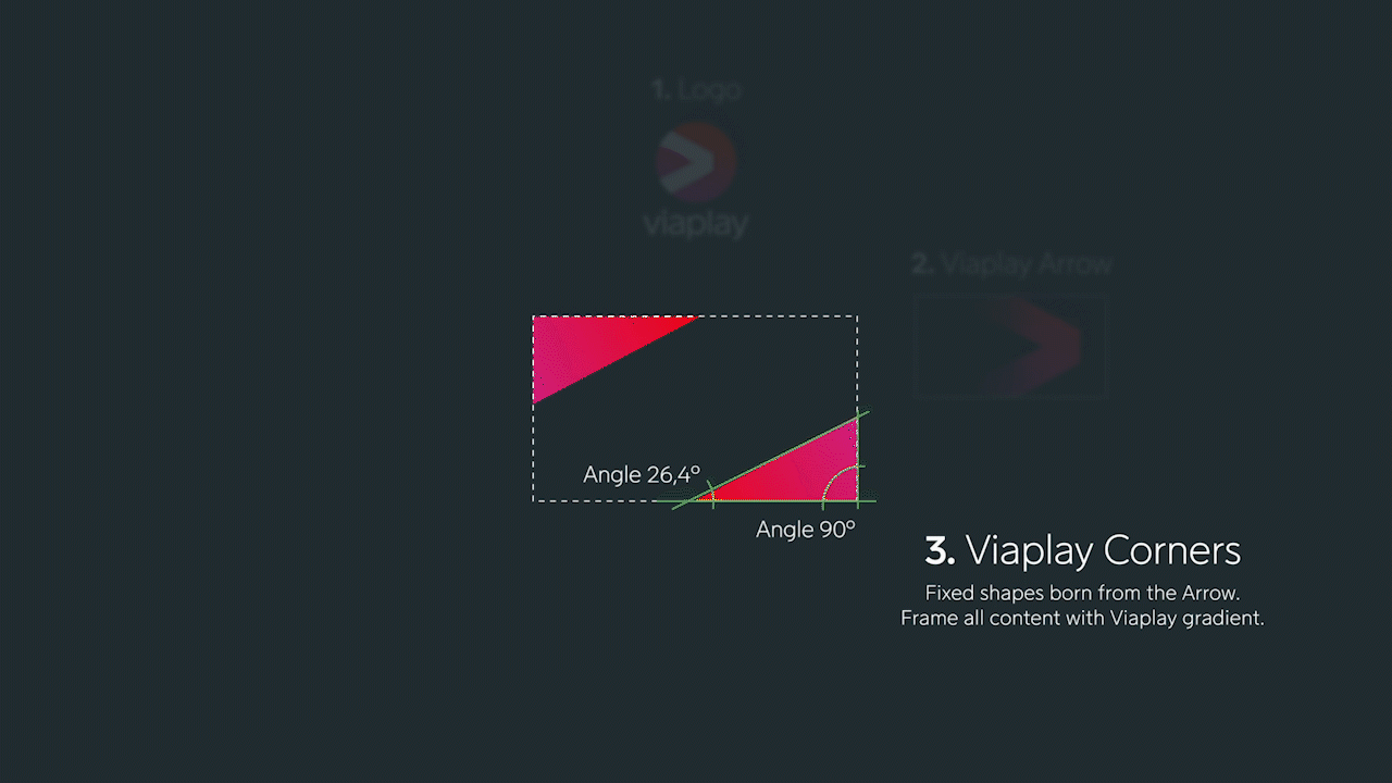
THE VIAPLAY ARROW AND CORNERS
Viaplay Arrow introduced in 2019 is a key asset to communicate with users. The arrow embraces the content, and the Viaplay corners are the minimum expression of it. They frame Viaplay's strong perspective — reflecting its positioning — and make clear to the user that this is Viaplay talking.

SONIC BRAND
A new sound was developed that embodies the challenger's honest, down-to-earth, witty attitude and allows the brand to have a new, diverse asset that connects with people differently.
CREDITS: Agency Poland: Freundschaft / Agency Netherlands: dentsuACHTUNG! / Agency Baltics: Not Perfect Vilnius / Agency TOV: We All Need Words / Sonic Branding: MassiveMusic / Font Design: Göran Söderström / Viaplay team - Senior Motion Designers: Rex Abba-Abba, James Fisher, Senior Creative Director Joshua Hertz, VP Brand: Anna Munkenberg / Max's Verstappen team: Herman De Vries / Poland campaign: Kacper Ruciński / Design agency: Celeste Herrera Molina, HEXA.