Rebrand of nordic region's largest premium-TV content portfolio. 20+ Tv channels for sports, series and film across Sweden, Denmark, Norway and Finland.
V sport, series & film is a family of premium-TV channels that offers television entertainment for the whole family. Viewers across the Nordic region can enjoy the very best entertainment experiences – from live sports to the biggest films and series.
THE STRATEGY

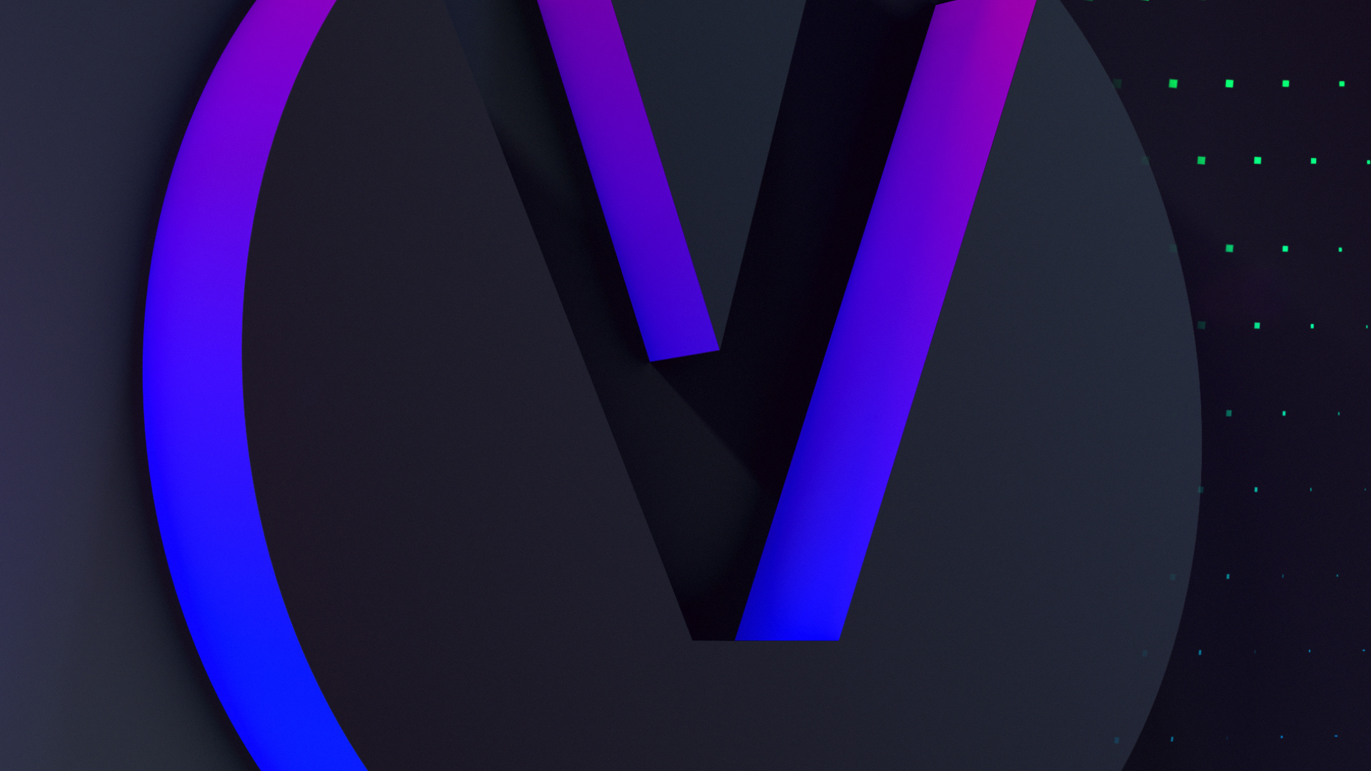
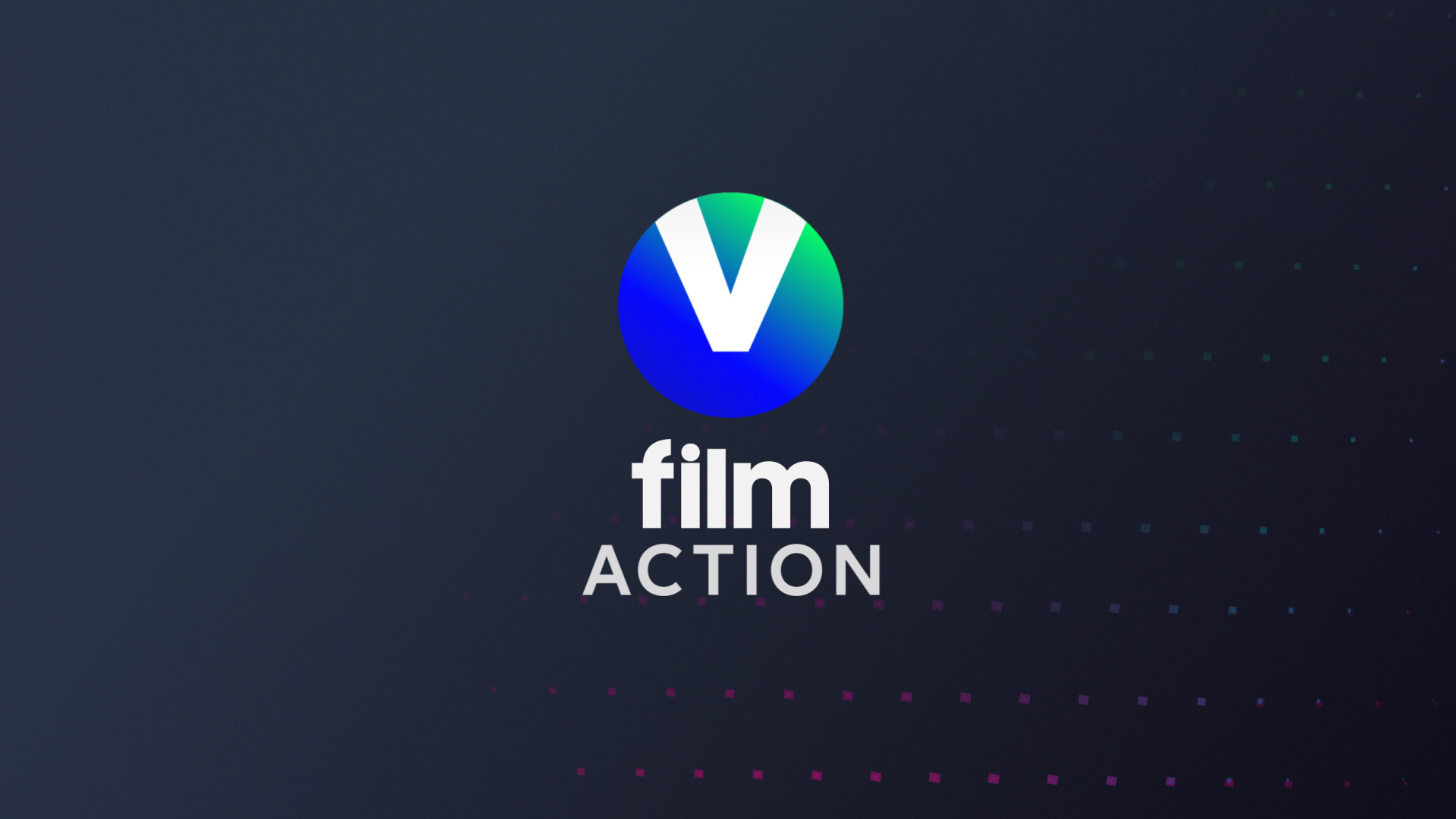
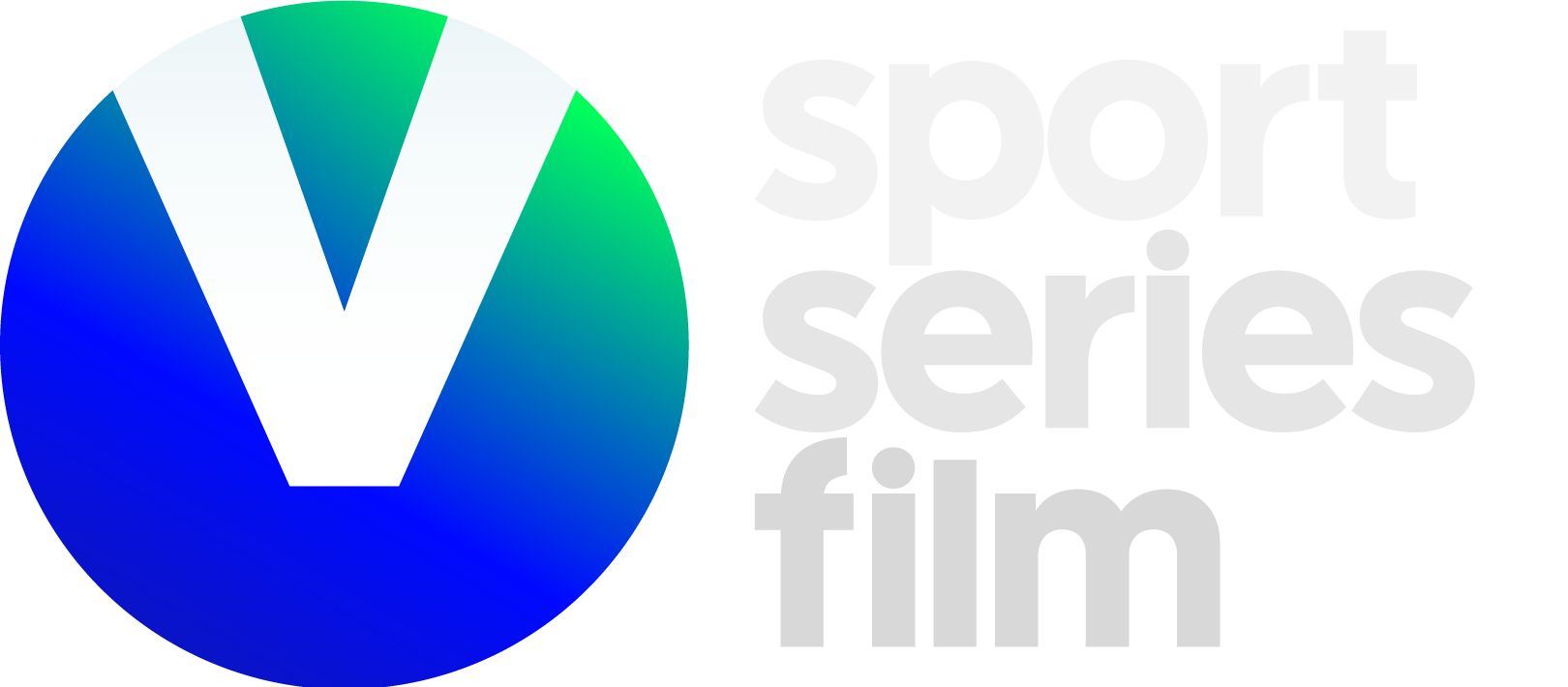
The “V” symbol is at the heart of the sport, series and film brands, keeping our imprint as we move forward.
We distill the singular iconic mark connecting with old and new audiences while keeping the collective meaning engraved on the brand.
A junction of geometry, depth and contrast. The outcome, an impactful, versatile and distinctive visual language. The unified, connected, bold identity captures the broad range of expressions and emotions of our content, creating an engaging experience to enjoy our best-known brands.
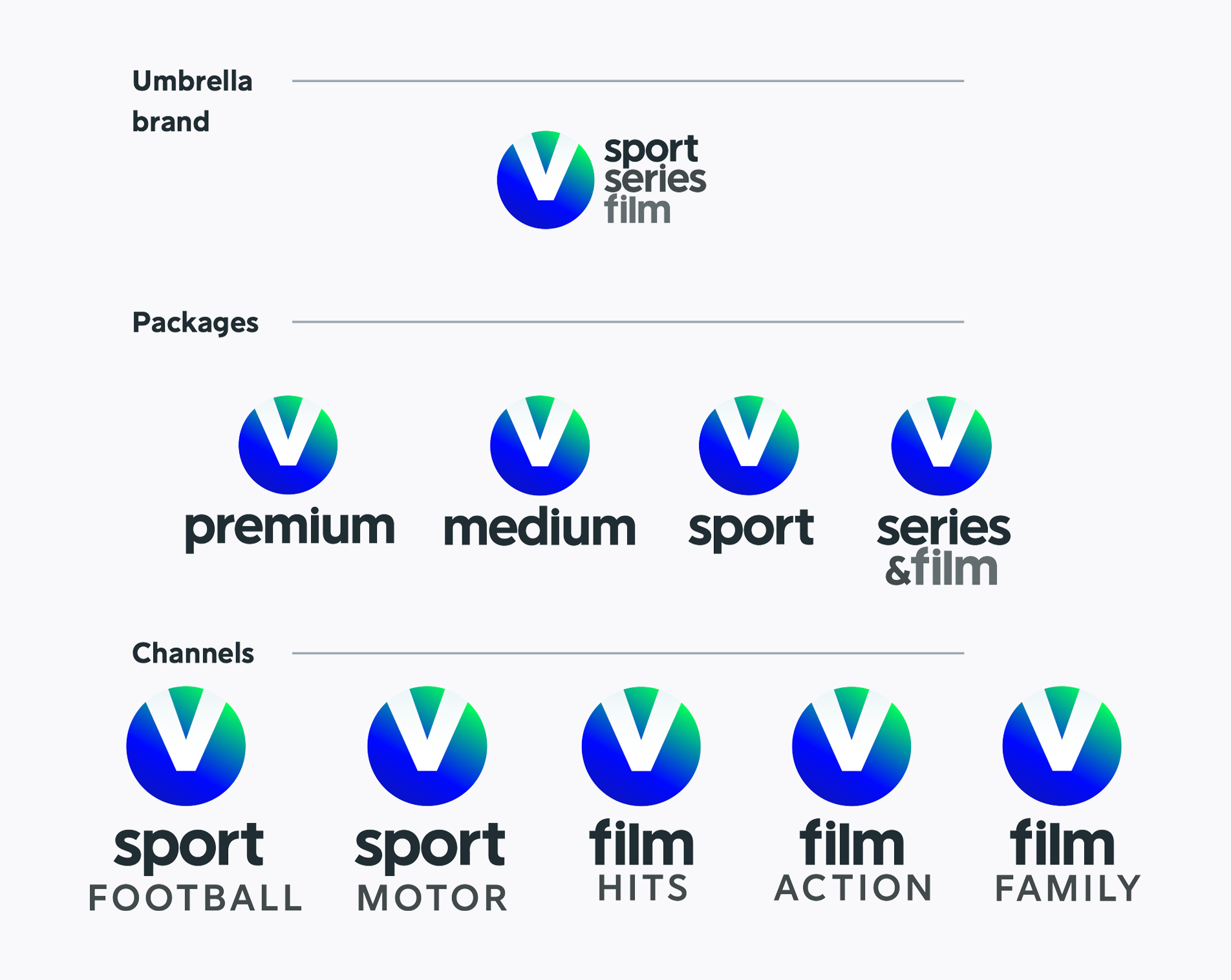
First was the logo redesign - keeping the symbol and defining a new logotype - that could work well across a wide range of sub-brands. Clear definition of the brand family and hierarchies for masterbrand, packages and Tv channels that spread across for countries and a wide offer.

VISUAL IDENTITY
Using depth we introduce a new dimension into the visual elements. Vibrant contrasting colours are key to allow the bold and elegant shapes to capture the range of expressions throughout the brand identity.


A versatile identity. The broad colour palette allows us to express the drama and seriousness of our film and series channels.


MOTION LANGUAGE
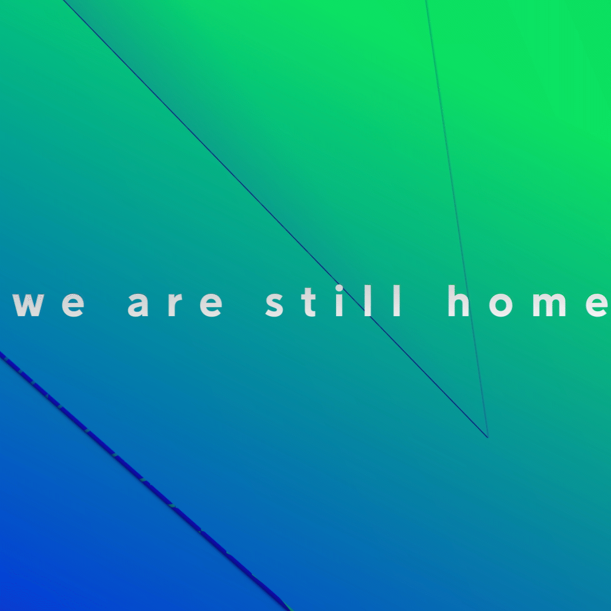
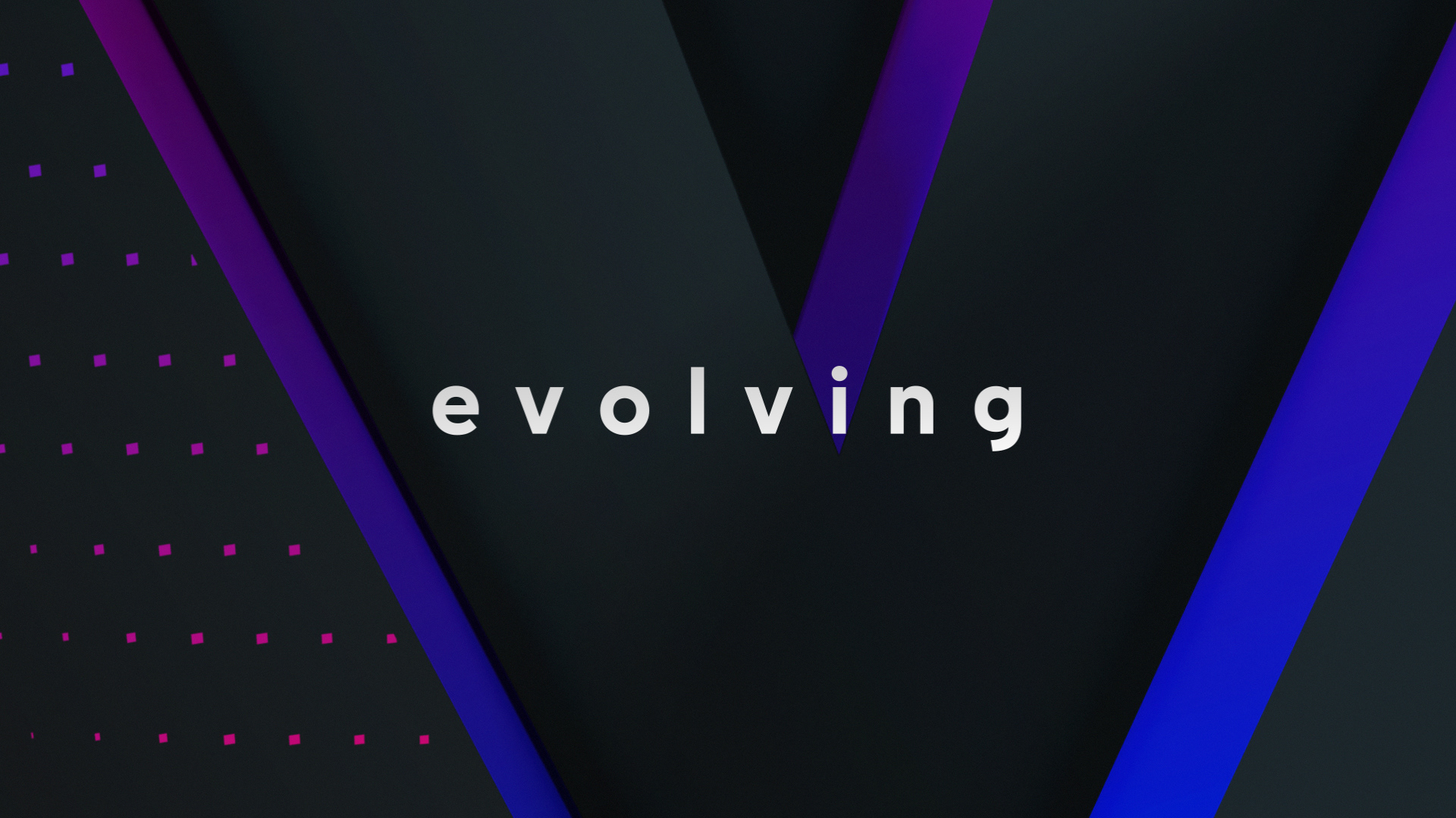
The typography plays a key role, trough a dynamic and elegant motion complementing the 3D environments and expressing our wide range of content.


PATTERNS
We have unique patterns that react and reflect the motion of consecutive frames throughout the screen for our V series & film channels. It is applied across idents and backgrounds seamlessly.
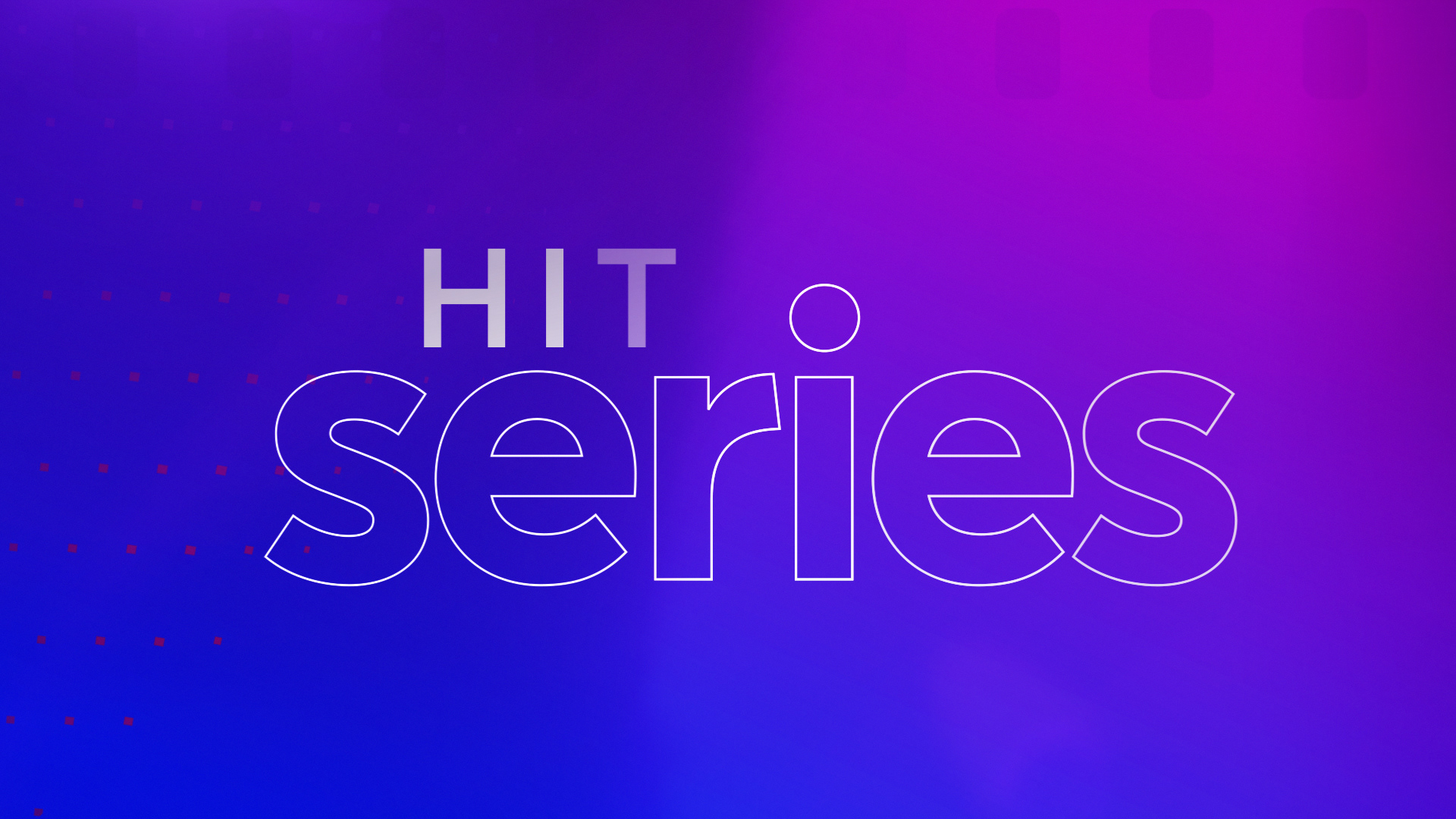
LOGO DEVELOPMENT
One umbrella brand. A flexible and versatile layout that embraces all the brand family. A clear and unified voice throughout markets and target segments.
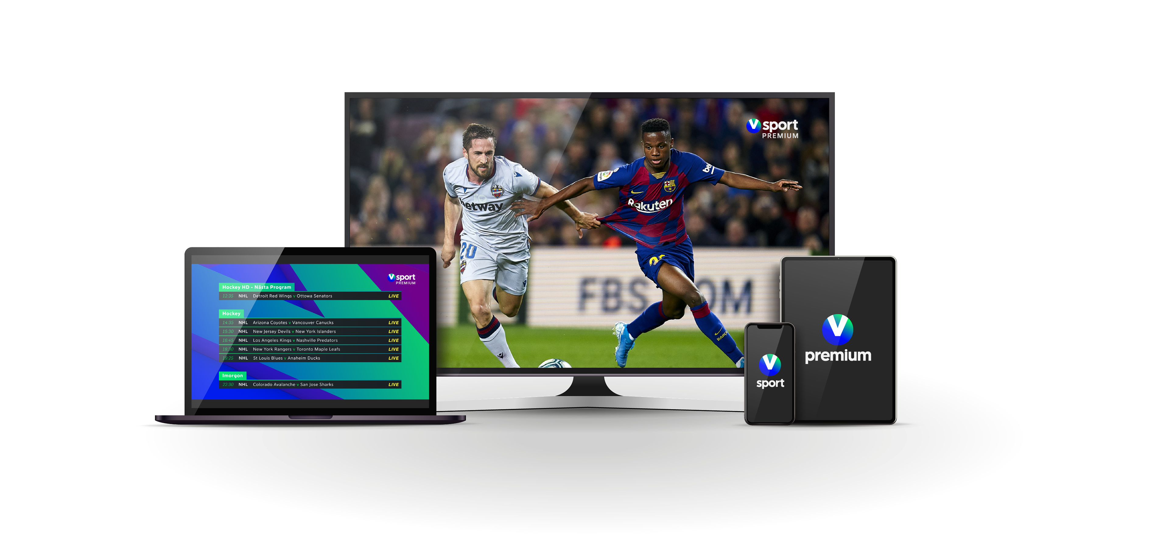
DIGITAL
The visual identity is applied in every communication with our audience. ATL / BTL campaigns.


COLOUR PALETTE

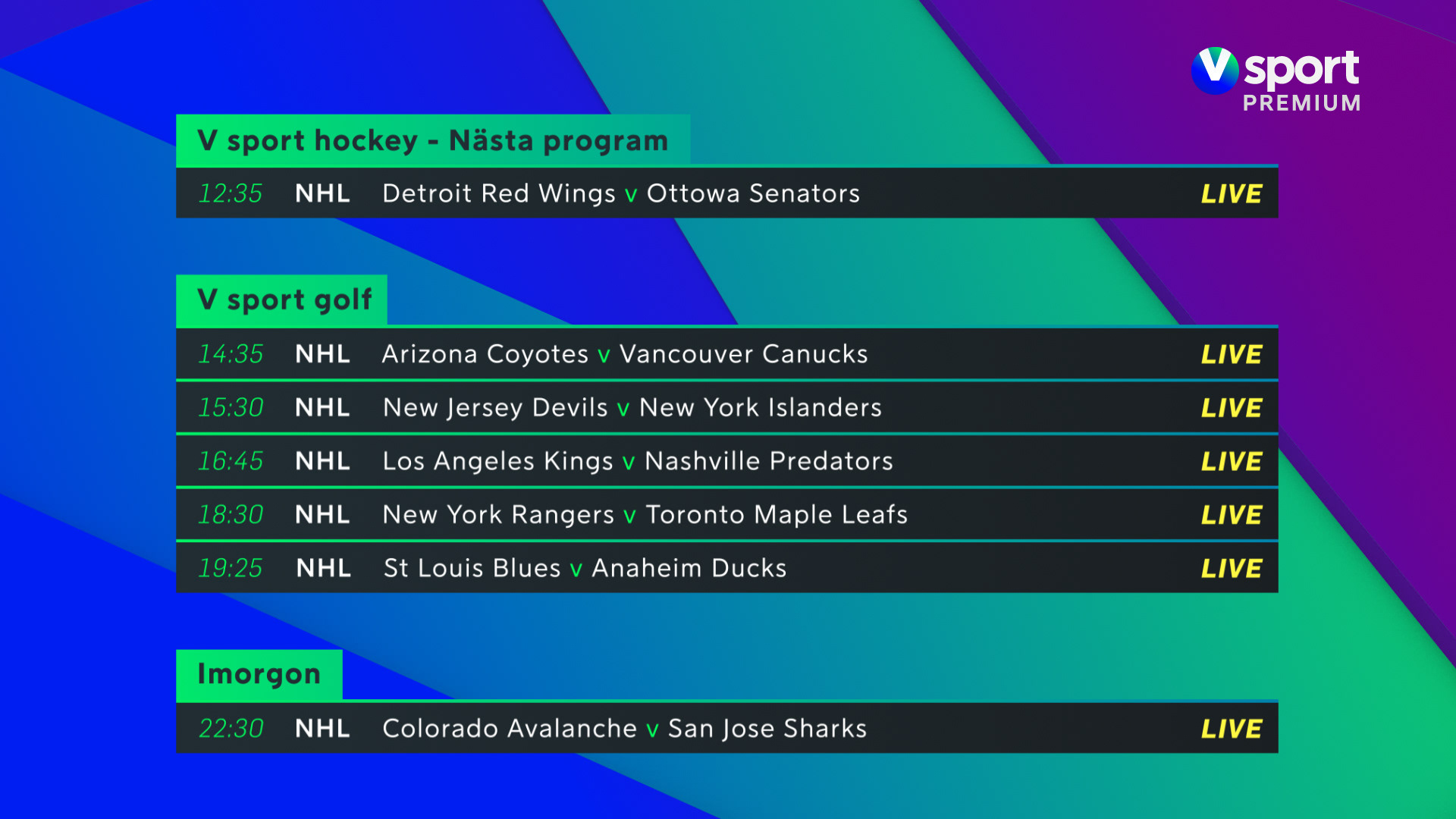
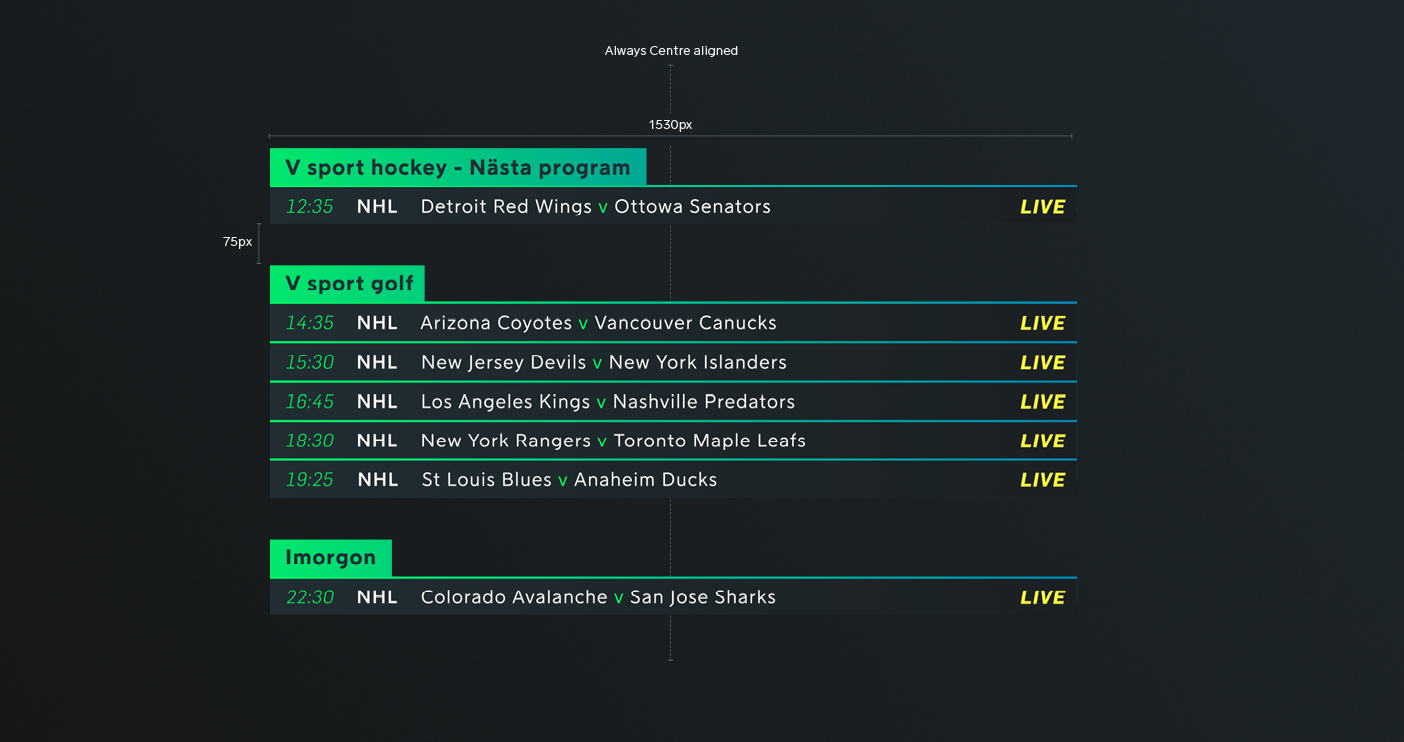
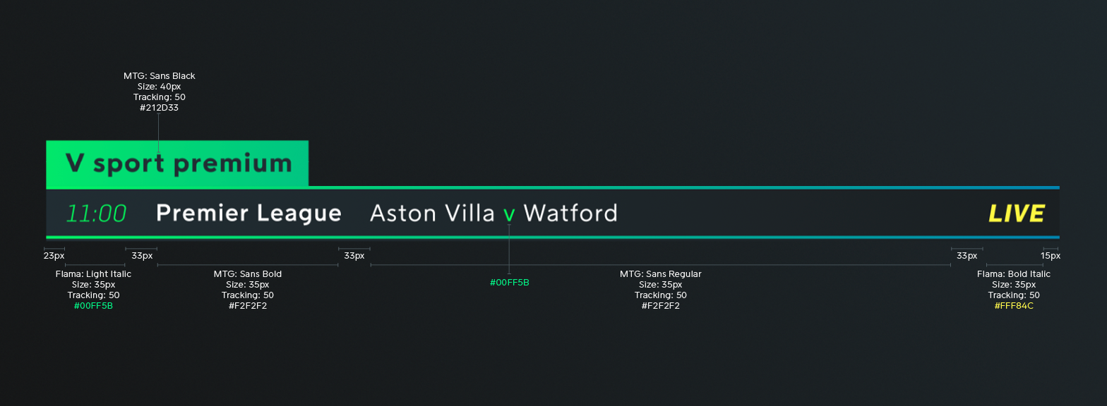
MENUS & LIVE GRAPHICS
And identity that allows menus and live graphics to be developed ensuring consistency throughout all the channels and countries.