
The challenge
A global brand identity for Viaplay, the European SVoD streaming service. The brand was to launch across Poland, the Netherlands, Baltic countries, the USA, Iceland, and the UK. The vision: to become the International streaming challenger. To achieve this ambitious aim, a refreshed identity was needed that could challenge the industry. A new tonality and positioning that could break through the clutter in the already saturated industry and connect with people differently.
THE BRAND strategy
The big idea: We know you. We get you. Everybody focuses on content… so we instead focus on the people. We challenge the way things are done by starting with the most important: our customers. We relate using truths—about consumption habits—that can be universal or local as long as they’re funny and ring true.
These recognizable insights, draw a smile and create an instant connection with viewers—talking to them as a friend sitting next to them on the couch would. The message is simple: Viaplay knows you. Viaplay gets you.
We bring to life Viaplay brand's ambitions through our concept, allowing the design assets to express the tonality and positioning and enhance how the brand engages with users. Striking a unique tone of voice by conveying unique insights.
BRAND EVOLUTION
The strategy gives freedom to create new communications, on-brand, with the same distinctive assets and tonality, while focusing on real and local people. This allows to address insights relevant to people and start new conversations about core topics in each of the markets. A truly global-local brand.
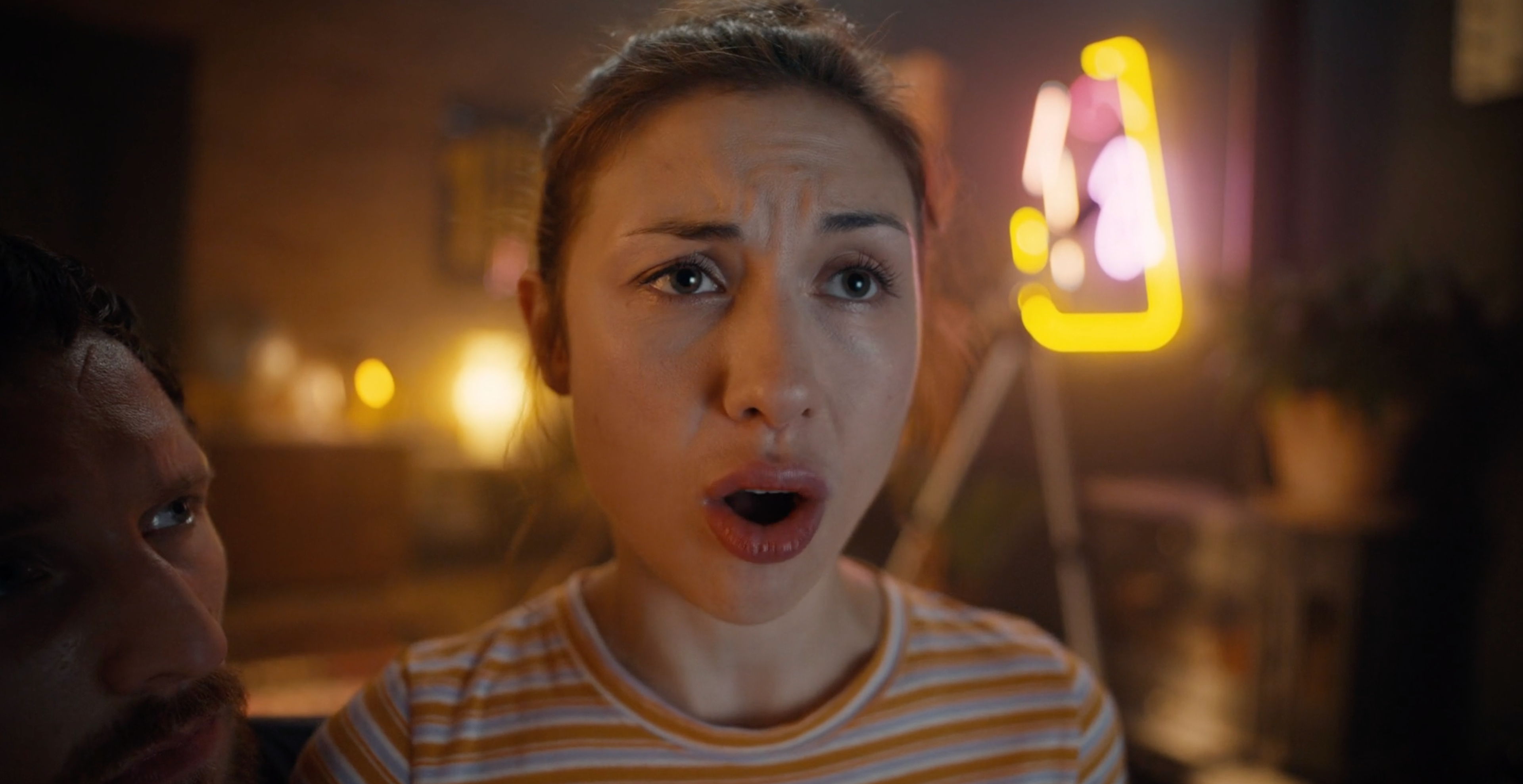
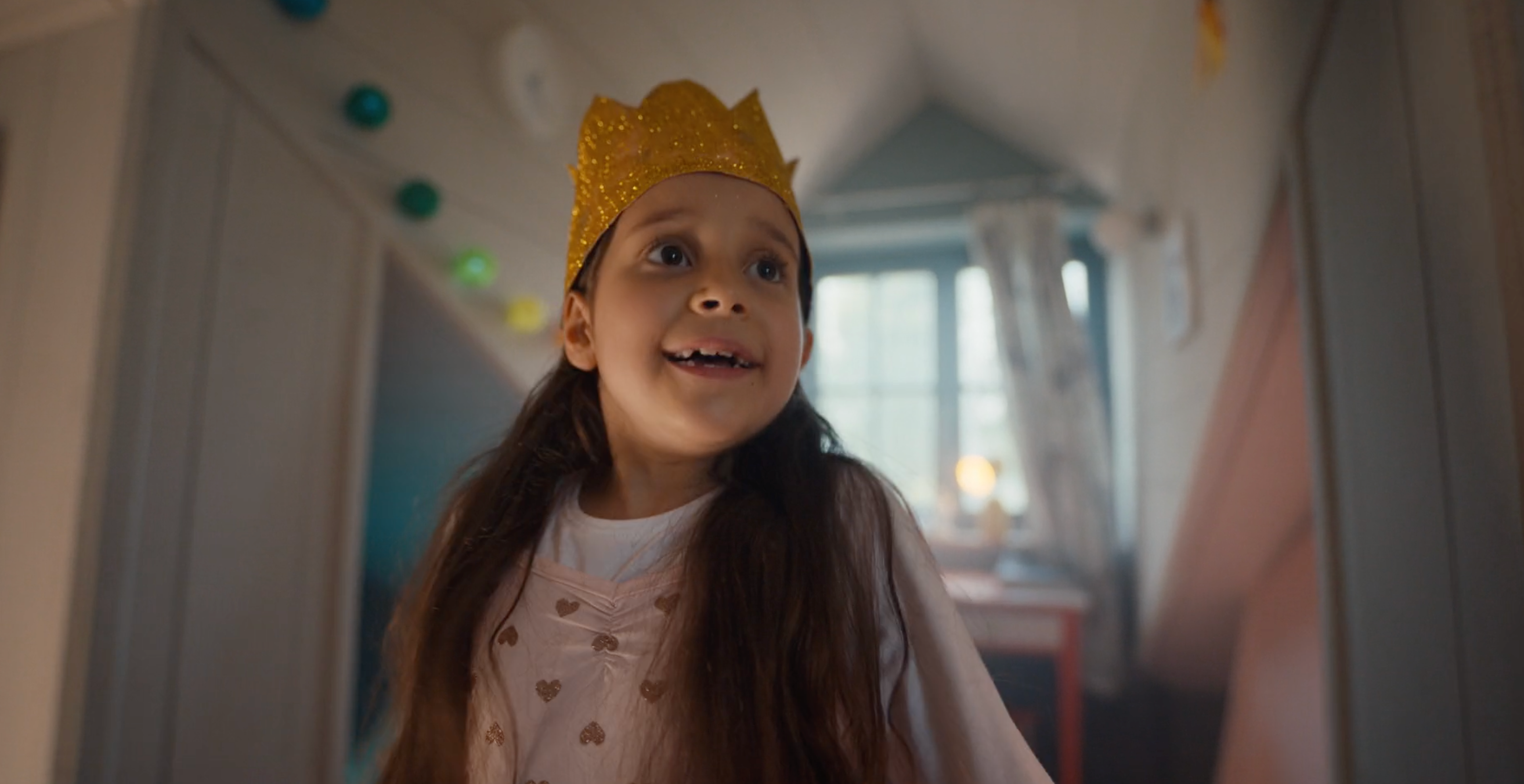

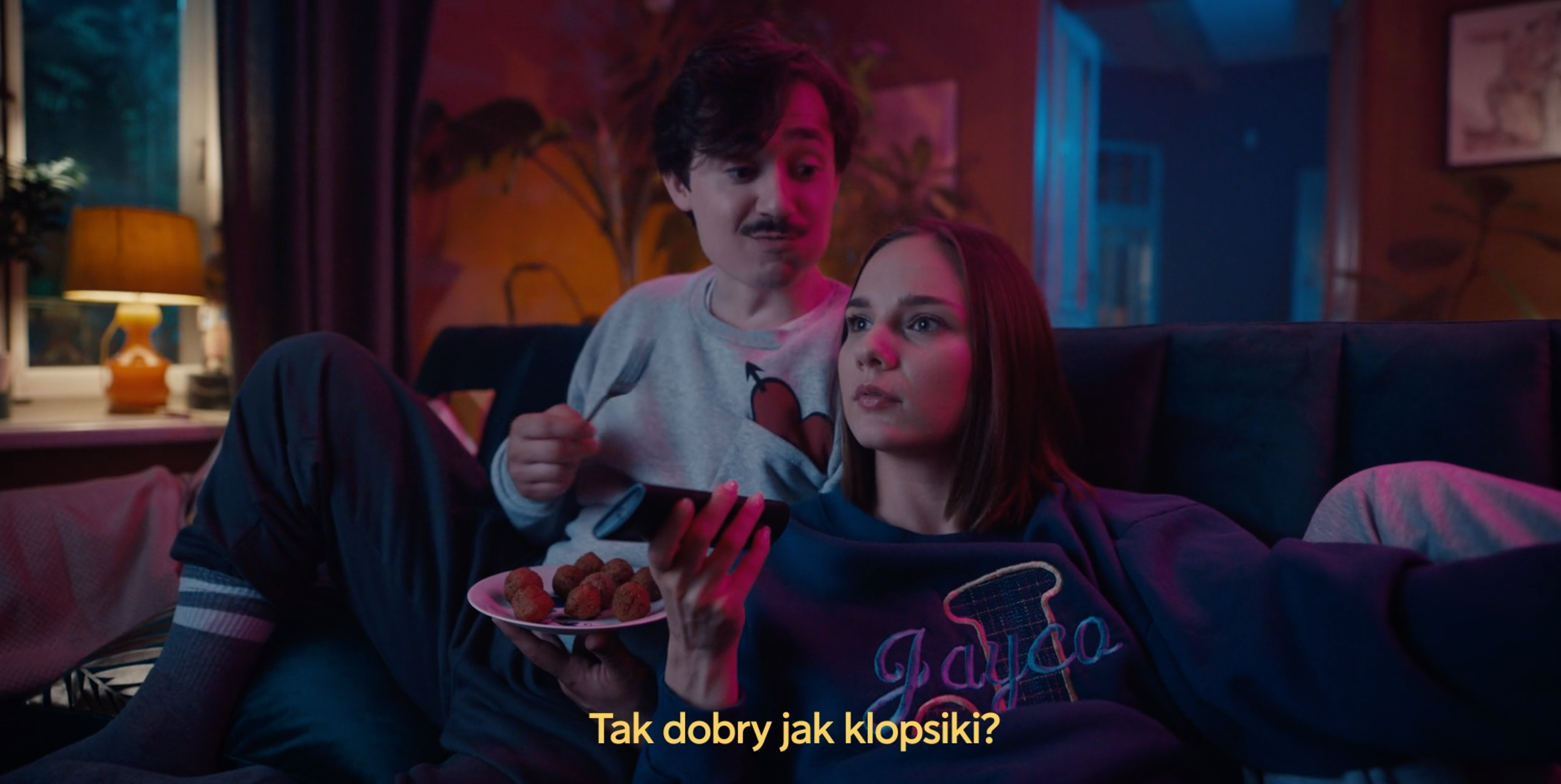
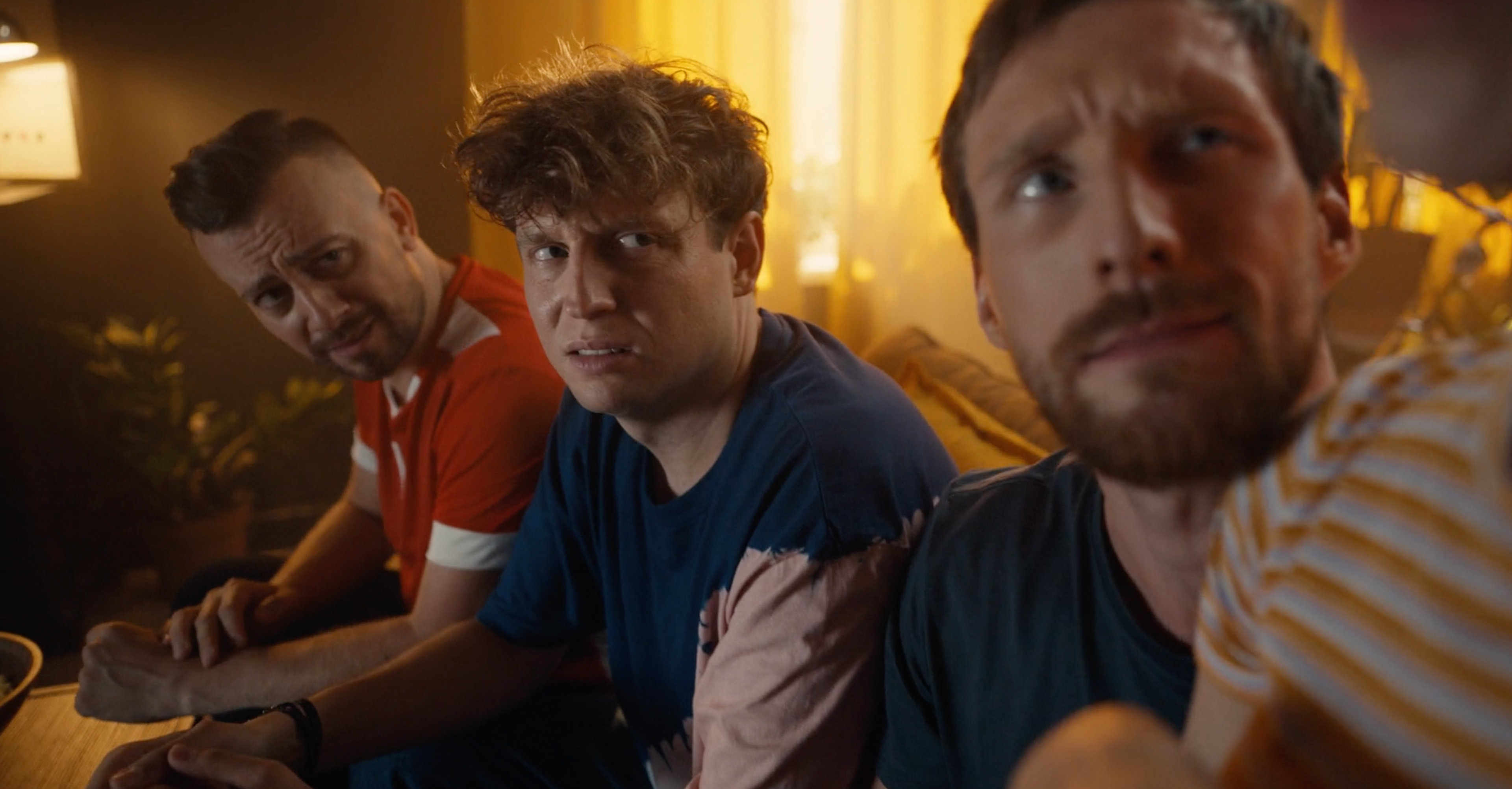
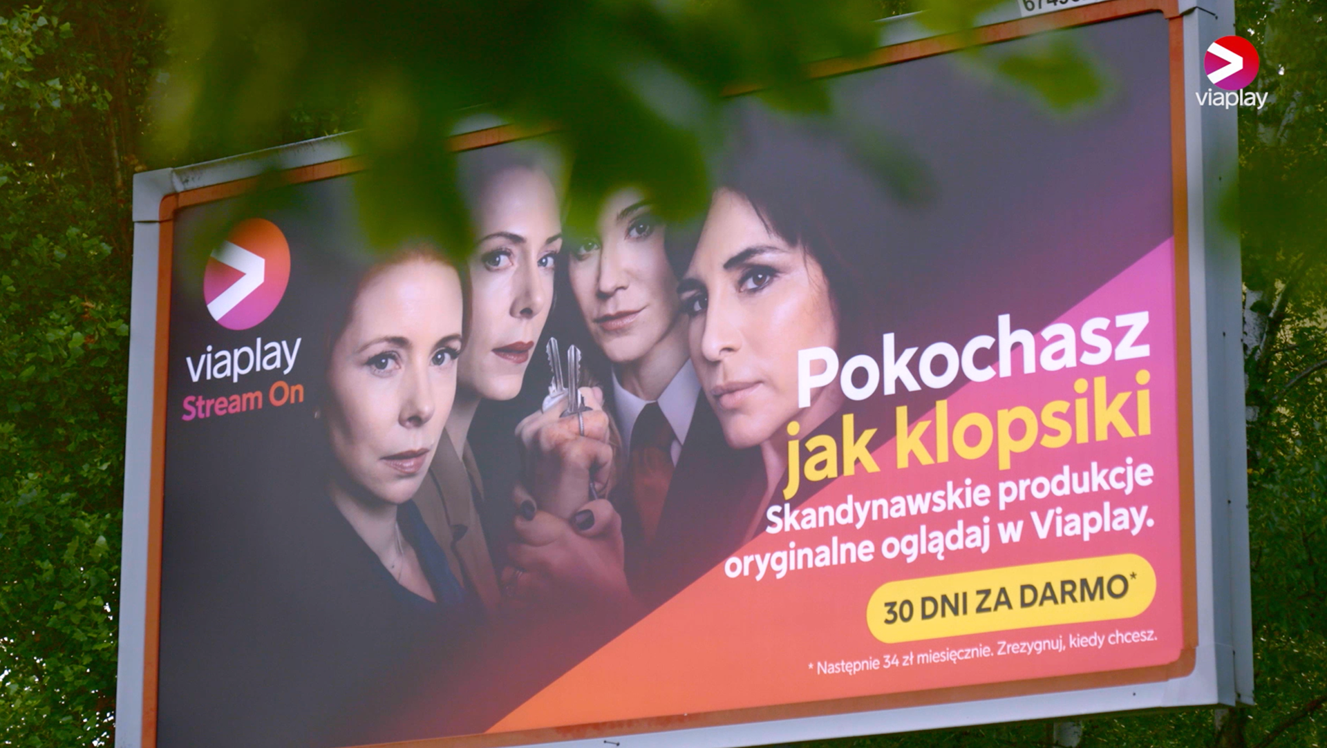
You gonna love them like meatballs.
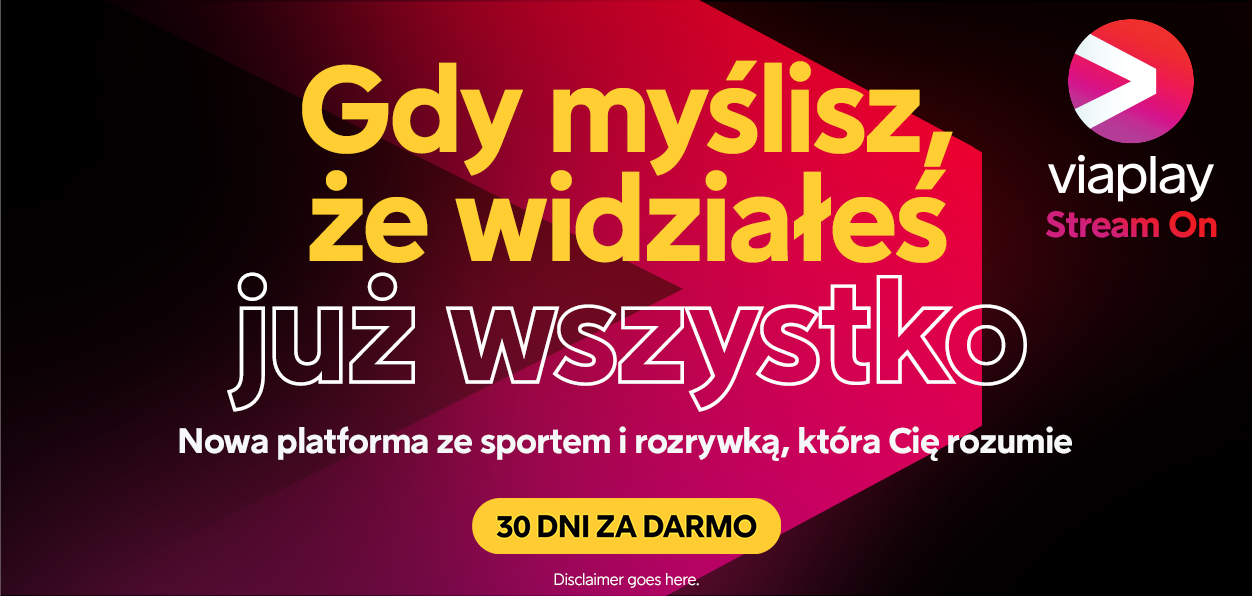
When you think you have seen everything… New platform with sport and entertainment that gets you.
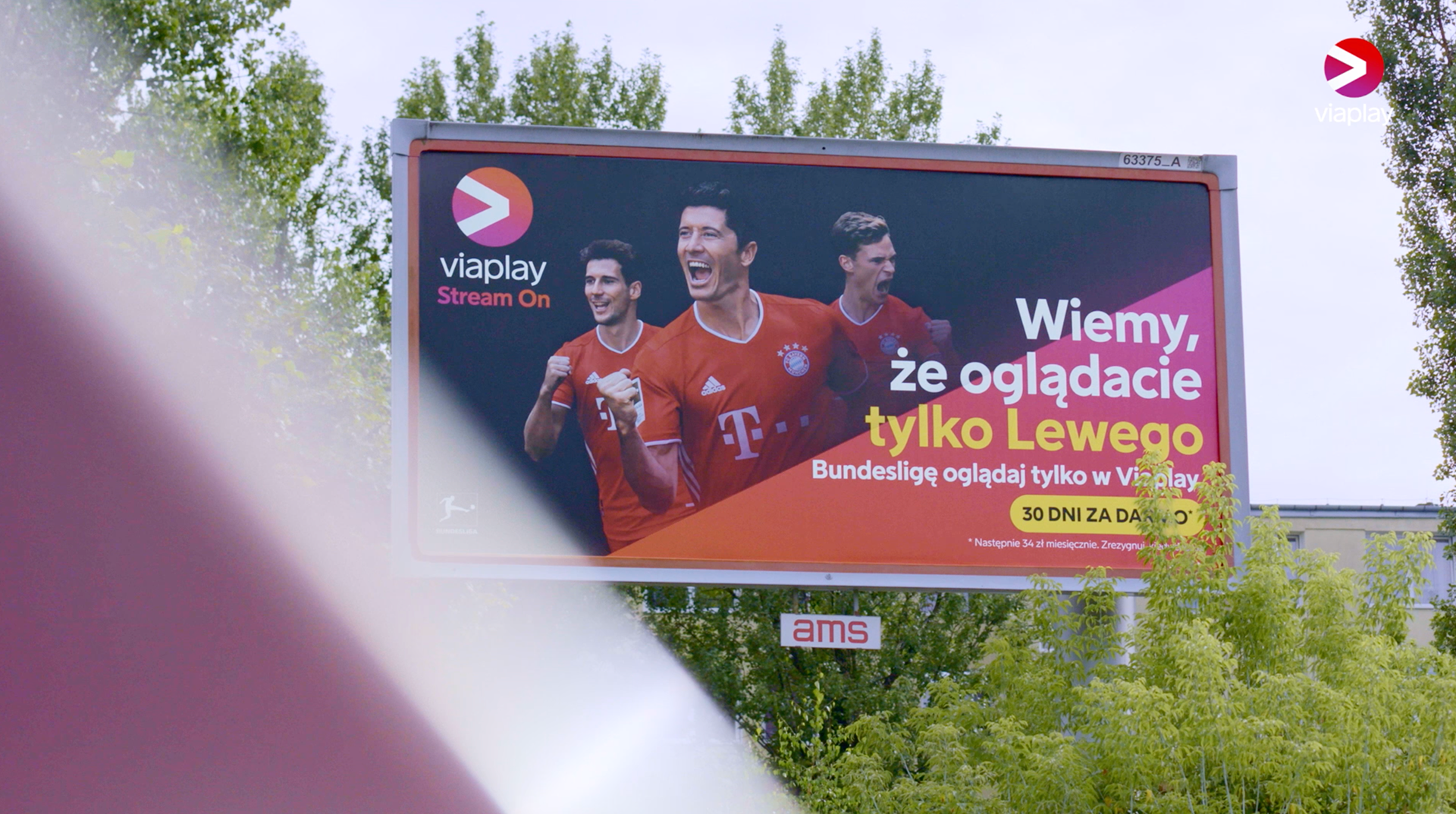
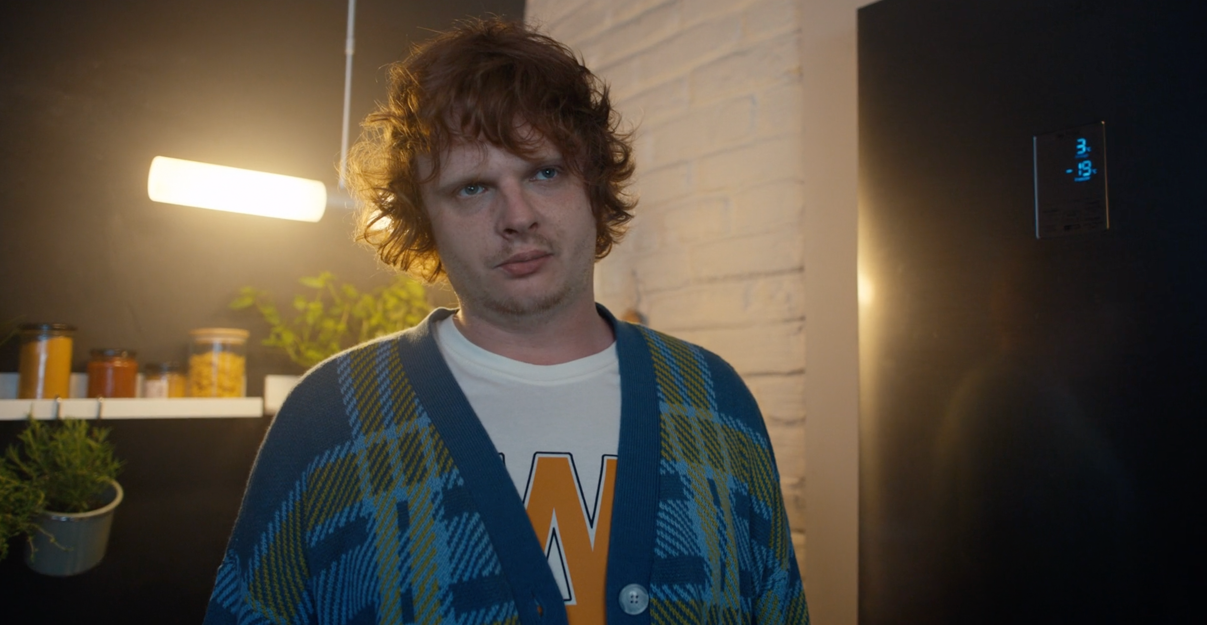
We know you watch only Lewy.
ART DIRECTION & VISUAL TONALITY
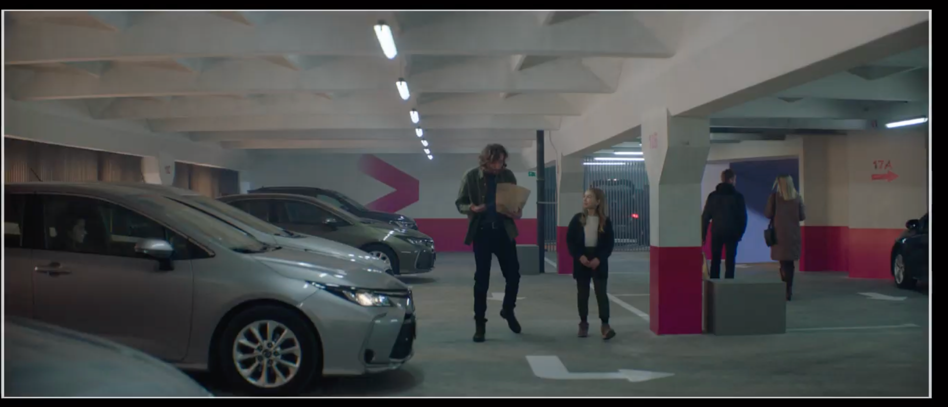
To recognize the brand before anything and create a mood. A strong, vibrant colour palette based on our brand colours and extracted from our original content. A stylized light in realistic-looking locations, wide-angle lenses and clever camera work. Contemporary and tangible spaces that feel natural with a bit of stylized colour, that feels ‘lived in’ and ‘used’—Viaplay world is far from a theatrical set. Warm yellows and ambers are contrasted by touches of magenta and purple-blue. These are supported by neutral tones, greys and natural elements.
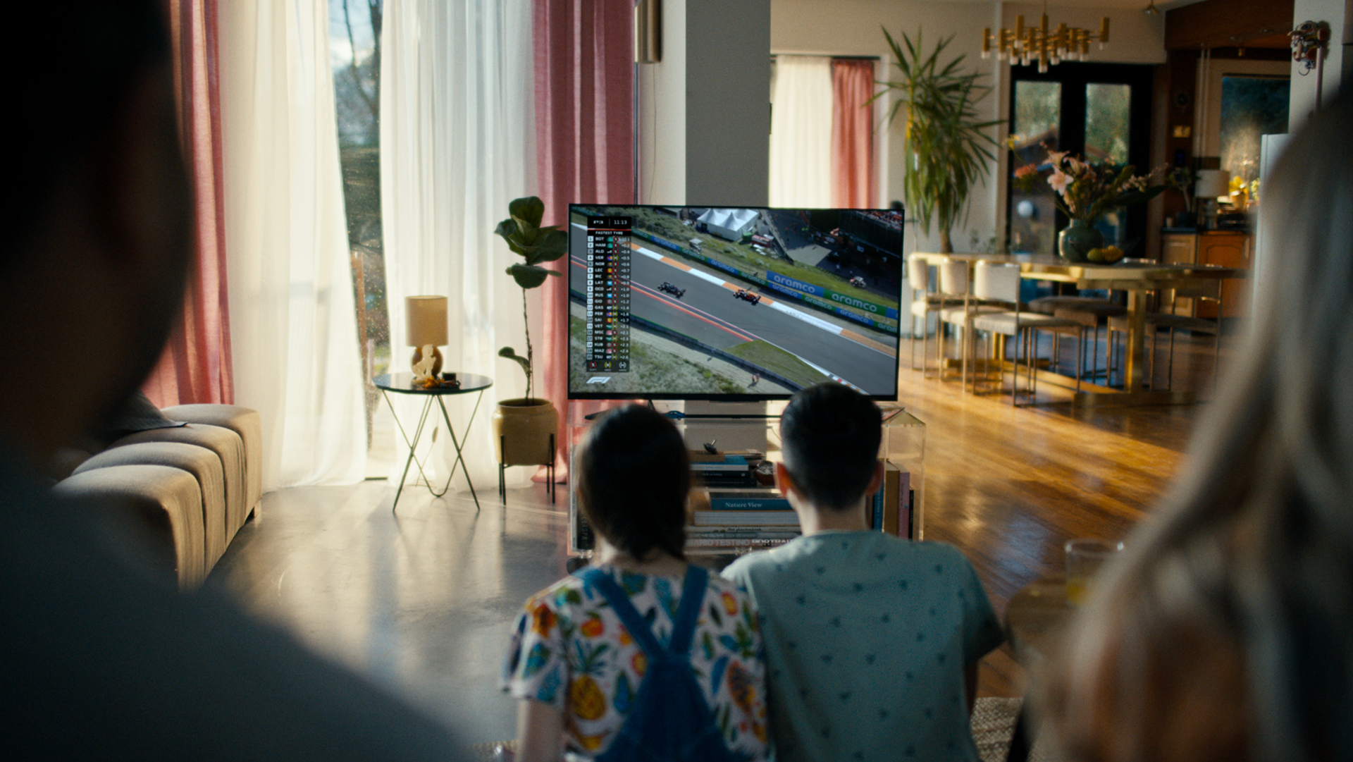


BRAND CAMPAIGNS ACROSS MARKETS — THE NETHERLANDS
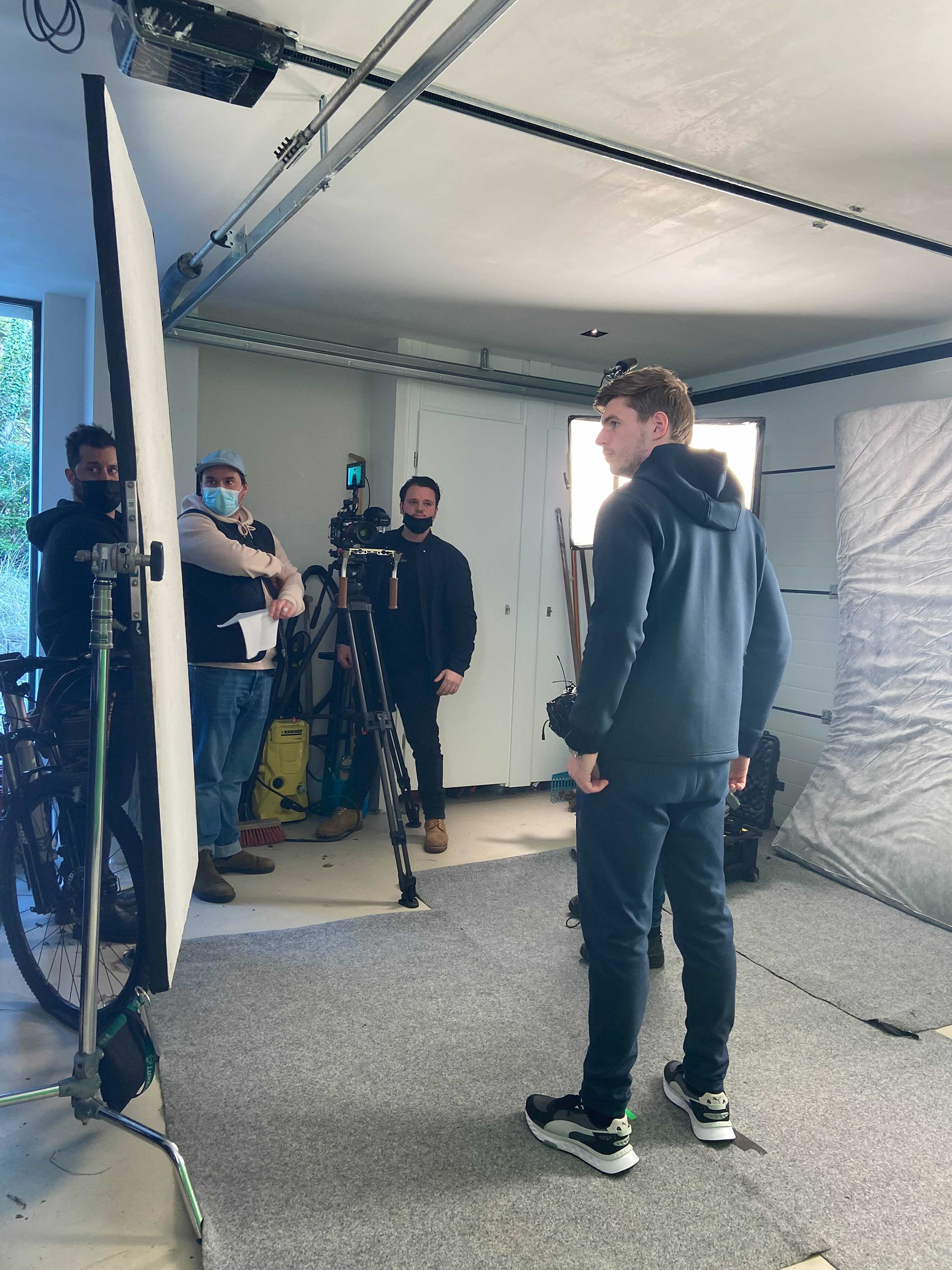
In the Netherlands, we partnered with a new brand ambassador, Max Verstappen. With him in place, it was all about making the story true to him and therefore true and real to his fans. A nearly real situation of him rushing from the Zandvoort circuit to his home was enough to complement a strong tonality spread out through other media. Design elements support a strong brand visibility embracing all types of communications.
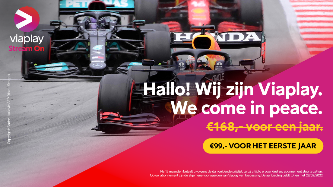
Hello! We are Viaplay. We come in peace.
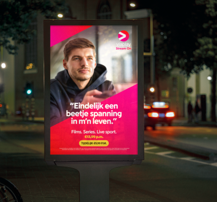
"Finally some thrill in my life"

Visit the dark Scandinavia but cheap.

In series politics is still fun.
looking for some extra thrill?
BRAND CAMPAIGNS ACROSS MARKETS — THE BALTICS
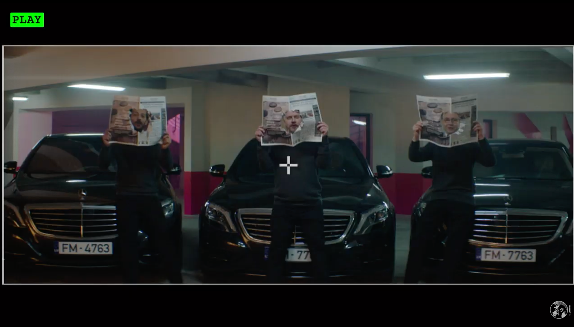
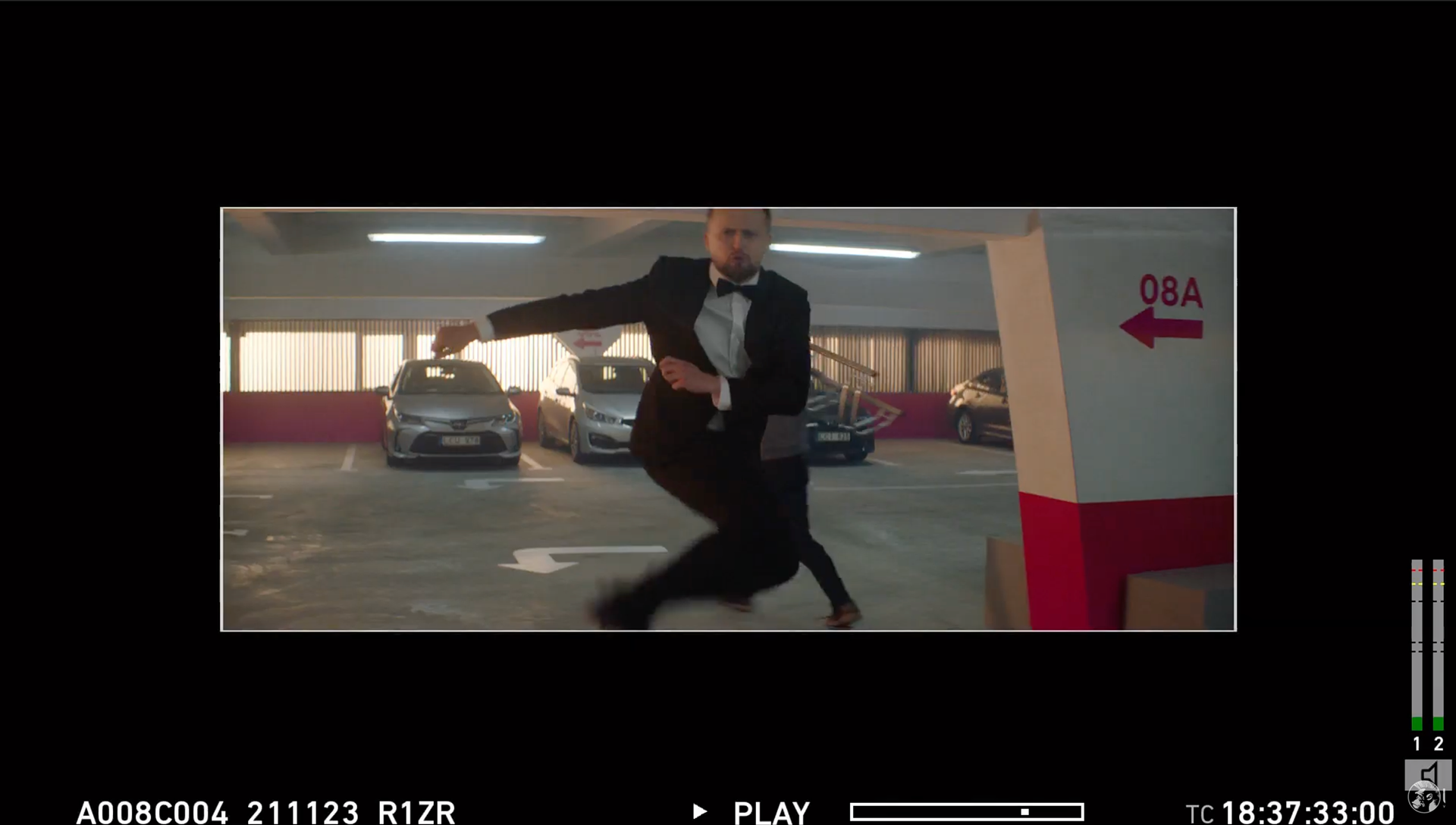
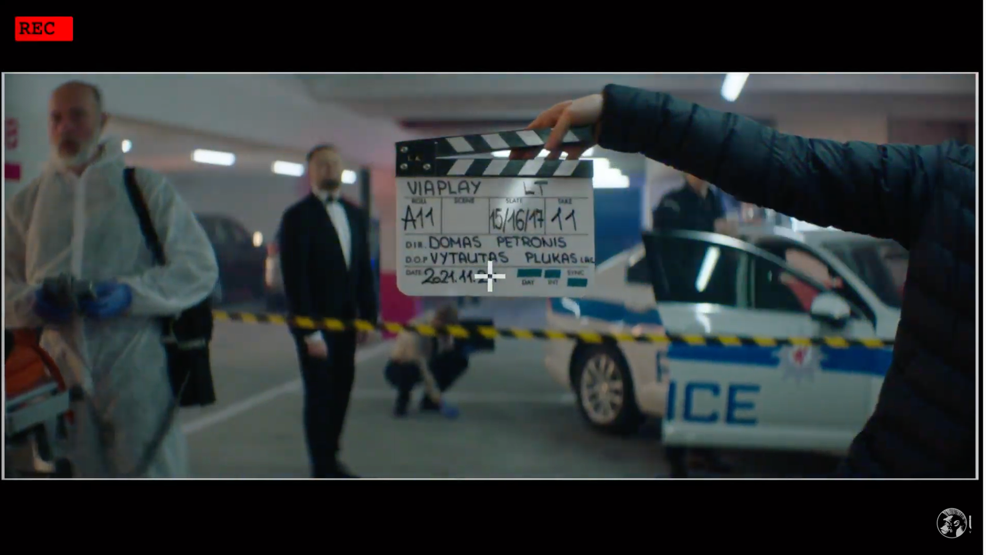
Each country has different needs, a different relationship with streaming content and different interests. For Latvia, Lithuania, and Estonia, the brand message needed to be adapted. But we still kept the humour through three well-known comedian hosts, that add a very cheeky and witty attitude, bringing our tonality to the forefront even when having a more sales-driven message.
CREDITS: Agency Poland: Freundschaft / Agency Netherlands: dentsuACHTUNG! / Agency Baltics: Not Perfect Vilnius / Agency TOV: We All Need Words / Sonic Branding: MassiveMusic / Font Design: Göran Söderström / Viaplay team - Senior Motion Designers: Rex Abba-Abba, James Fisher, Senior Creative Director Joshua Hertz, VP Brand: Anna Munkenberg / Max's Verstappen team: Herman De Vries / Poland campaign: Kacper Ruciński / Design agency: Celeste Herrera Molina, HEXA.