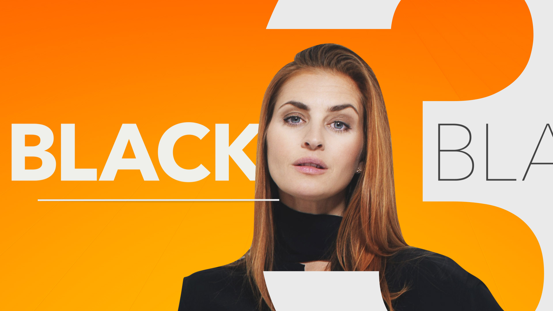
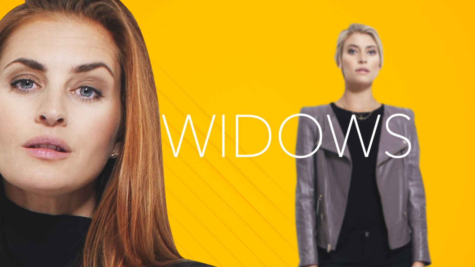
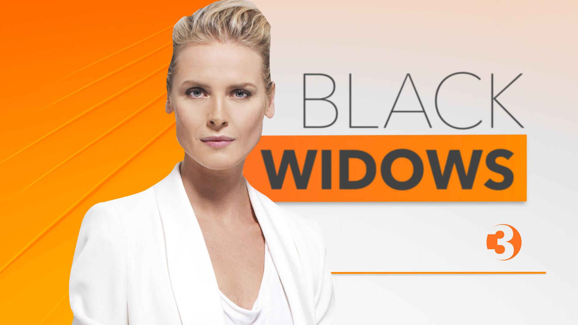
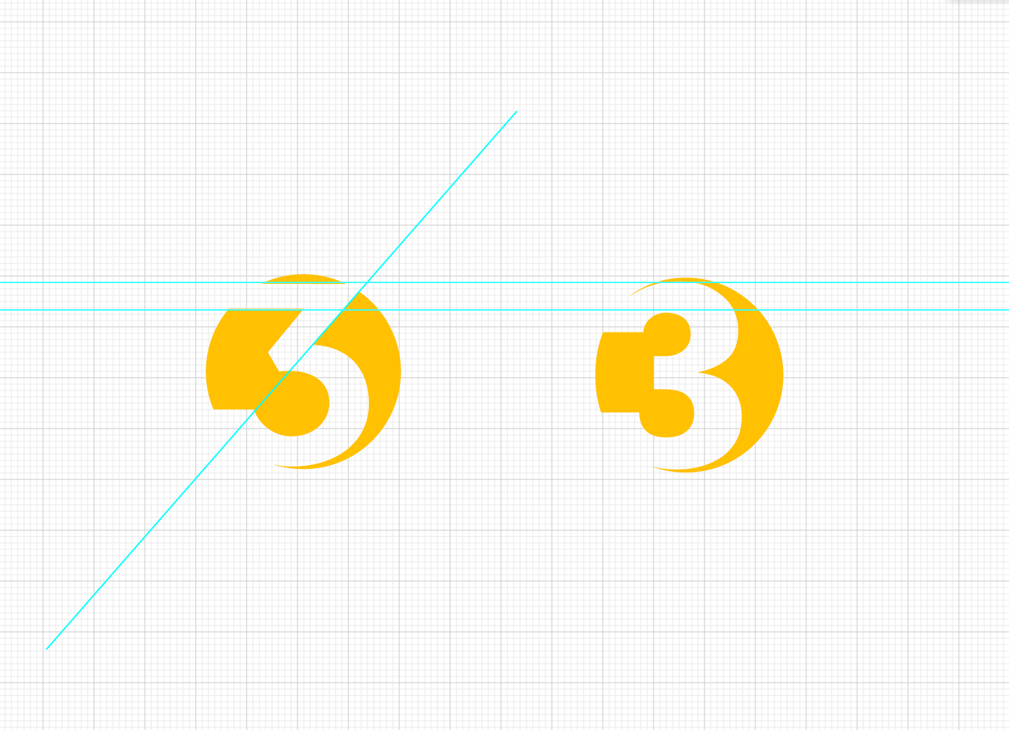
As one of the major commercial channels of Norway, it was needed to re-positioning and re-shape this well-known brand, so the redesign of TV3's logo to a flat, more modern and up-to-date look was mandatory.
CONCEPT STRATEGY
Let's go closer.
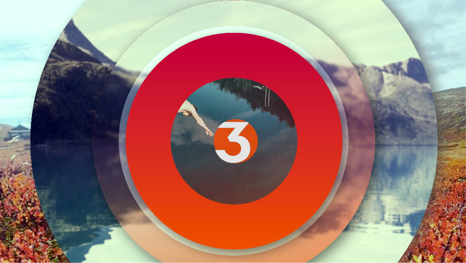
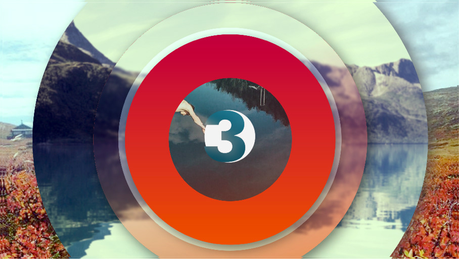
We go closer to Norway's everyday life, trough their stunning landscapes, warm people and rich culture. We zoom into TV3's world of content, moving closer to our beloved characters, creating a warm visual identity that has the Friluftsliv at the center of its strategy.
We capture the Friluftsliv: the connection to nature that is so strong in Norway. We partner with well known Instagram photographers to capture the essence of Norway's life in a unique way.
CONCEPT STRATEGY 2ND ROUTE
We proposed a secondary idea and execution. That focuses exclusively on the talent welcoming you to TV3's world. Bold yet warm, modern yet fun. This is TV3's world.
