CONCEPT STRATEGY
The impact.
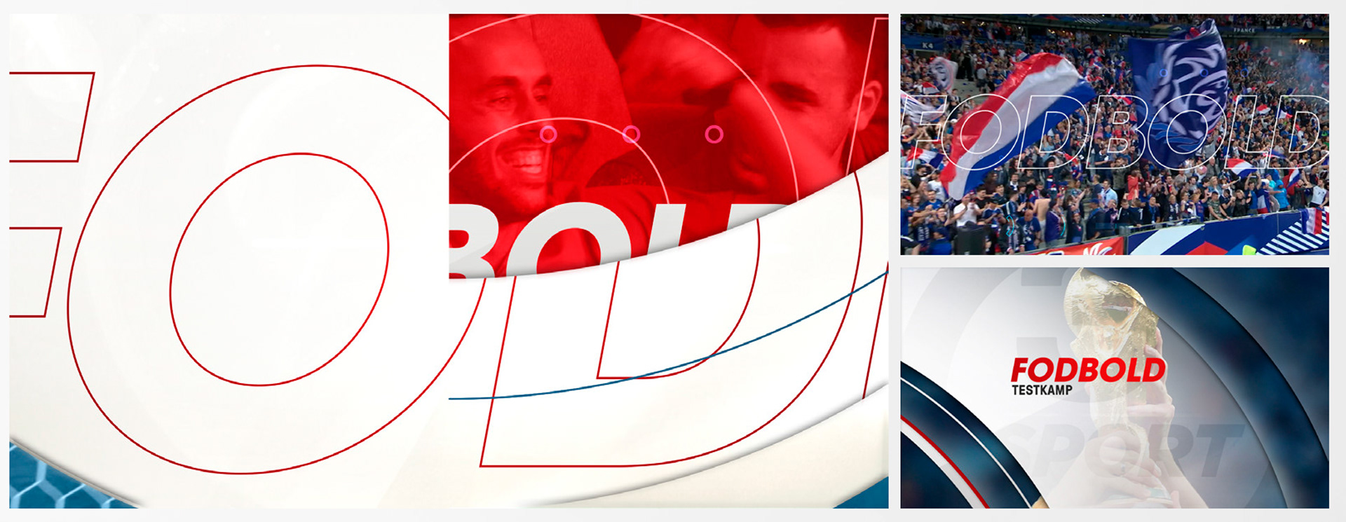
Tv3 sport’s logo is at the core of the new identity as it hits the screens and impacts creating an instantly recognisable ripple effect of great sports content that goes far and wide. The impact acts like a wave that dynamically flows across all on and off-air elements. Shards reveal our popular games and events through glassy textures and a strong colour palette. The ripple of tv3 sport’s new identity will be felt by passionate fans and viewers of all sports!
The new identity is built in layers that represent impact of the information and images. The “shards” are the main element of the package always placed in layers to create depth. These elements combined with the typography and our signature colour palette are injected across all areas of tv3 sport’s content.
NAVIGATION AND ON-SCREEN INFORMATION DESIGN
Typography DEVELOPMENT
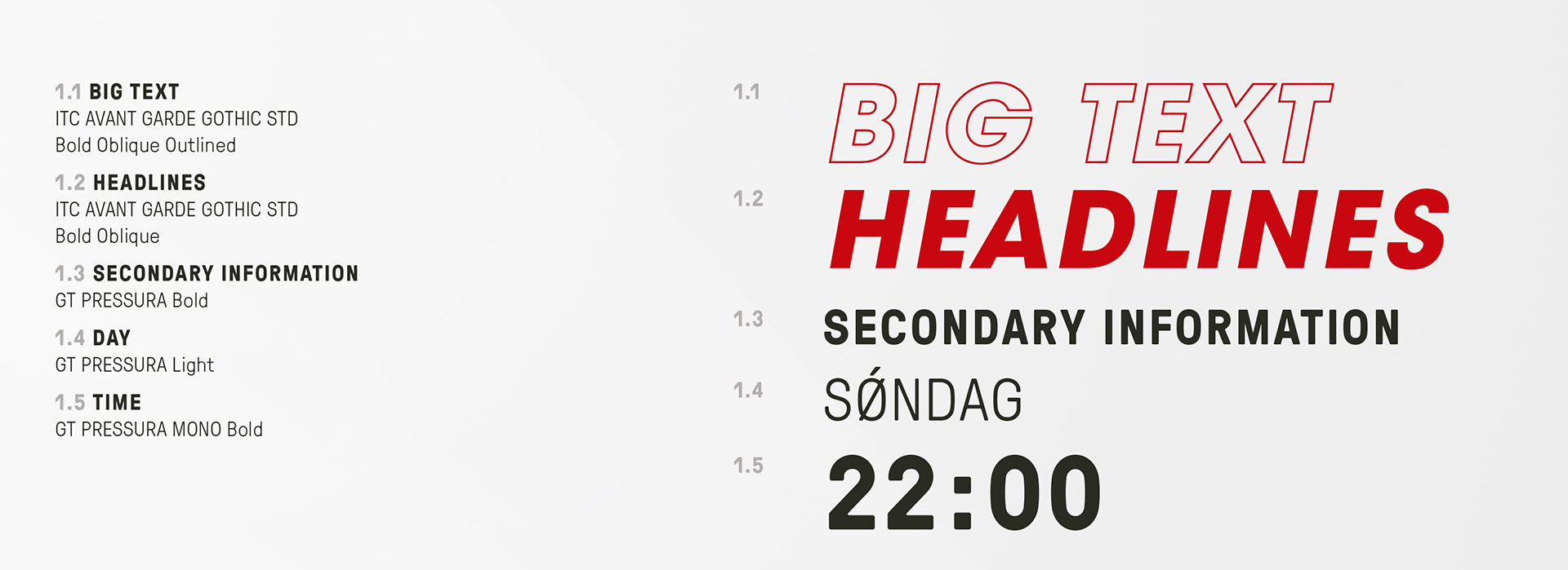
GT Pressura is our secondary typography. Inspired by the impact of the metal type stamped. It uses the visual gesture of ink spreading under pressure as a stylistic device, offering an alternative to more spindly typefaces of the digital age.
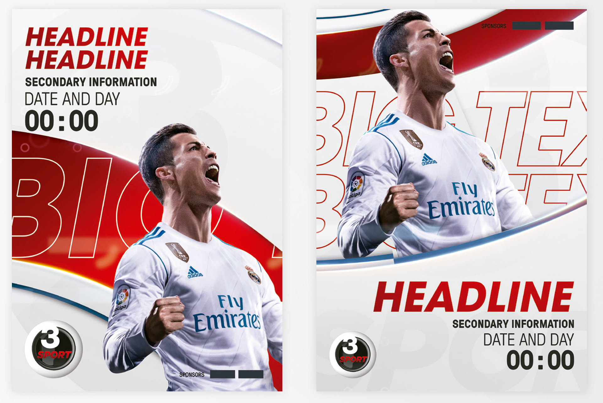
ITC Avant Garde Gothic STD is the go-to choice for headlines and big titles as per its many attributes and the stablished presence that goes with TV3 identity.
On Screen Promotion
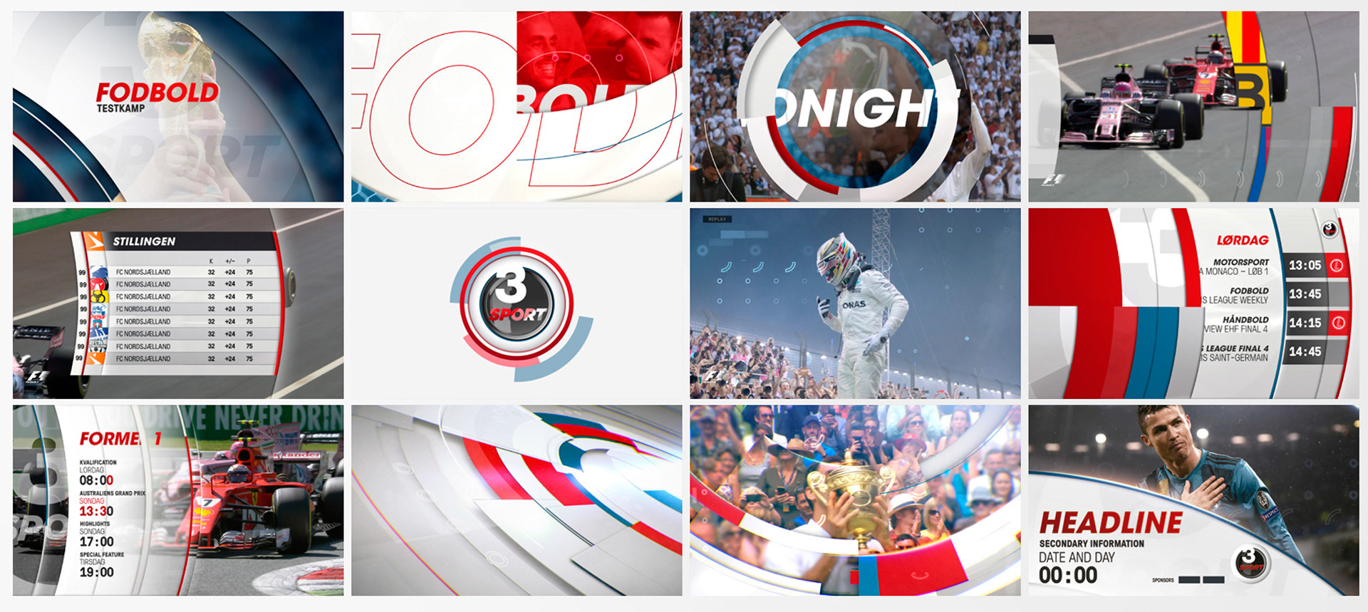
The menus are structured so the content can be represented uniquely and flexibly. It interacts with content In a variety of ways as we introduce the time as breakers, to guide the audience through the different single items and daily programes.
We use the shards as a device that contains and highlights the relevant information. The red line animates to dictate the duration of each page and the live chip animates in to emphasize the message.
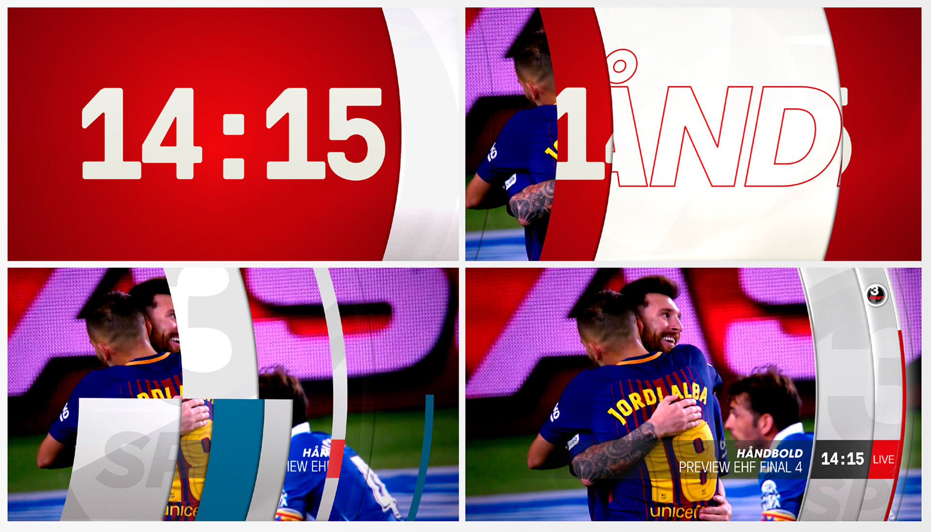
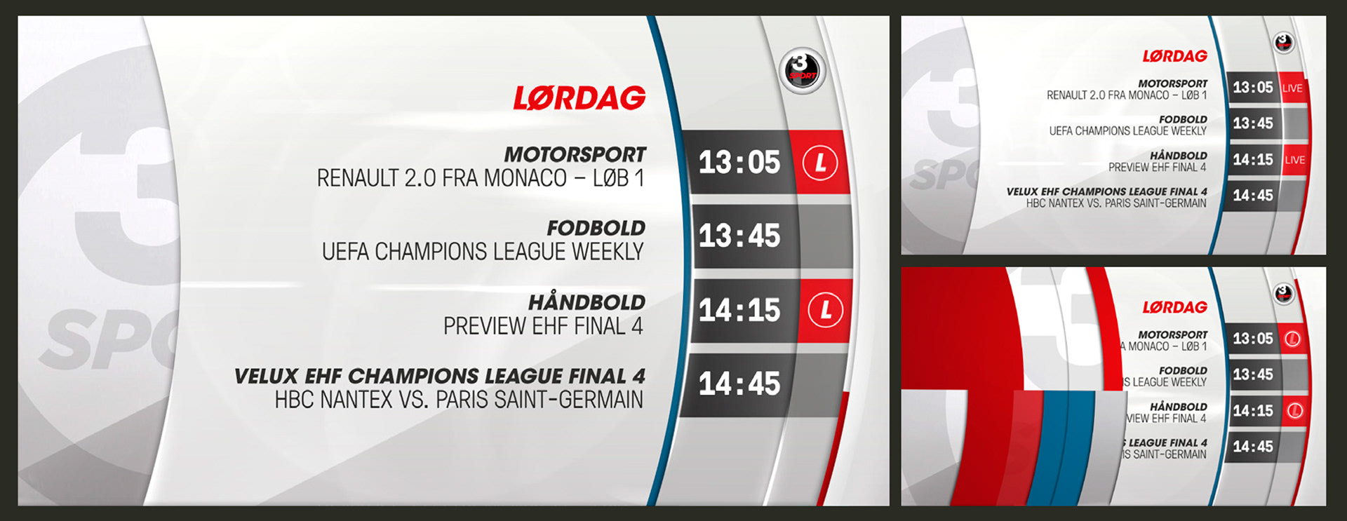
Our imagery and bold typography can be housed within the shards, or placed as cutouts interacting within or on top of the shards. These strong brand elements provide an exciting kit for tv3 sport’s On-Air and Off- air promotional designs, and allow a great degree of flexibility.