Concept strategy
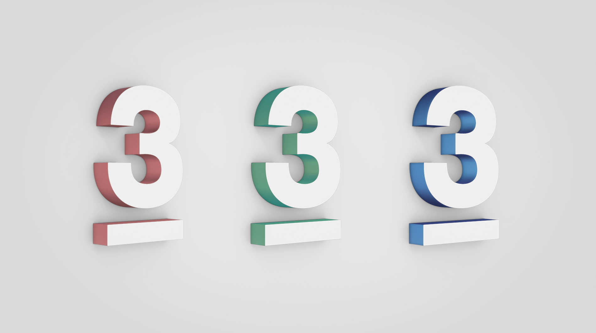
The power of three. We celebrate a unique intersection of content, people, and Sweden's first ever commercial channel. As simple as 1.2.3.
An identity based on the number three that effortlessly reinforce TV3's brand at every touchpoint: idents, OSP, print, digital, social media, sound design, and we do it all with a hint of playfulness.
TV3 Rebrand Montage
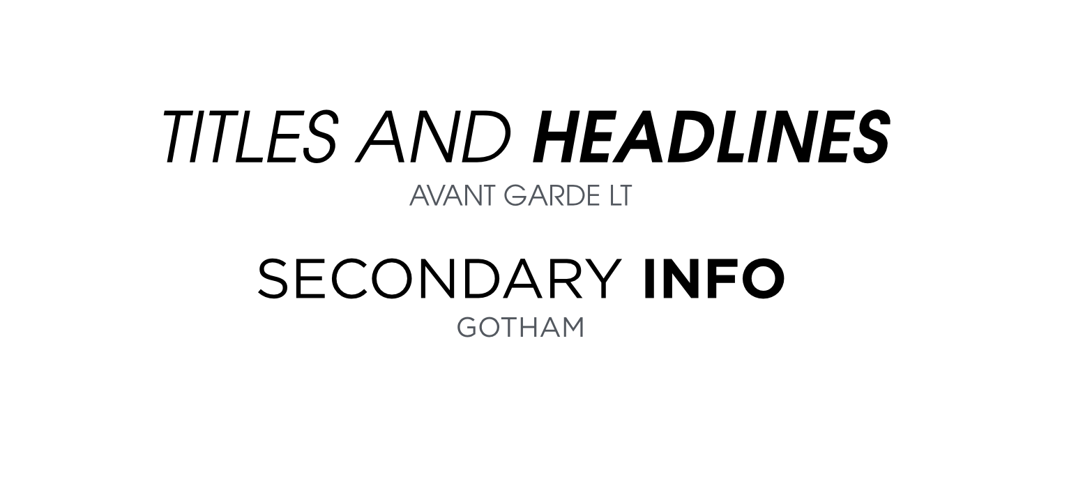
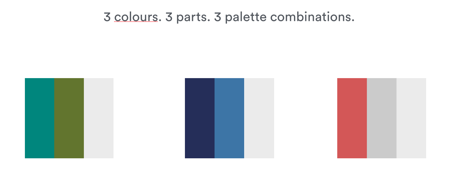
Typography & colour palette
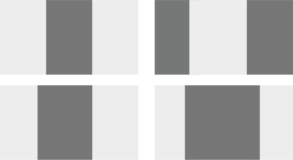
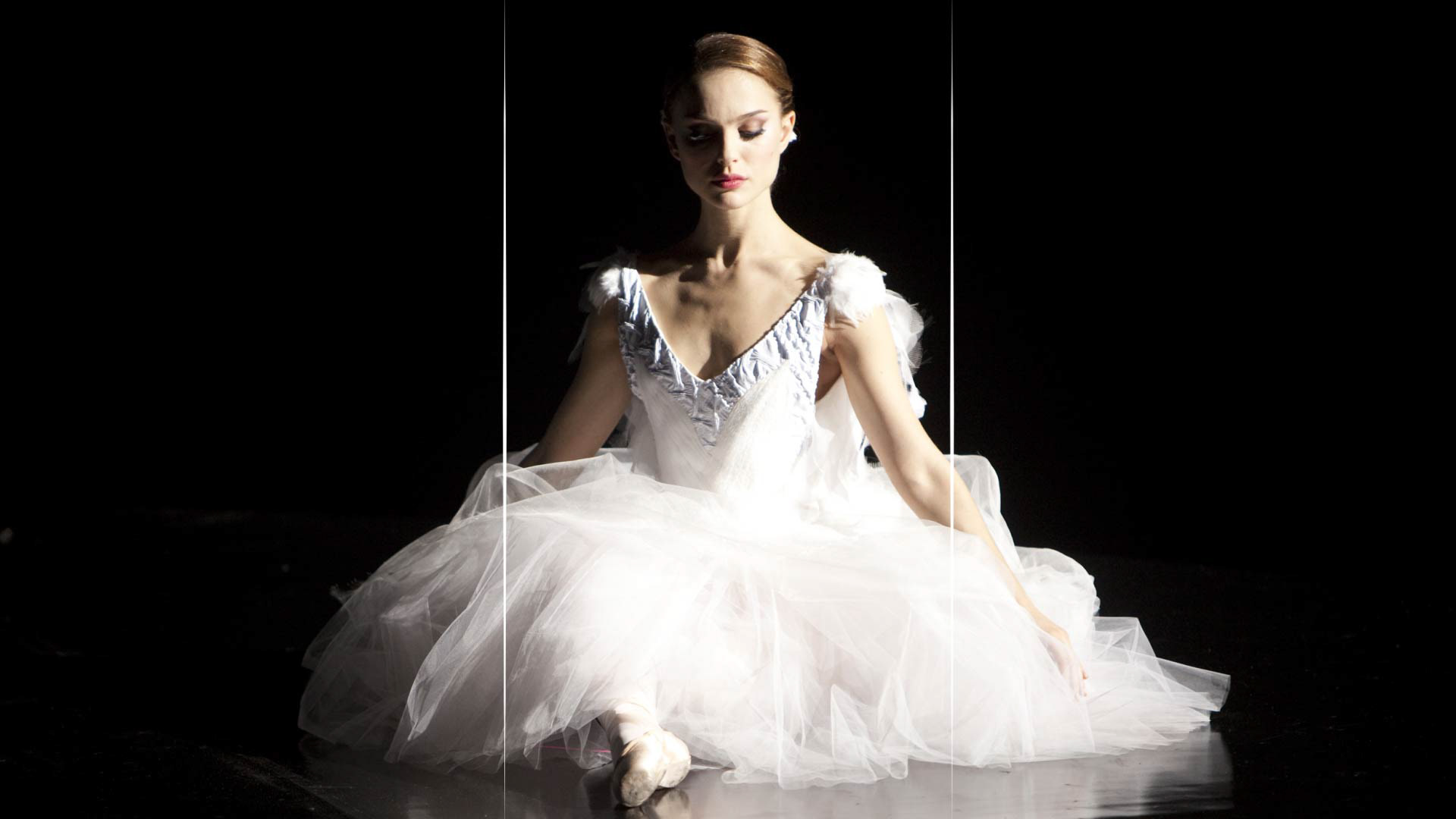
All the design layout is based on a flexible and dynamic three panel layouts. The centre panel moves, and the other panels resize accordingly. The three part grid allows us to have a distinct layout for all the communications. Together with the three-part colour palette allow us to create a playful visual interface that is used through the entire package, achieving a cohesive and unique brand.
On-Air Toolkit
We take ownership of the content by introducing the Three-Part Grid.
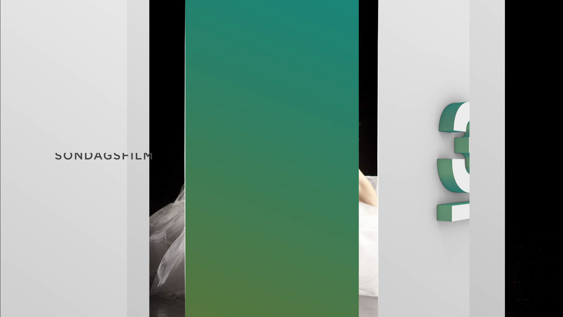
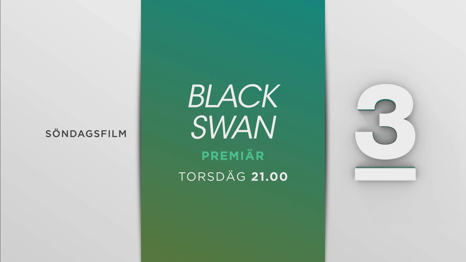
Endpages
Establishing TV3 positioning within the family of brands.

Menus & line ups
Digital and OOH
