
A simple, bold and engaging visual identity to boost Viaplay brand into new horizons. Viaplay is the premium online video streaming service and leading on-demand streaming service in the Nordics. Offers the full range of on-demand products, including EST and TVOD sports packages. 5 Countries. 80+ original titles. 85%+ reach across devices.
Brand position
Family me time - content for everyone.
Brand promise
Endless moments of entertainment.
Purpose of the rebrand
Drive awareness & sales
THE STRATEGY
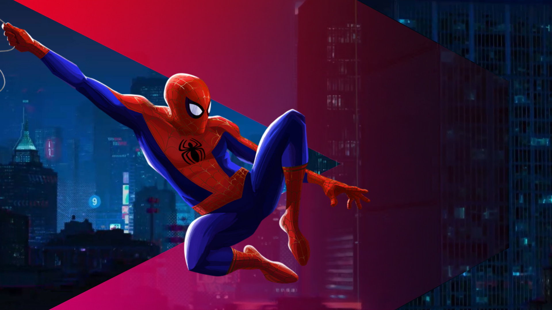
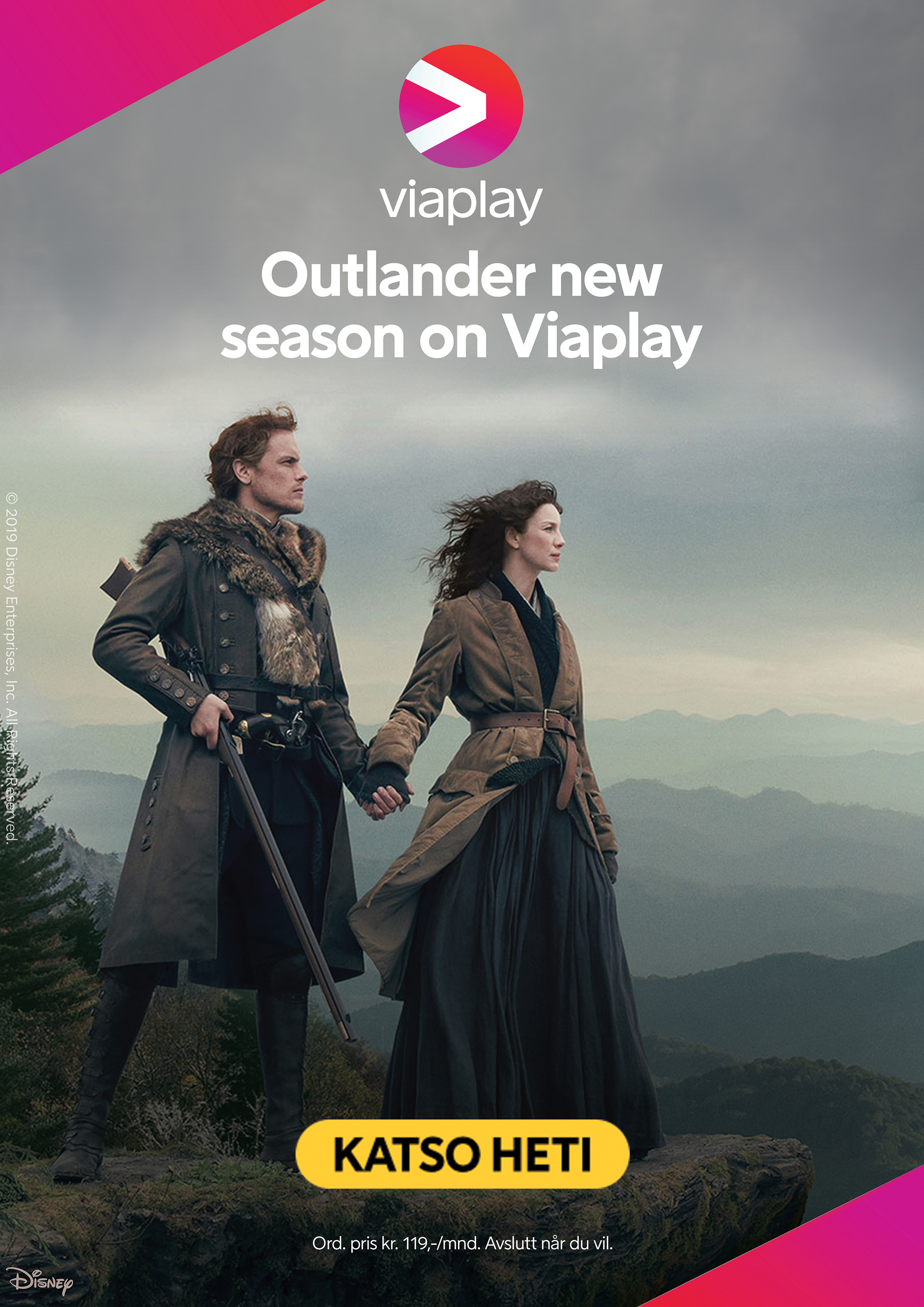
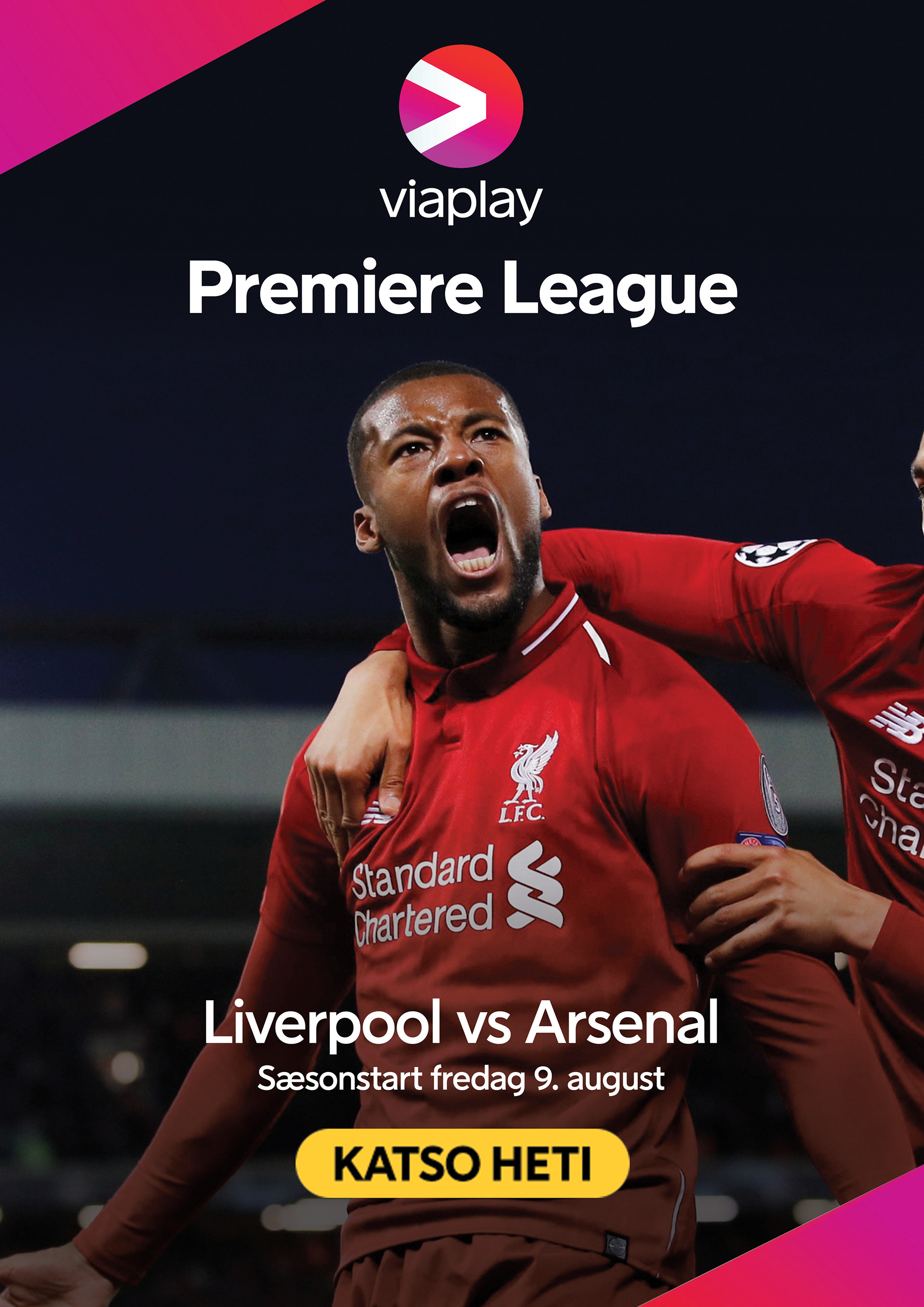
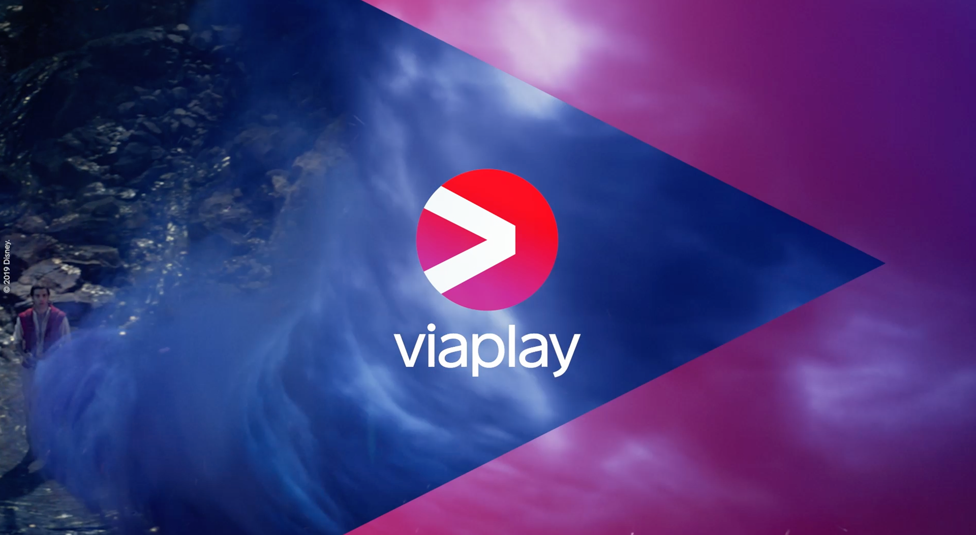
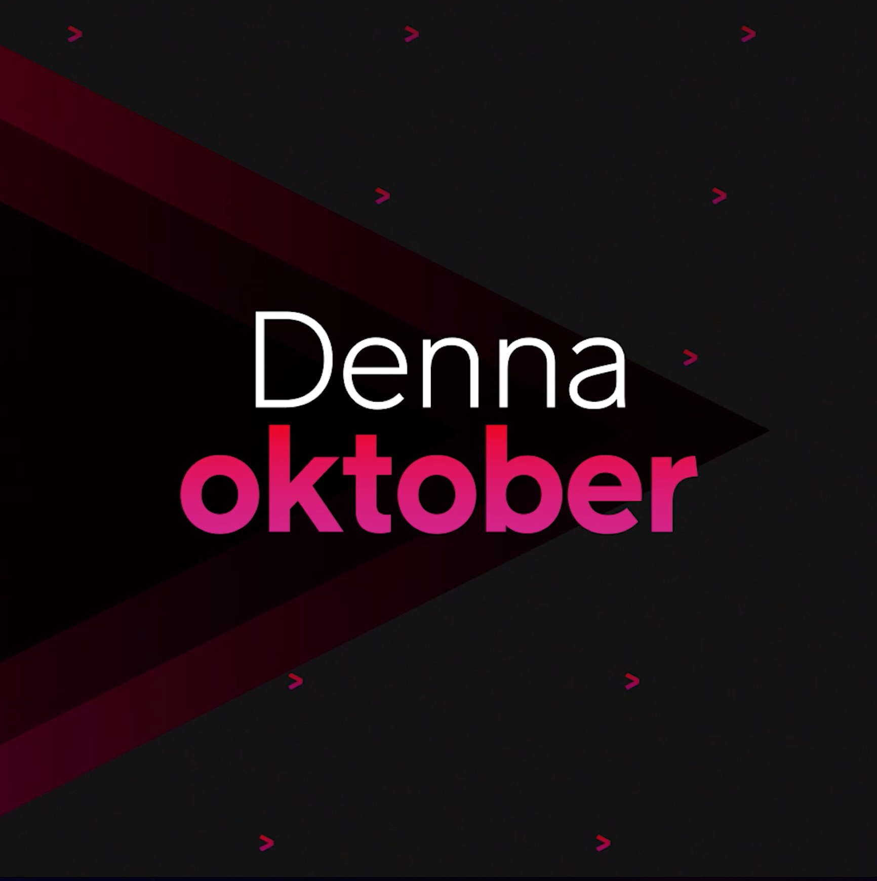
Developed a strategy to place Viaplay at the center of all the communications and let the brand engage directly with its audience focusing on the unique way of looking at the world by framing the endless moments of entertainment. The forward movement of Viaplay's arrow opens to the "corners" that embrace all the messages.
THE OUTCOME OF THE NEW STRATEGY
A performance that goes higher than expected. An increase in Brand sender recall (<58% in nine months and continuos growth) on impact, clearness of message and overall liking. Placing Viaplay on the right path to get the audience to recognise and understand the brand and its offering as the leading streaming Tv.
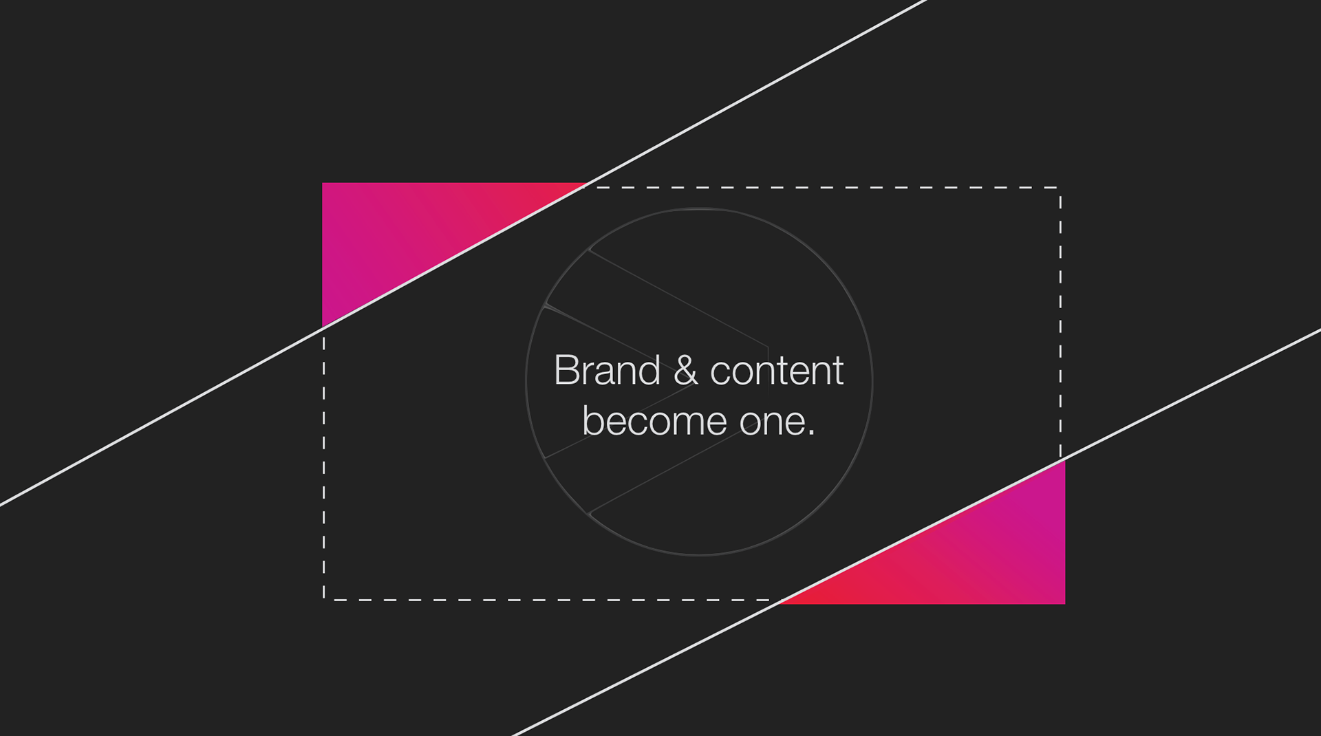
Brand and content become one. A clear and unified voice that allows Viaplay to take ownership on its vast catalogue of content, and have a strong place in the consumer’s mind.
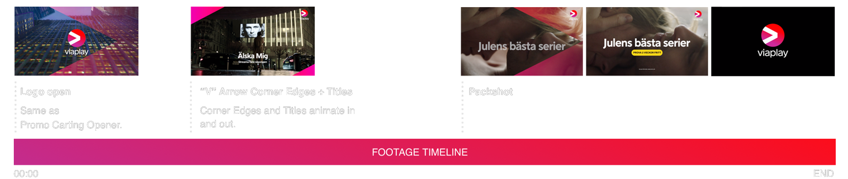
BRAND MOTION
The motion is a key element of the new strategy. The arrow whit its forward movement always brings more content, endless moments of entertainment for the entire family.


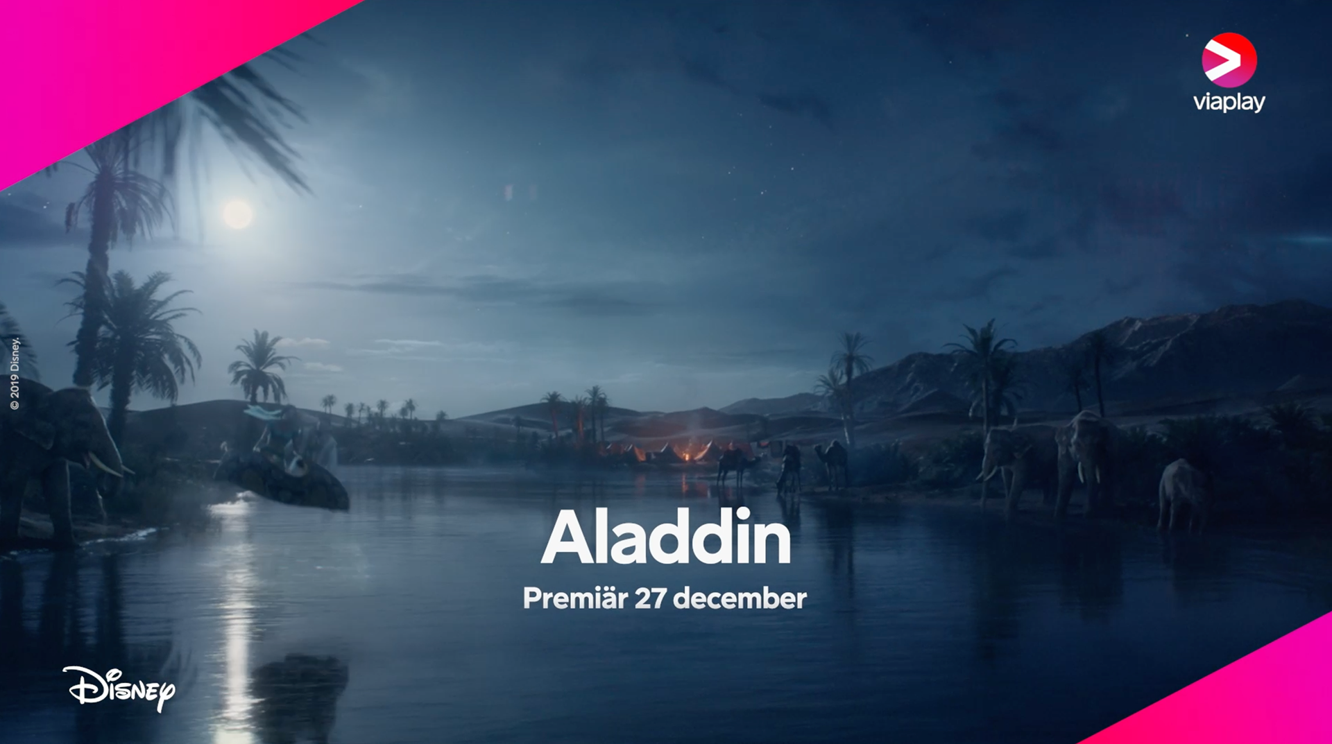
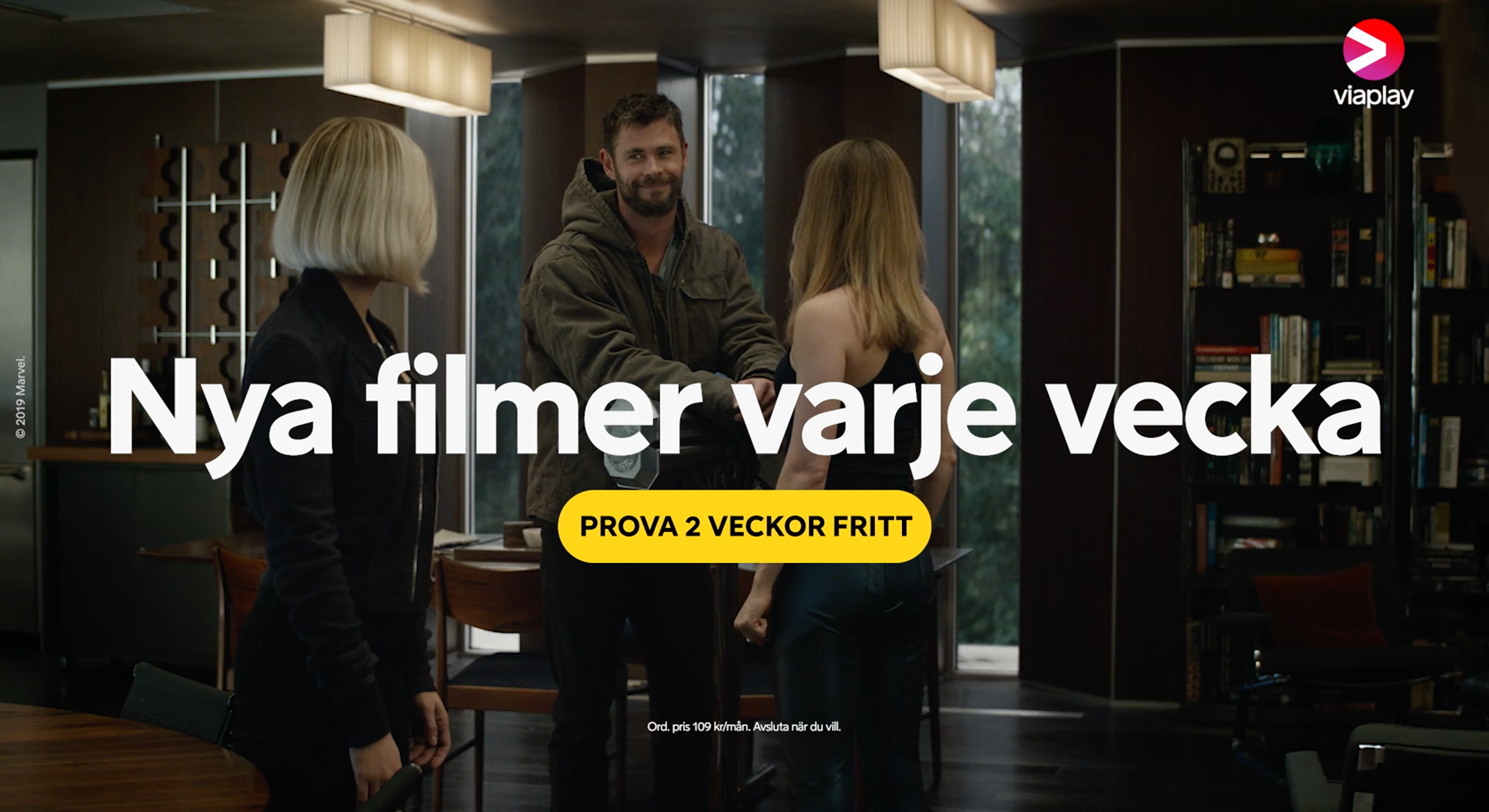
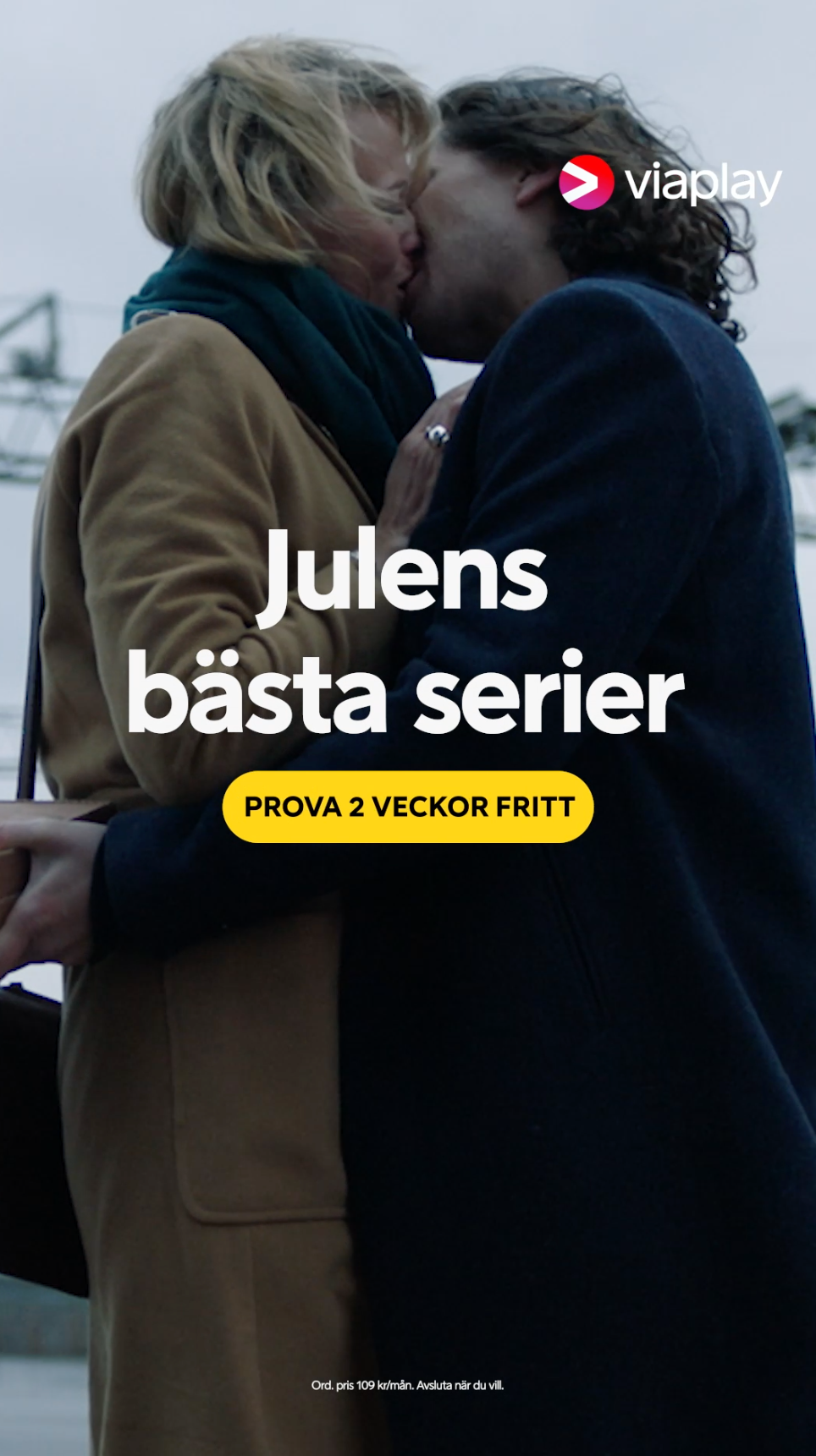
The new strategy is applied throughout mediums, in every communication with our audience. ATL / BTL campaigns. Original content is a key value for Viaplay's users. The new strategy strengthen the identification on people's mind between content > brand > sub-brand in a natural way.
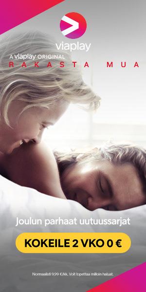
DOOH / OOH / Digital banners
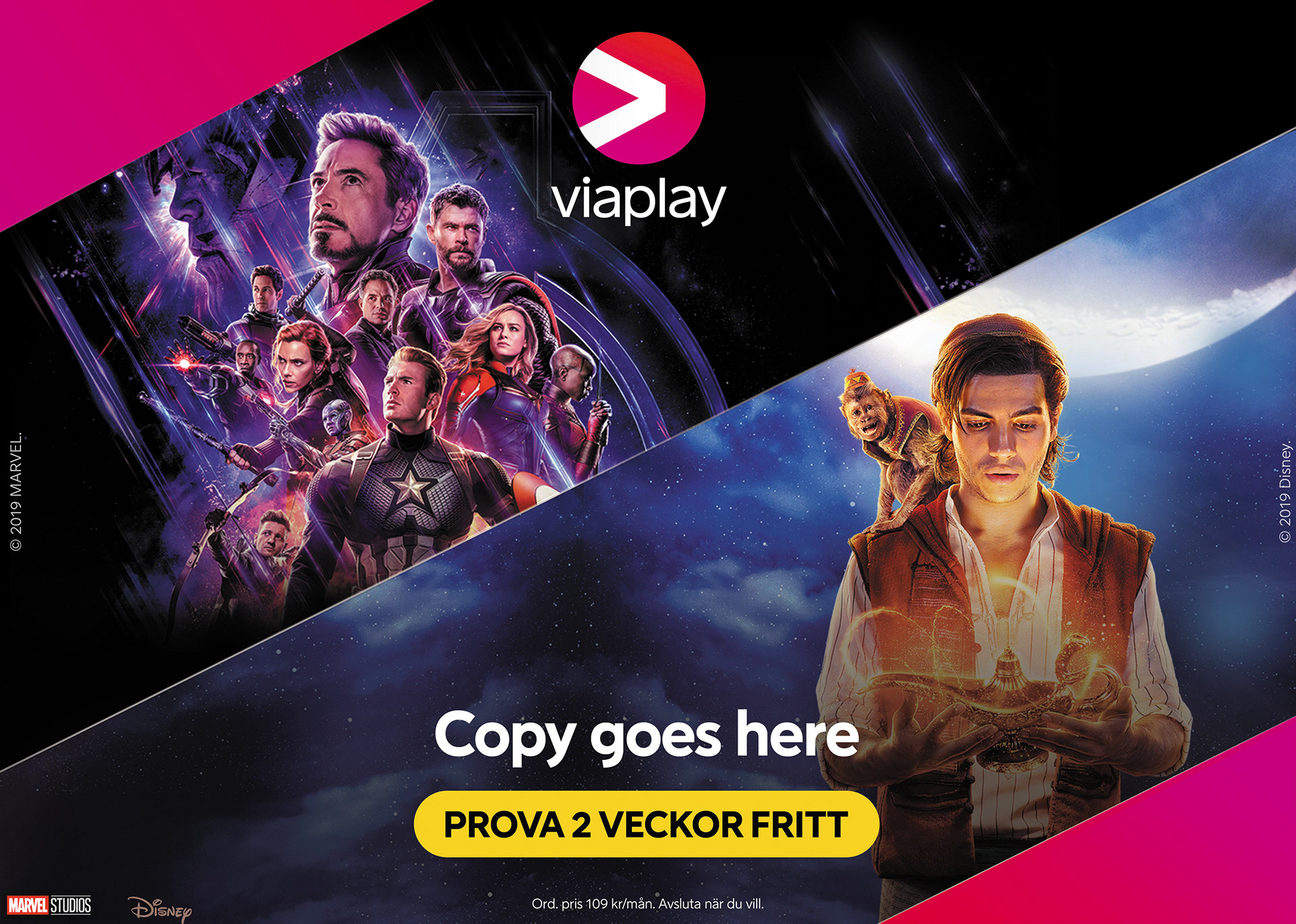


ATL / BTL
Brand partnerships
The visual strategy is flexible enough to work in any medium and embrace partners brands and IPs.