VIASAT is one of the leading entertainment companies from the Nordics since 1991, offering television, broadband and everything in between. VIASAT branding was a repositioning on what the brand offers and how its perceived, by costumers and competitors.
The concept of crossing, intersection, an expression of Tv, play and broadband coming together on one leading service.
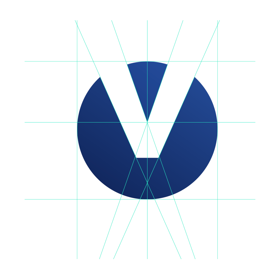
LOGO

The “V” isotype sits at the core of the crossing, intersection, of the business, TV, Play and Broadband. The “V” embraces what VIASAT stands for.
The strategy frees up the "V" to
contain our audience, messages and content.
The isotype has been adjusted based on balance, composition and symmetry to bring it together within the wide family of brands.

COLOUR PALETTE
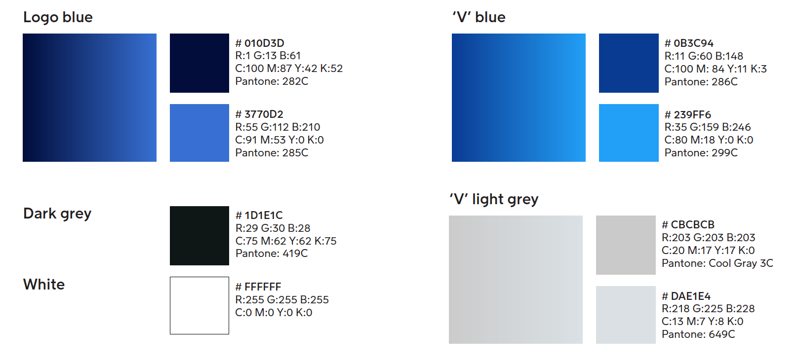
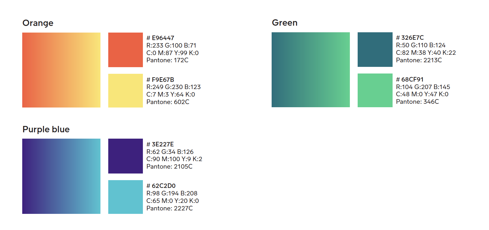
A wide colour palette that embodies our main brand and it's flexible enough to support our sub-brands, marketing and performance campaigns, as well as physical applications of the brand.
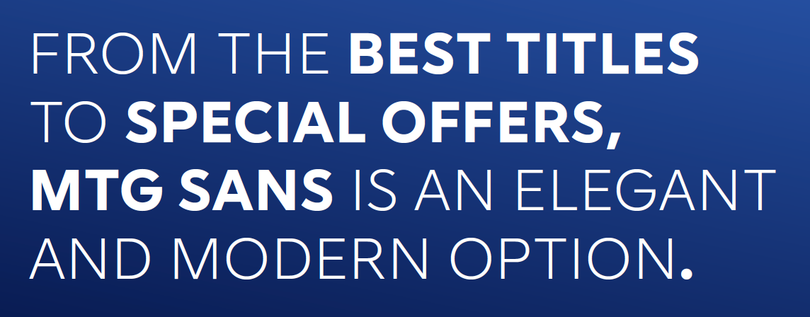
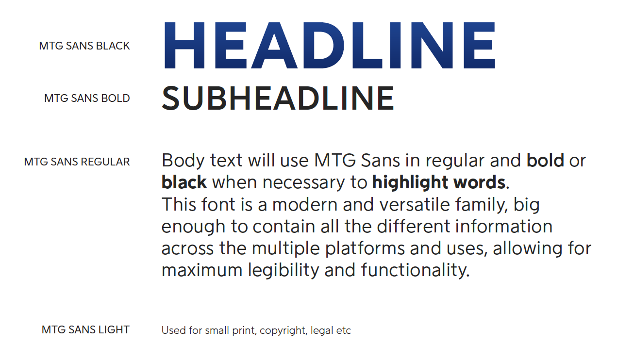
TYPOGRAPHY
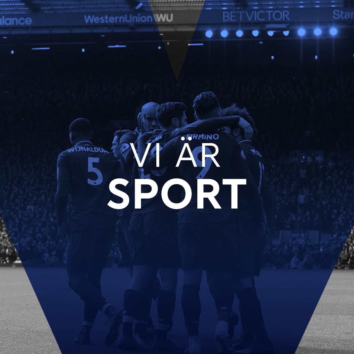
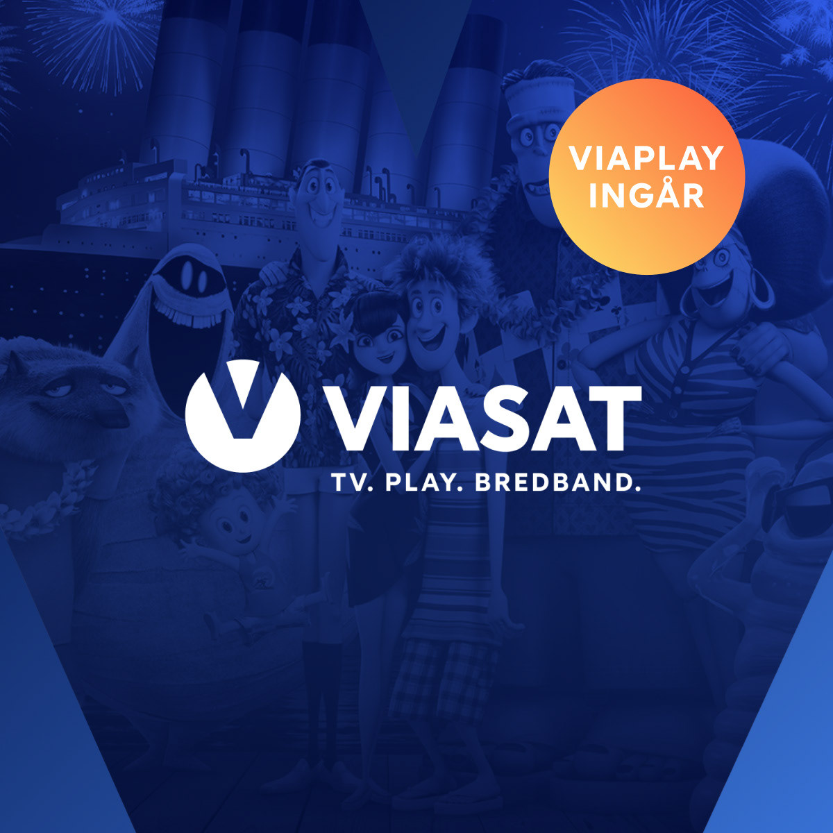
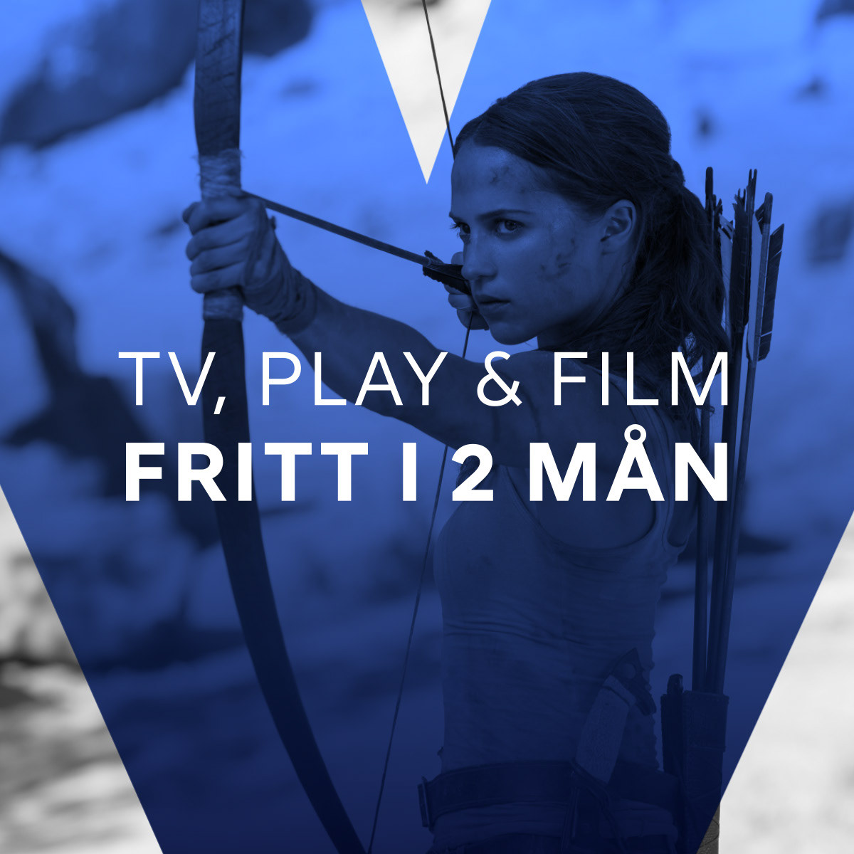
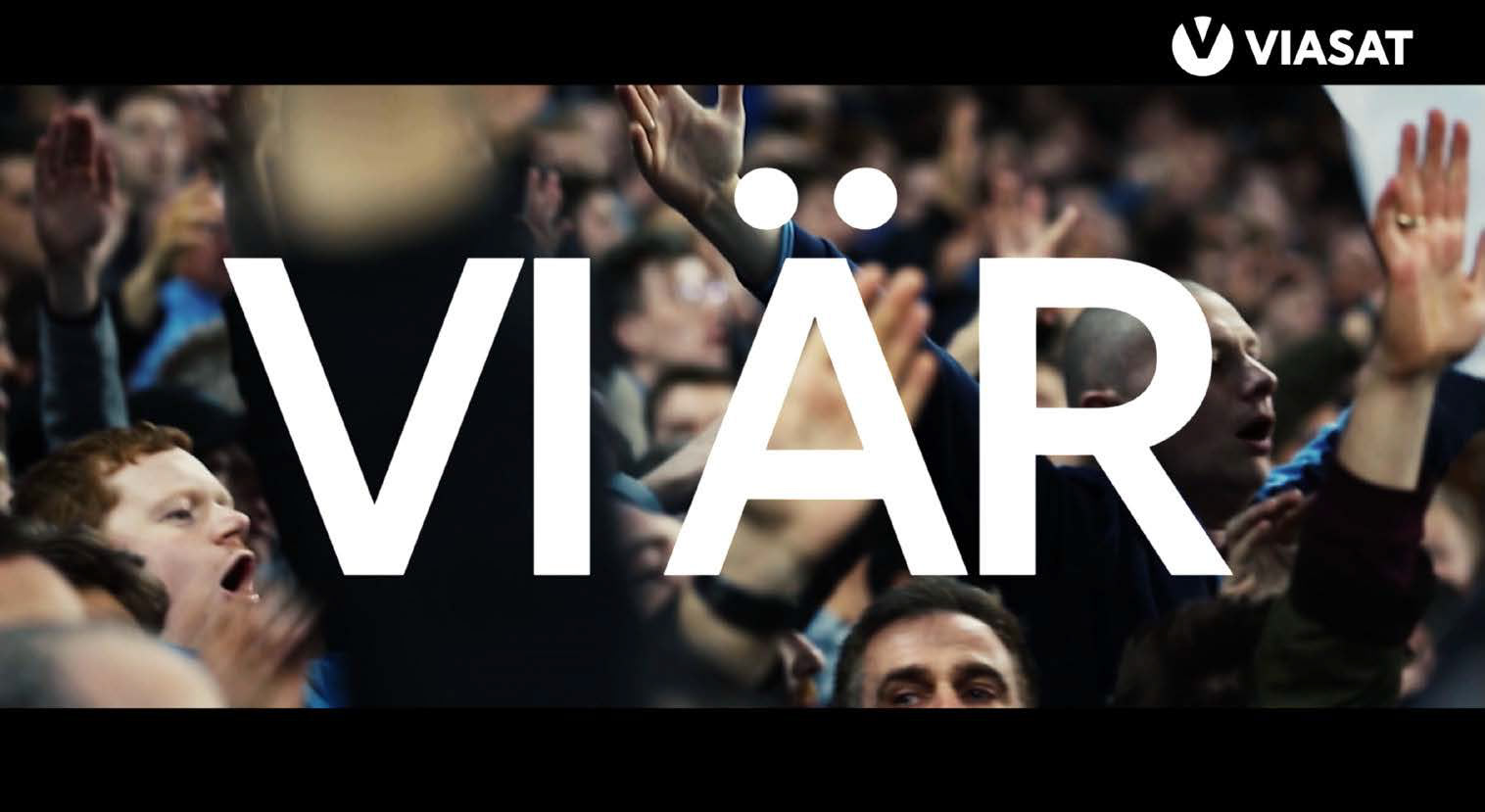
The costumers, the people. The core of VIASAT. The "V" frames the moments where they experience VIASAT world of services.


WE ARE VIASAT
The new brand positioning was all about who we are, what we do, and why you love VIASAT.
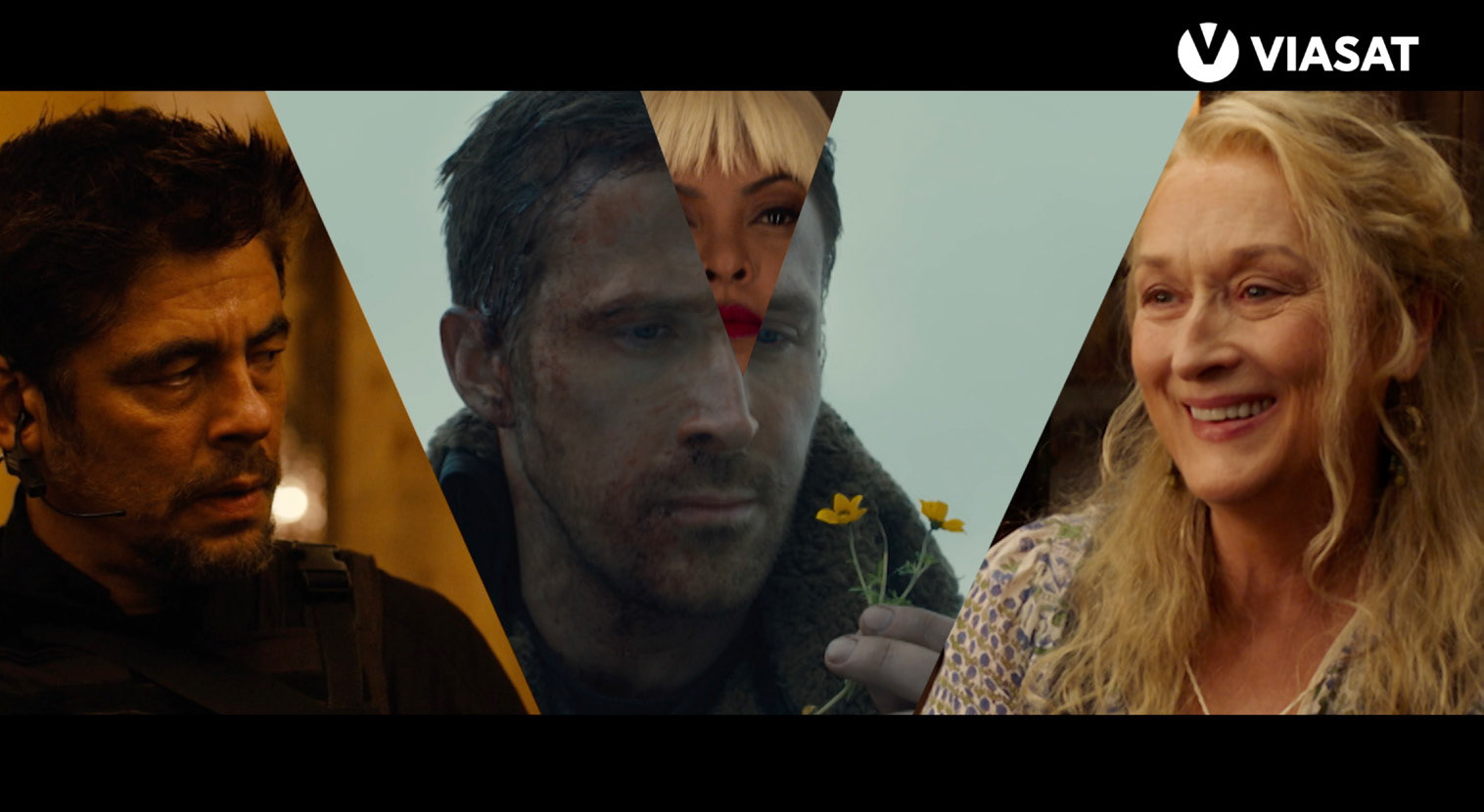
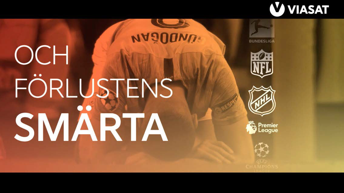
A wide range of applications and mediums were developed. A flexible, versatile but consist identity that spreads across all the touchpoints.